Decorating with Green
Top Image Source: bloglovin.com
Colour. I can’t live without it. I need bold and colourful rooms, playing with as many colours as possible and for me it’s about earthy Autumnal colours; browns, greens, ochre, orange, plum. That’s what makes my heart sing from an interiors perspective.
Moreover, it seems that colour and colourful interiors are here to stay for a little while yet. There has certainly been a trend towards the use of bolder colours in interiors in recent years, and why not?
Colour, used in the right way, can evoke all sorts of emotions and make your interior a happy place to be. Used in the wrong way it will be bland and can sap your energy, affect your sleep and even cause your digestive system to either go into overdrive, or slowdown.
So, let’s explore Colour……. and why it is such a powerful tool to use in your interior space.
Colour Psychology-The Science Bit
What colour represents to you or me, may be very different, as each of us have our own preferences for the colours we like to wear or decorate with.
However, there is a whole field of colour physiology which looks at how colour influences our moods, our choices, even our behaviour. The colours we choose say a lot about our personalities, as we each process colour differently in our brain. Finding a colour that works for you, in your home, is as important a decision as the design ethos you are going to follow.
And, it is okay to choose a colour that isn’t “on trend”. If you prefer black, that’s fine. If you prefer deep red, that to. Remember, we are all individual in that sense, and just because yellow is perceived to be a happy colour, doesn’t mean it will be for you.
Colour is fundamental to interior design and decorating. The choices we make affect the way our homes look, the way our homes feel to us and today, I am focusing on GREEN, my favourite colour.
I wonder what that says about my personality?
Green
The most chameleon of colours, now associated with serenity and calm, was once considered deadly poisonous. Green has undergone something of a revolution since the 17th and 18th century, when historians believed it may have contributed to the death of Napoleon Bonaparte, to the symbol of life and growth, environmentalism and conservation.
Image Source: www.cristinahusebo.com
It strikes the eye in such a way as to require no adjustment whatsoever and is, therefore, restful and soothing. It carries association with sincerity, health, fertility and good luck (green is the colour of a lucky clover). Dark green is associated with money. It is also associated with jealousy.
It is the sign of growth, new life, Spring. In nature, it is the result of chlorophyll, which enables plants to convert sunlight into energy. This is what gives them their green colour. Remember your biology lesson anyone?
Negatively, it can indicate stagnation, it slows down metabolism too, and, incorrectly used, will be perceived as being too bland.
Researchers have even found that green can improve reading ability. The use of green can signify intelligence and confidence.
Green for various cultures is also the shade illustrating the divine and religious figures. In the Muslim world, the colour green is strongly related to the Prophet Muhammad; in England, the color has heroic meanings and it is connected to the stories of Robin Hood; in China, the color represents disgrace, while in Japan green signifies eternal life.
In more recent years, green has taken on a whole new meaning and is now used to describe a wide array of practices, and ideas, be it recycling, the reduction of carbon emissions or growing your own food.
The History of Green
Introducing green to the art world in 1775, Swedish Chemist Carl Scheele produced a deadly green pigment known as Scheele’s Green, which was used throughout Victorian age, regardless of the fact that it was suspected, by many, to be dangerous. This colour contained green pigments but also deadly arsenic. The fact that this was used the coloring of Napoleon Bonaparte’s bedroom wallpaper forces many historians to believe that Scheele’s Green caused the revolutionary’s death in 1821.
The deadly combination was replaced in the 19th-century with the mixture of copper and arsenic, which was used in many impressionist paintings by Cezanne and Monet. Not surprisingly it was banned in 1960.
Decorating with Green
Image Source. www.dulux.co.uk
Ever since Pantone named green its colour of the year in 2013 (Emerald) and again in 2017 (Greenery), green has been a popular choice in interiors. But, you need to be sure that green is the right colour for you before you go ahead and decorate with it.
Like all colours it has to resonate with you, you need to feel comfortable with it or you will simply regret starting your scheme.
Green is around in wallpapers, accessories and furniture, so if you don’t want to go all out and paint a room green, perhaps you can add it to you room in a smaller dose.
Blue and Green Should Not be Seen
One of the typical interior design myths, that blue and green should not be seen. When used correctly, the colours are simply stunning together. A deep navy room with a green sofa, or contrastingly, in the room below, a deep green room with a hint of navy, in a simple chair. Note in the picture below, the green colours used are tonal, a darker green wall with a lighter green velvet sofa and rug.
Simply adding green plants to a navy room will lift the colour.
Image Source:www.internityhome.pl
Geen and Yellow, a Happy Yet Calming Combination
Yellow is a colour I’ve had a mixed history with. I have broadly hated it, but that is probably because, previously, I have used rather insipid yellow colours; pastels which will never sit in my interior scheme.
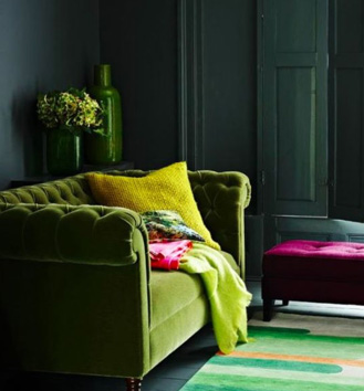
It is now, however, one of my favourite colour combos at the moment (see the corresponding post on my new ochre bed, in my deep green room) a green that will calm and sooth you along with yellow, which is an uplifting colour, a happy vibe. Here, the secret is to use yellow as an accent colour. Think deep green walls with a yellow sofa, or a desk. A velvet green sofa with a yellow throw. An accent chair in yellow. My secret is to keep yellow on the side of mustard and ochre, deep enriching colours that sit well with my dark interiors.
Yellow sits next to green on the colour wheel and is therefore an analogous colour. These colour sit harmoniously together, creating a pleasing combination.
Image sources. LHS https://www.housebeautiful.com. RHS www.flickr.com
Green and Pink
A very popular choice in interiors at the moment, and just looking at the photos below, you can see why. Pink and green is a stunning colour combination, arguably a complimentary colour scheme as pink sits on the red end of the spectrum opposite to green on the colour wheel. Complimentary colours will enhance each other. They will appear brighter together than when separately, or one can be used to tone down a deeper shade in the other. Complimentary colours are the simplest to use, typically one colour acts as the dominant colour, with the other in smaller doses. Adding a neutral colour, gives your eye somewhere to rest; in most of the images below, wood or brass are providing this effect. In one or two photos, a simple white table or the white of the marble fireplace breaks up the scheme.
Image Source:www.barlowandbarlow.com
Image Source. Devol Kitchens
Image Source:www.britishstyleuk.com
Image Sources: www.deardesigner.co.uk.
Green on Green or in a Neutral Scheme
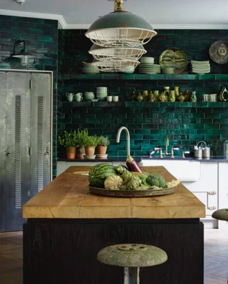
If you don’t want to embrace deep green walls, or a mix of green and another colour, try adding a touch of green to a neutral scheme. In the picture from Artist Residence below, green velvet chairs enhance an otherwise neutral room. In the kitchen below, green is used more substantially, but against black and white and with metals and wood to balance it.
Image Sources: LSH Artist Residence. RHS www.feedly.com
Hints of Green
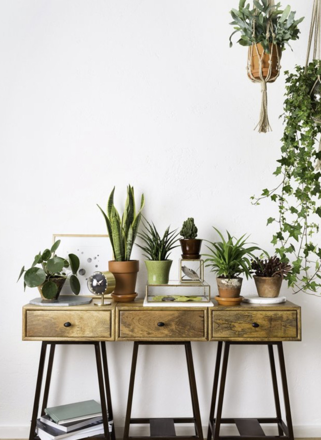
And, if you really are not a colour lover at all, you can’t go far wrong with plants and foliage for adding a hint of green to you home. Plants not only look great, but have air cleaning properties. You can read all about the enhancing properties of plants here.
Flowers on a summer table, or greenery at Christmas, really help enhance a neutral room.
For me, green is a relaxing colour in my bedroom and a thinking colour in my study. But most of all I simply love the dark hues on the green spectrum. That is what makes my heart sing when I walk through the door.
The Girl with The Green Sofa


