Dark and Moody, My Kitchen Update
It didn’t need a big change, I certainly was not about to paint this room again, especially given its size and ceiling height, and I was not about to embark on a whole room revamp from a cost perspective, but you can make small changes that make all the difference to a room; refresh a room that you can’t afford to replace necessarily, I guess.
The question is why I felt the need to update my kitchen at all. Well, we actually did the renovation work on this room back in 2008, just before I got pregnant with Jack, and the kitchen itself was looking a little tired. The units themselves are perfectly fine, as are the doors, if not a colour I’d necessarily choose if I was to re-do the kitchen again. I would prefer to paint them a different colour, but my husband is adamant that he doesn’t want us to make an expensive mistake, so for now, until my powers of persuasion improve, the kitchen units are staying. They are neutral, however, so I can afford to play with colour in this room, quite a bit.
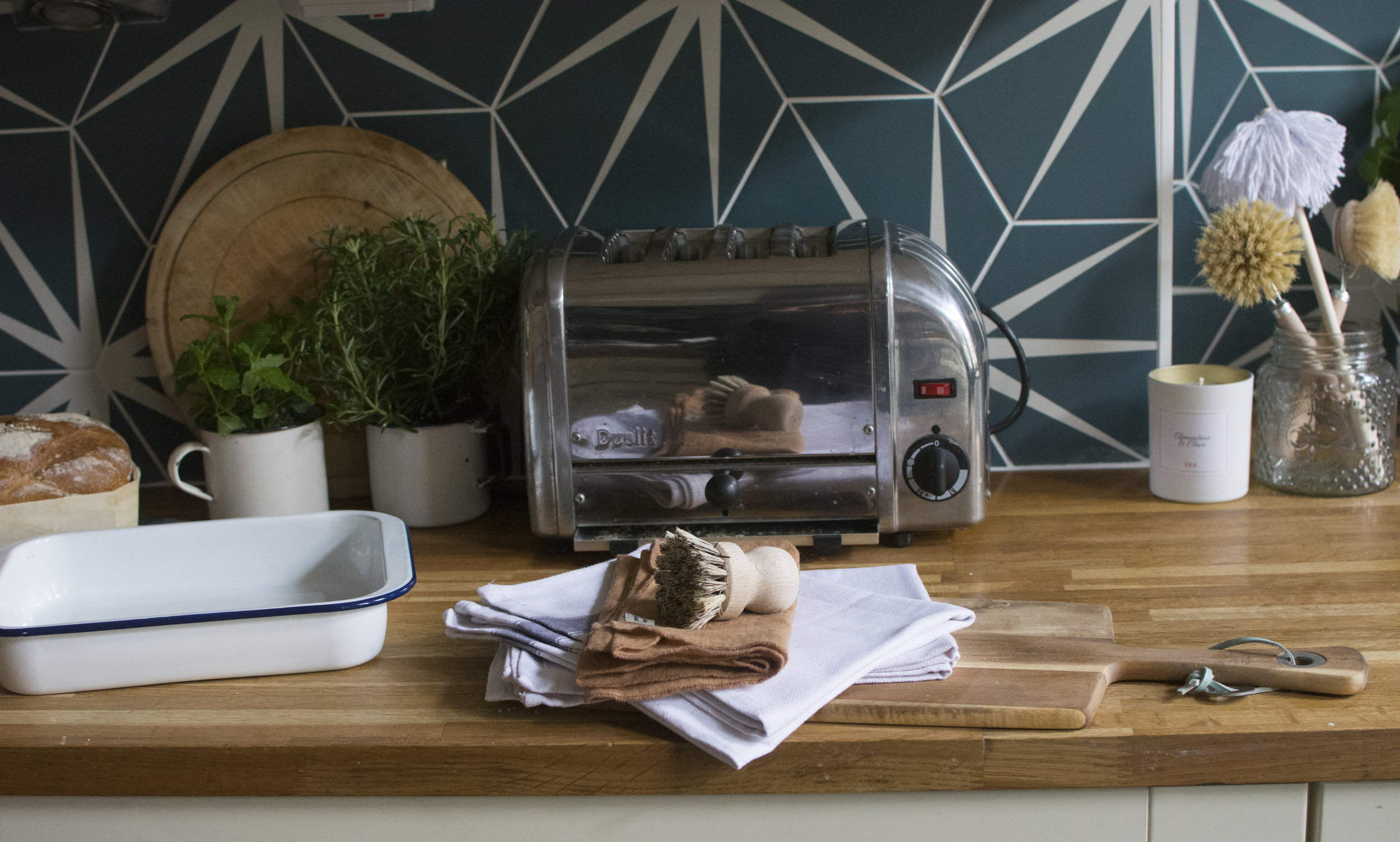
We began by re-sanding the wooden work surfaces, you can see above, and oiling them again. I have to say, many people shy away from wooden surfaces, but we have had ours over 10 years and they are still in pretty good shape.
I then tackled adding new wallpaper.
I do all the wallpapering myself, I’ve learned over the years, and I’m getting pretty good at hanging paper without gaps between the panels, although I’ve had some howlers along the way. So, I took a deep breath, opened the purse strings, and felt justified in splashing out on House of Hackney wallpaper for this room. Because my walls are already a deep inky blue I went with Limerence in ink, which has a background colour that matches almost perfectly.
Now, I was not about to do the whole room in this wallpaper, much as I would have liked to, I simply couldn’t afford it!
So, I chose to wallpaper the feature fireplace wall, and I added touches to the opposite wall and to the wall beside my kitchen door. This took the wallpaper across the room, kept the kitchen part cohesive with the dining area, but saved me a pretty penny on doing the whole thing.
As you can see below, I kept the other walls the same; painted in Rivington Blue by Abigail Ahern.
If you’ve followed me for a while, you will notice in this shot, that I have changed my dining room table. This was driven in two parts; our original table was old and grubby from the kids growing up, around it. That in itself was not the only reason to change it, I could have simply done a renovation job.
However, we found the table was too large for us on a daily basis. We quite like also having a sitting area in the kitchen (which I will get onto in a minute) and we love playing board games and simply reaching the board was proving challenging for the kids, around our old table. So, we gave that one to charity and MADE.com very kindly gifted me this beautiful table; The Belgrave in Oak.
I’m not going to dwell on this any further, you can find out why I chose this table here.
However, I will say, we have never played as may board games as we have in the last few weeks, it has transformed the way we use this space. And, that is really why making changes to our home can work so well.
Blue and Green should not be seen, is not a phrase you will ever hear uttered in this house. I have neglected my plant game recently, driven largely because I was travelling every week and watering them always seemed to be the last job I remembered to do. Hubby is a great hand at watering my faux plants, but sadly is not green fingered so I simply gave up buying new plants.
But, I love the way they enhance a room, and so over the Christmas break, I bought some more, remaining optimistic that this year they will survive. Watch this space!
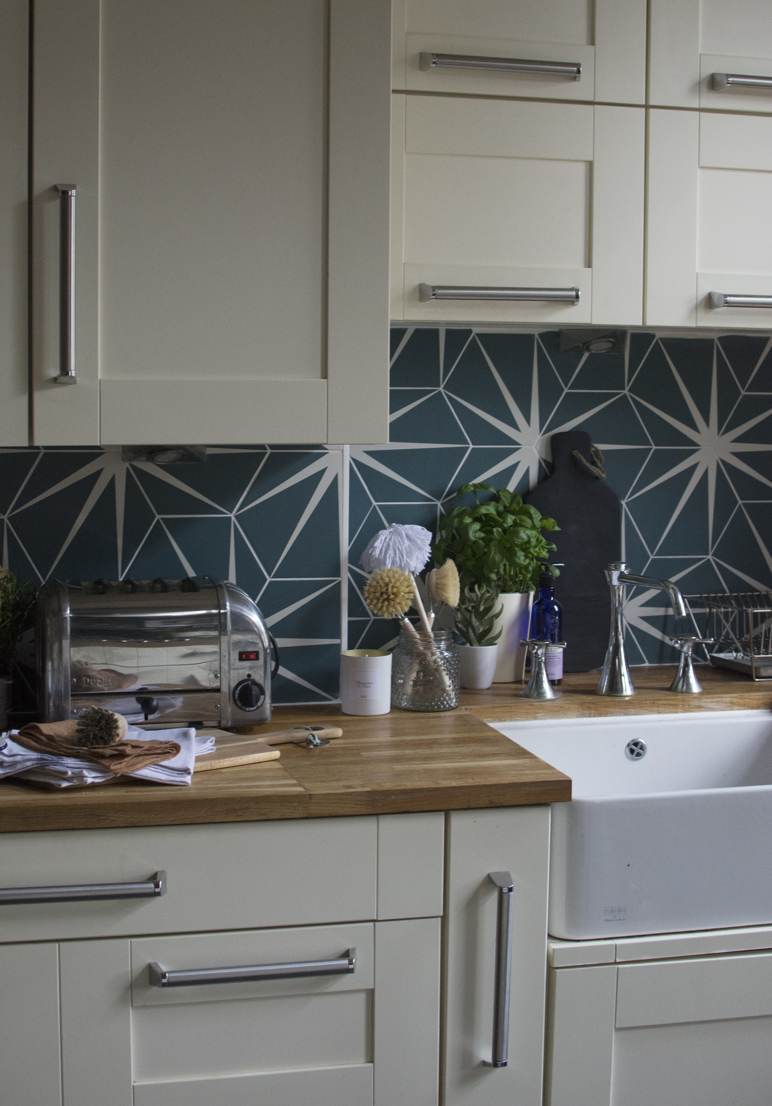
Changing your tiles can really transform a room and when it is a small space like a splash back, it doesn’t have to cost the earth. I’d been dreaming about these lily pad ties for months and when Ca Pietra contacted me with their new porcelain version, I knew it would be a practical, yet beautiful change to the Kitchen. I had metro tiles in matt cream in this kitchen previously, and whilst they were beautiful, they quickly became scratched by items on the work surface. Moreover, the cream wasn’t really a big contrast to the cupboards and they tended to get lost in the space. I was all for something striking and practical this time.
These are the porcelain Lily pad tiles in Peacock blue and in the interests of transparency were gifted to me. You can see the green version of the lily pad tiles in my bathroom update here.
Finally, came the living area in this room. We have always had a sofa in here, shoved under the window. A place for the boys to sit while we cook. However, as the boys have got older, they like to disappear into another room on their own, sometimes their bedroom, sometimes the other room downstairs.
Not blessed with a huge amount of downstairs space (we are all about the bedrooms in this house), I wanted to make this more of a living space, and now we had a smaller dining room table, we had the ability to do just that.
I already had the pink Moby velvet chair from MADE.com, I bought it in the sale last year. But, our old DFS sofa was tired and I wanted a two-seater sofa that would sit better in the space.
So, I returned to Living Room. I had met Jo, the owner, earlier in the year when she hand delivered my Model 2 ochre velvet chair. Jo was originally a buyer for MADE.com and had come across me due to my Green sofa. We chatted and I loved the ethos behind her brand. I also loved the quality of her furniture and so I returned to buy this Model 2 sofa in Designer’s Guild Linen mixed tweed.
I added a new rug from Homesense and this pink fringed Pouf from Bloomingville.
Finally, hand stitched cushions (by me) with left over House of Hackney Artemis velvet (the rest was used to create the fringed lamp which I moved from my bedroom) were created to go alongside beautiful gifted velvet cushions from Luxe39. These cushions are available in any colour combination, but I chose a navy and a teal blue so I could turn turn them over when I felt like it. As a really nice touch, Helen added a pink zip to co-ordinate with the room.
We now use this room more than any other in the house, testament to how making changes can really affect the way you use a space. This is multi-functional and hard working space; it is living room/dining room/kitchen but each element works well together. I can’t imagine the kids not sitting in here playing games, doing homework or sitting on the sofa watching television while we cook, and it has saved me the time and money of replacing a perfectly functional, if a little tired kitchen.
The Girl with The Green Sofa


