Suszi Saunders Dark and Dramatic Home
This is a stunner of a home, dark and dramatic, glamorous and cosy. Meet Suszi Saunders whose home also recently featured in Living etc. Suszi has recently renovated this home from a structurally sound, but bland box, extending out the back to create a fabulous family kitchen and painting the home in dark colours, stamping her personality onto it.
Read on to find out more.
I’m Suszi and I live at home with my husband Nat, four-year-old son Teddy and our 19-year-old tortoise, Linus. I’m a hypnotherapist and Nat writes comedy shows. We are both completely rubbish at any kind of DIY. We bought our Victorian terrace in South East London two years ago after selling our top floor flat. Nat has zero interest in decor and never requires me to discuss interior decisions with him. He lets me do whatever I want. I couldn’t love him more!
Our house was structurally sound when we bought it but totally bland. It had two lovely reception rooms but a tiny galley kitchen, so I instantly knew it was the house for us as I couldn’t wait to extend and have an open plan kitchen / living area. Upstairs there were three double bedrooms, plus a miniature 4th bedroom neighbouring a teeny tiny bathroom. There was no question that we would rip down the wall and create a lovely spacious family bathroom. As I had recently turned vegan when we moved, I gave away all my sheep skins, and was on a mission to “veganise” our new home. We chose vegan friendly paint from Farrow and Ball, bought feather-free sofas and cushions, replaced our wool rugs with cotton ones, and reupholstered our vintage leather chairs. I’m pleased to say that the texture and cosiness has not been lost in the process.
Previously, I had dabbled with dark decor in our old flat, painting our hallway in a deep, dark chocolate brown colour. I couldn’t wait to transform our new vanilla home into an oasis of black. When we started the renovations, I didn’t really know what I wanted, and I very much made decisions as I went along. I think it was an entire stroke of luck that it turned out well, although there were some inevitable dramas along the way, like the kitchen that we bought online. When it arrived, I cried as I hated it but couldn’t return it as it had been bespoke painted. Turns out I love it now. And when the Crittall style doors arrived I thought my world had ended when the fire safety logo was on EVERY SINGLE BLOODY PANE OF GLASS! Turns out I never notice them at all now. So, I’ve learnt a valuable lesson; the things you hate at first are probably not that big of a deal and there’s no need to have a meltdown about it.
We lucked out when we found our builders. They are magicians and gave everything I asked of them a go. They made the reno process as stress free as is possible.
Reception rooms:
Both of our reception rooms have a similar vibe. Dark grey walls and ceilings, original fireplaces (that we reinstated), a mix or real and faux plants plus lots of metallic accents. One thing we’re missing is pictures. Our walls are still looking a bit bare but we struggle finding things we love. Nat’s a huge film nerd so vintage posters are the main source of our collection but we’re still in need of more.
Open plan kitchen / diner:
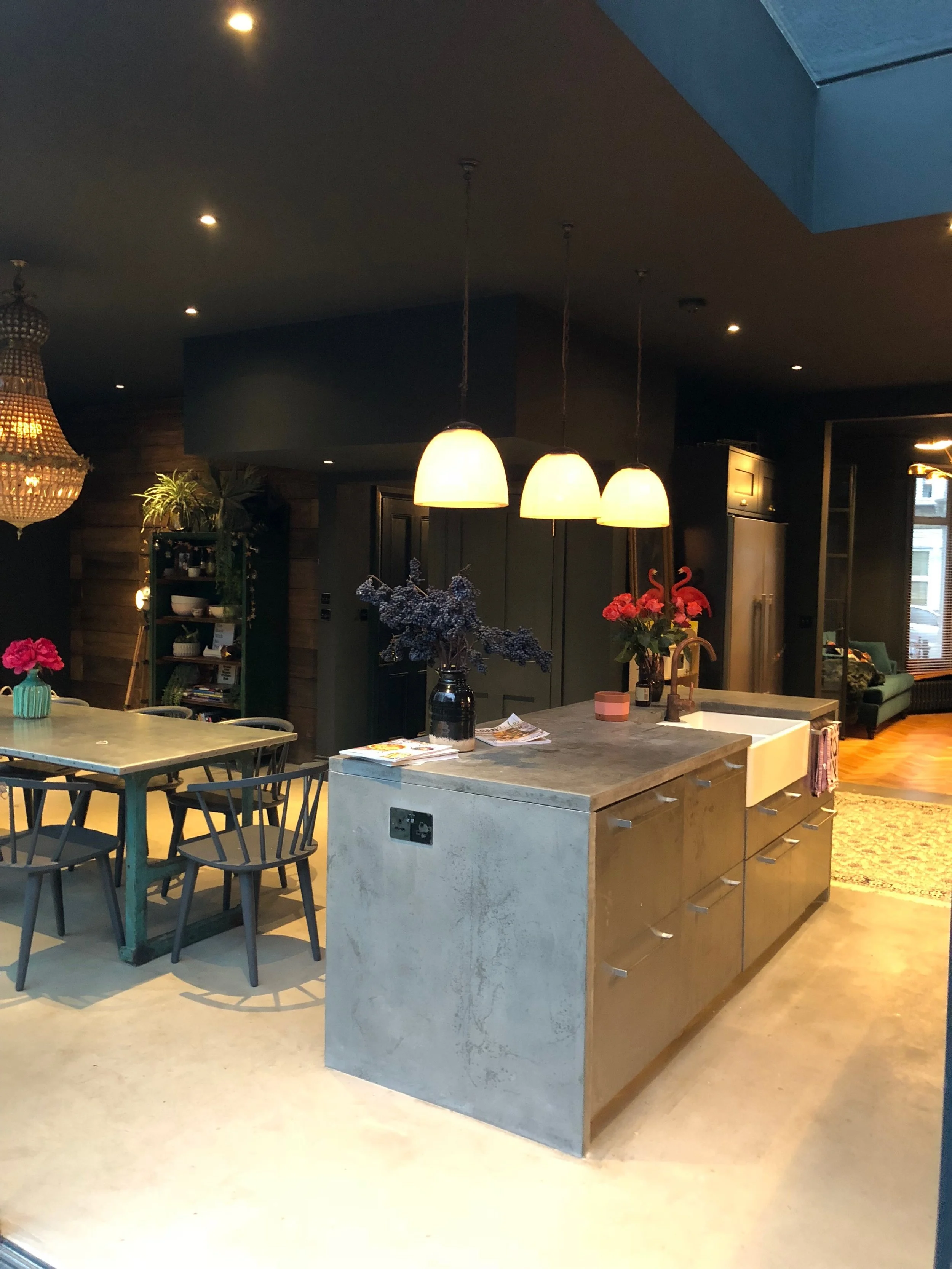
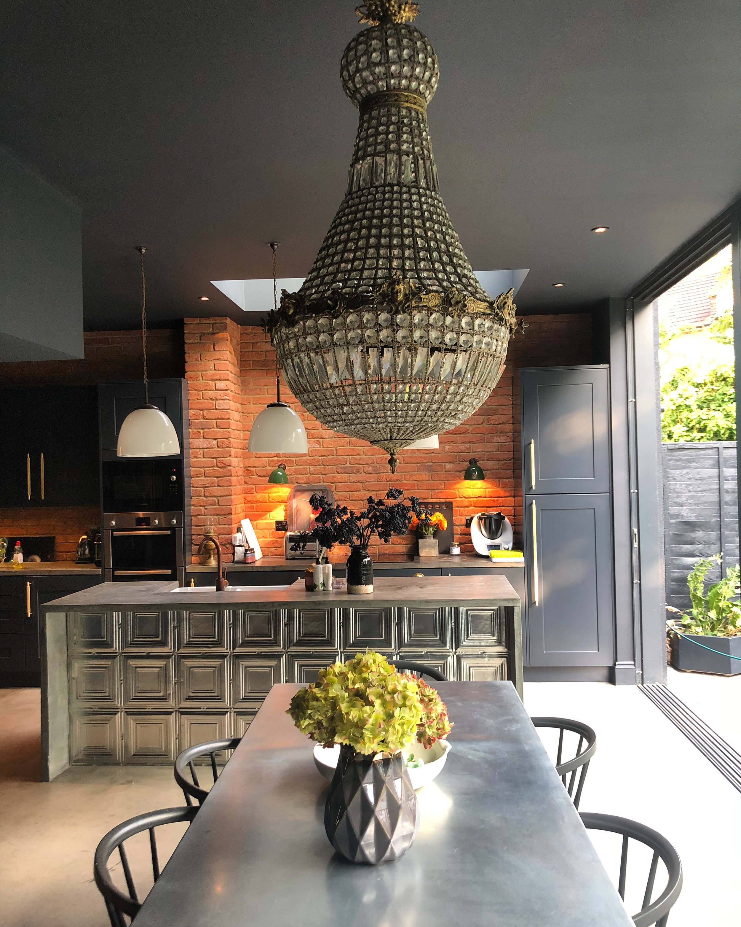
Our dark grey kitchen cabinets are from DIY kitchens. As I mentioned above, they weren’t quite what I was expecting as they have a laminate effect. Turns out that has proved a godsend with a little sticky-fingered toddler as they are super easy to wipe down and keep clean. They were bespoke painted in Farrow and Ball’s Railings, the same colour as the walls and ceiling. And like everyone else it seems, we chose gorgeous gold hardware from the masters that are Buster and Punch. They’ve helped elevate the super cheap kitchen cabinets. For the kitchen island, we used stainless steel cabinets from Ikea - these are less easy to keep clean!
I was hoping for concrete worktops and a polished concrete floor, but rich we aren’t so we had to compromise. Luckily, our builders came to the rescue and said they’d attempt to make the worktops for us at a super cheap price. It took them a couple of attempts but now we have the worktops of our dreams and it didn’t bankrupt us. They also used a self-levelling compound for our floor which looks amazing and was a fraction of the price of a polished concrete floor. The thing with concrete is you have to expect stains. In fact, the more stains you have, the better the patina. It also makes the ‘dirt’ less obvious!
We’ve added bricks slips for warmth, a reclaimed scaffolding board wall for a bit of texture, and a mix of silver and copper accents. Like the rest of the house, we have lots of antique lighting. I guess you could say my vibe is dark and eclectic.
Hallway
Sadly, we didn’t find any beautiful original tiles, when we ripped up the ugly flooring, so we used some gorgeous cement tiles from Bert and May. the monochrome vibe really pops against the dark Hague Blue Walls. This colour follows all the way up the stairs and onto the landing.
Master bedroom:
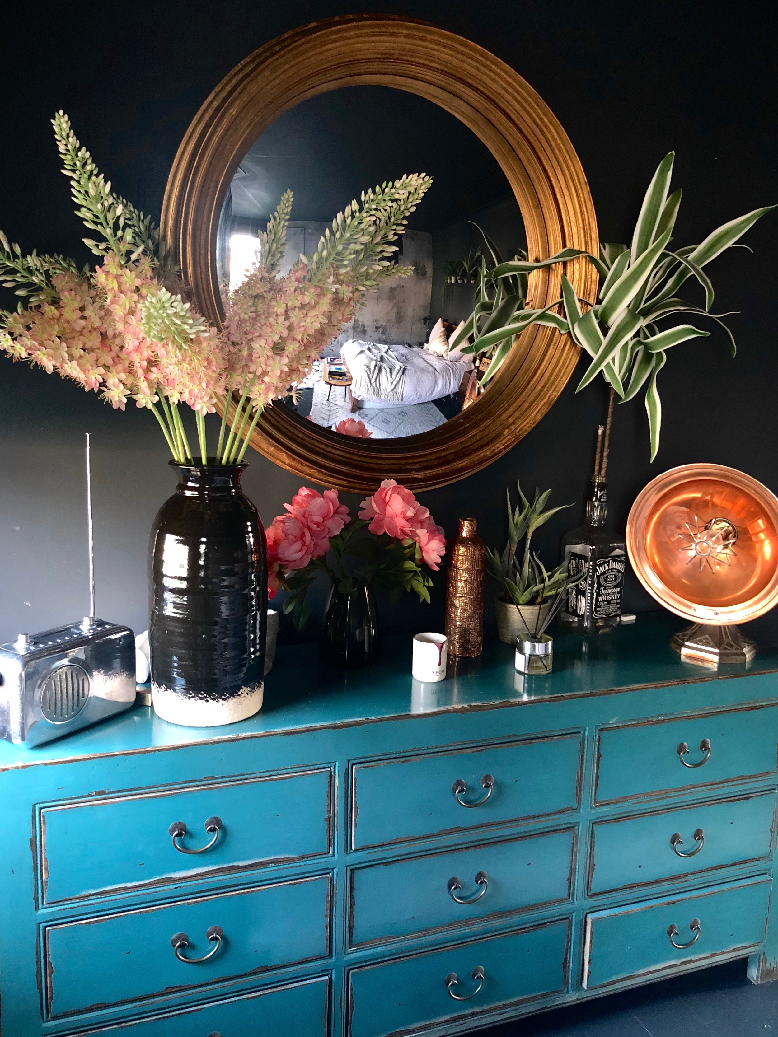
I don’t know why, but I found this room the hardest to decorate. I guess I just wasn’t used to sleeping in a dark room, but I’m now 90% in love with it. It’s a mix of dark grey walls, softened by pale pink linen bed sheets and a minky textured mural wallpaper by Rebel Walls. The turquoise chest of drawers adds a splash of colour, as does the gold convex mirror by Reflecting Design. Nat’s only complaint is that he can’t see as it’s lit by a gorgeous but utterly useless chandelier. But I don’t do practical.
Bathroom:
This is my favourite room in the house. I planned nothing and yet it just seemed to come together at the last minute without any hiccups. My big splurge was the cast iron bath, which was offset by the much cheaper floor and shower tiles.
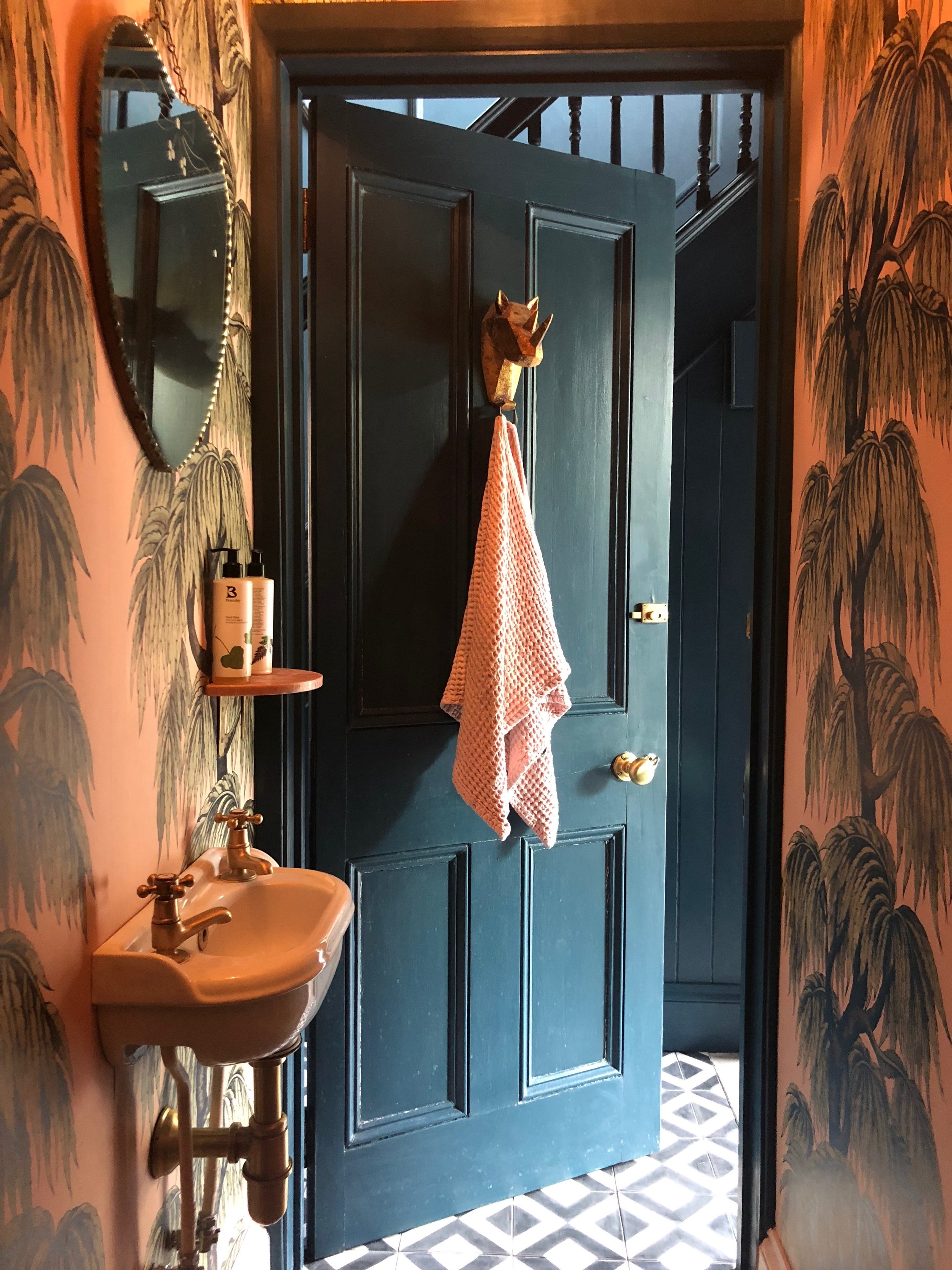
Finding brass taps was a nightmare, as few places did them and the ones that did were way out of our budget. Then I stumbled across Bespoke Taps which were so much more affordable. I love the brass against the black accents, and our builders made some copper pipe radiators for us. The palm print wallpaper from Cole and Son finishes it all off.
Teddy’s room:
Teddy said he wanted a black room (hooray!) but we went for a dark green, accented with a bright yellow bed. We’ve used Ikea picture shelves to display his books and a vintage ammunition crate for his toy box. The super soft, vegan friendly rug is by Snowdrops Copenhagen.
Next up is our loft conversion. We’ve just received planning permission for two more bedrooms and a small bathroom. Currently, I’m deciding whether to continue the dark theme or embrace some lighter, brighter colours. Watch this space!
The Girl with The Green Sofa


