My Main Bathroom Renovation
It has been a long time coming, my bathroom revamp. I’m not one for ripping out a perfectly functioning bathroom and when we first moved into this house the main bathroom was brand new, if not to my taste.
So, I kept telling myself I’d wait a little longer and before I knew it, over 10 years had passed. 10 years of dealing with every other job this Victorian house needed, because anyone with an old house knows, somehow there is always another thing that needs repairing.
Last year I decided it was time, largely brought about by a small brown stain on my kitchen ceiling, indicating that the shower was slowly leaking down. But, just as I was gearing up to the planning process, a pervading smell coming from under the floor of my top floor bathroom, indicated something was amiss.
And, it was. Ripping out a two-year-old bathroom, my expensive tiles, and having my entire third floor taken up to solve a plumbing problem, meant that my bathroom budget had to be spent on a bathroom I’d already paid for.
We fixed the job, the bathroom was lovely, even better I’d say, and I’d found a team that did a quality job, working to finish my bathroom in time for Christmas.
So, armed with a thousand ideas and Pinterest boards, I started a 9-month planning project to come up with a design for my new main bathroom and saved some more money so that I could afford to do it.
I’d never done a room from scratch, always having something to work with, be it furniture, lighting, carpets or flooring. This was an entirely blank canvas, it all needed to go, and to my mind a complete re-jig in terms of bathroom layout. With no bathroom planning experience, whatsoever what could possibly go wrong!
I knew I was going to have to get some ideas down on paper, otherwise my mind would be forever absorbed in this project, and I have a day job and two kids to think about. So, I created the above mood board. I wanted this bathroom to have a timeless feel to it. I live in a period property and I was not about to re-do this any time soon. I also wanted it to feel contemporary. I guess a modern bathroom that looked like it fitted and had always been there. But would it translate? Would I be able to create what I could see in my mind’s eye and on paper, in the room itself?
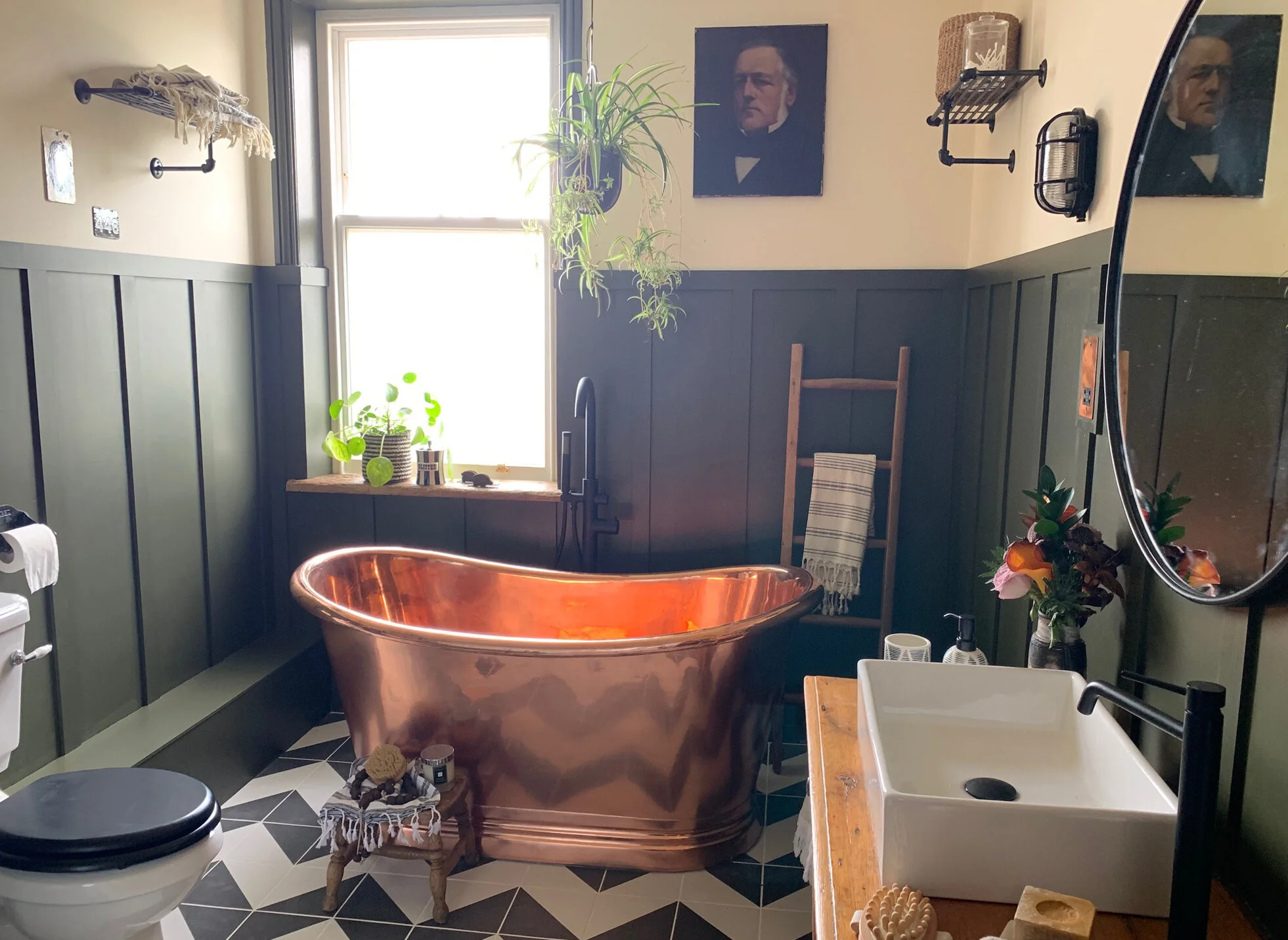
I knew I wanted to have a bath (my husband and kids were not that bothered), a place to relax after a long week travelling. Originally, I had planned on having a cast iron bath (most likely painted), but a day lost on Pinterest and I had fallen in love with copper baths. I could see how the tone and the metal would look beautiful in the scheme I was thinking about. They also have a timeless, luxury look to them, perfect for what I was trying to achieve.
I knew how much they cost, but I managed to placate my husband by telling him that we were not about to replace this bathroom anytime soon, and therefore the cost per annum was relatively small. He went for it. No beer required!
The whole scheme was then planned around the bath, which I wanted to take pride of place under the window. Of course, I also wanted a walk-in shower, having had to live with a corner shower, which you could barely squeeze into. The best place for this was on the wall behind the door, and so it all worked out, the layout was flipped on its head and the two main feature swapped places.
Having been an Instagrammer for quite a while, I also knew that I wanted crittal in this room. I’d seen many a bathroom revamp that had me swooning over crittal showers and while they are on trend for 2019, that was not the reason I wanted one. On trend or not, I love the aesthetic they create in a space.
And so, armed with these two features, I also decided to go for black bathroom fittings; shower head and taps. I wanted to keep my shower tiles relatively simple (metro tiles) so that they didn’t detract from the shower or screen, and I knew I wanted a patterned floor. This was the hardest decision because I simply didn’t know if it would be too much. In the end, after going around and around with tile decisions, I wanted to create a zig zag floor that I had found on Pinterest. I simply stuck to black and white tiles to keep it timeless and to fit in with the other parts of the bathroom.
That was as far as I got, although anyone who follows my revamps will know that I also like to add vintage to a room, since I am a longstanding advocate of the fact that vintage wood adds a certain texture and mood to a room that new items simply just don’t do. The best way to do that was to find a washstand, more on that shortly.
Finally, I knew I wanted panelling in this room and ideally to revamp the sash window, so that the bathroom remained cosy in winter. I’ve DIY panelled two rooms to date and it completely transforms the space, for very little money. My mood board has green panelling on it. I’d be lying if I said I didn’t choose the final colour scheme until two days before this room was painted. I have more green tester pots then B&Q in my cellar.
@lindaclaytonwrites very kindly introduced my to BC Designs when I put out a plea to help me find a copper bath that I didn’t need to sell my children to afford. The baths come in two sizes but I chose the smaller one which had ample room for me to stretch out in, but did not overpower the bathroom.
The sash window behind the bath was renovated by Ventrolla. They repaired the joints, added their bespoke draught proofing system, new hardware and glass.
The Shoji crittal shower screen, slate effect shower tray, black shower and Cambridge toilet are from Soak. The Carter white metro tiles and the Parisian cafe porcelain tiles in black are from CaPietra. The cast iron radiator is called Peerless and is from Trads Cast Iron Radiators. I had mine painted in ancient breeze a copper tone to match the bath.
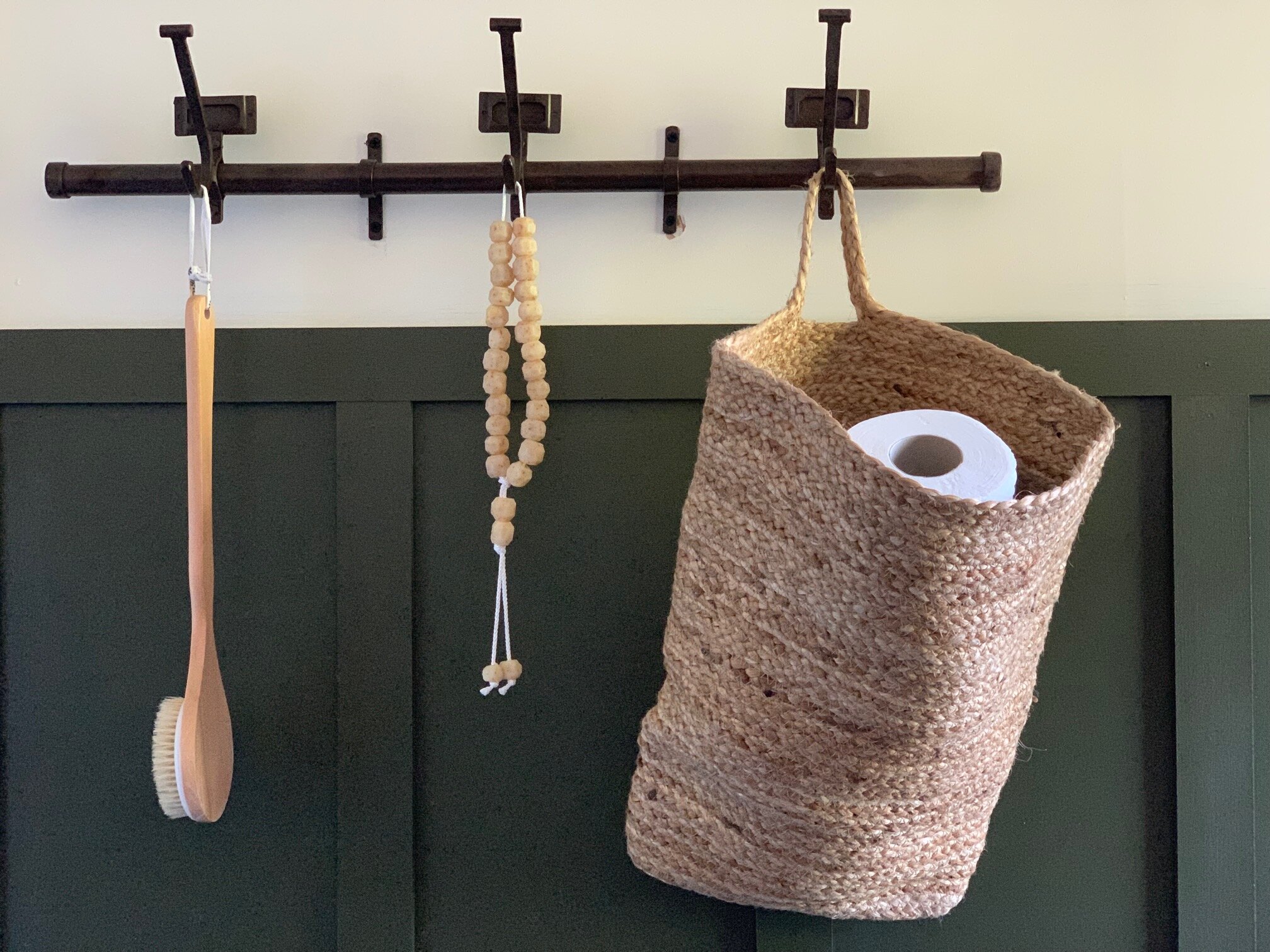
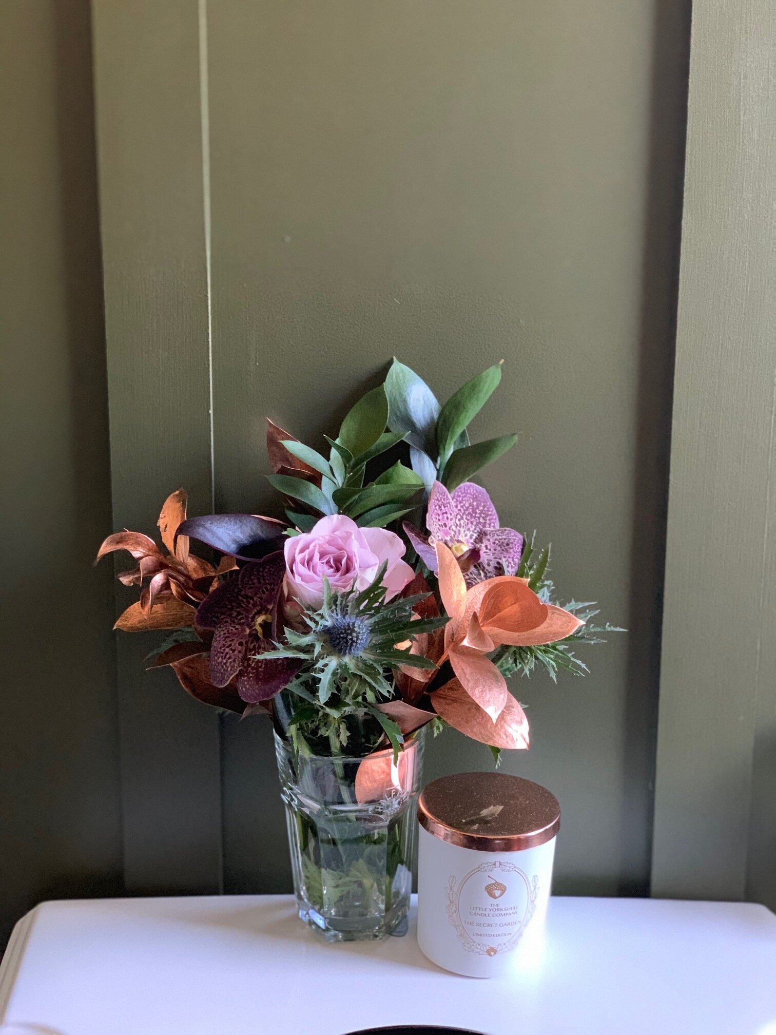
The wall hooks are from Nkuku and the bag (holding toilet rolls) from Design Vintage. The vintage stool is one of two (the other is by the bath) which I sourced from Oakwood Vintage, along with the towel ladder behind my bath. The lantern is from Covet and the candle from Little Yorkshire Candle.
In the above shot, you can see my vintage toilet roll holder, from Etsy.
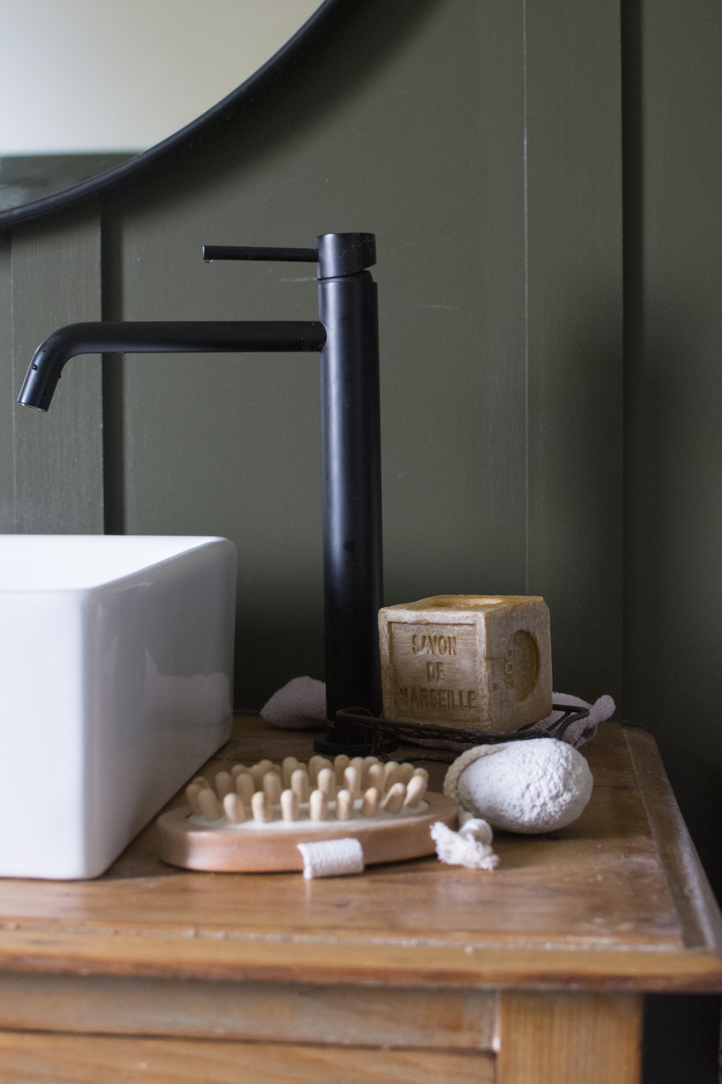
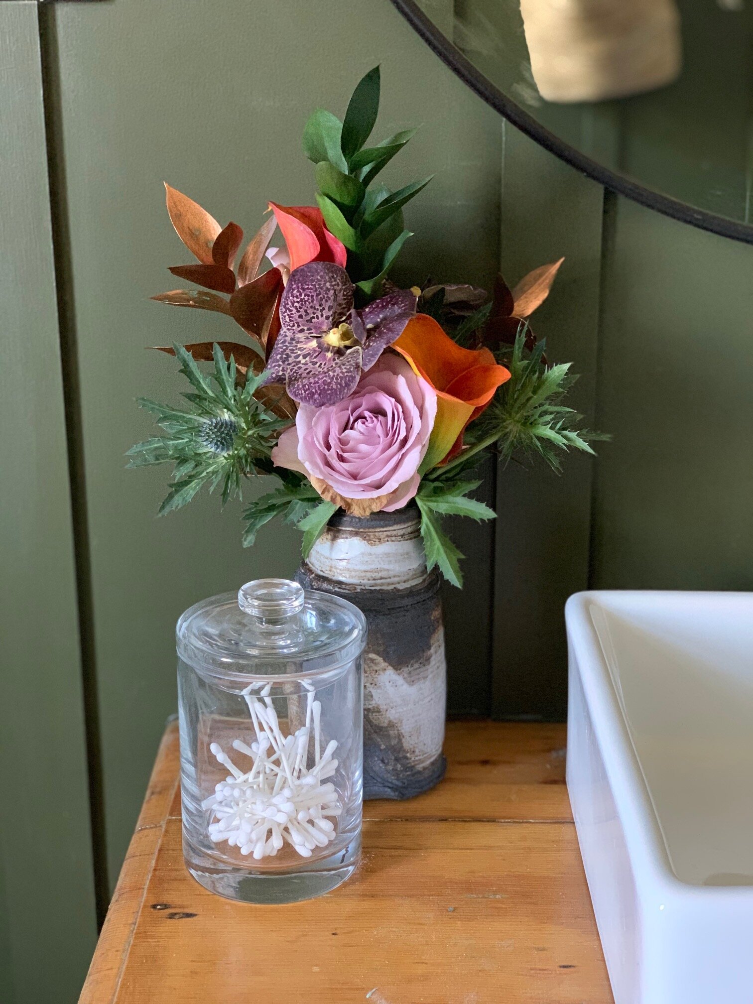
In these two images you can see how I finally chose to style my sink. I sourced this vintage table from Oakwood Vintage. The table was painted in white gloss (several layers of paint) when I found it and I spent a good few weekends, outside in the garden, stripping and sanding the table back to its natural patina, which I think works perfectly against the green panelling, painted in Invisible Green eggshell by Little Green Paint Company, a lovely olive colour. The upper walls are painted in White Tie by Farrow and Ball. I left the table with some hints of paint, to keep it looking rustic rather than sleek and then I used danish oil to seal it and protect against splashes from the sink.
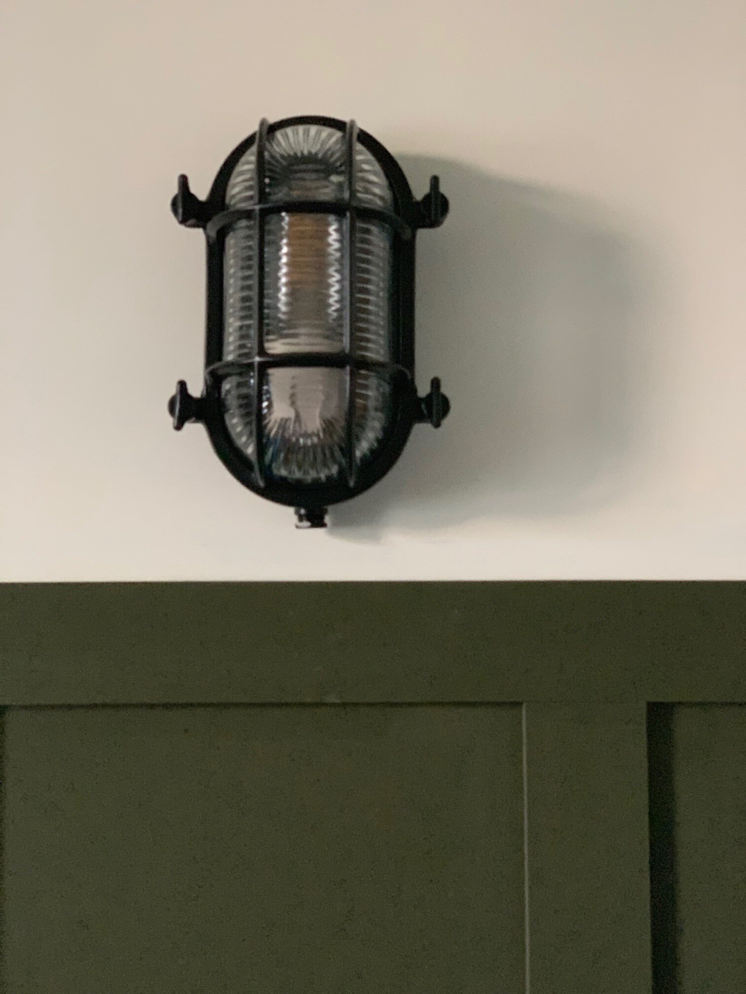
The counter top sink is from Soak and the tap from Victoria Plumb. The mirror is from Maison du Monde, lights from Dowsing and Reynolds (which give a lovely industrial feel to the room) and the copper shaving socket (to tie in with the bath) from Ashdown Home. The towel holder is from Victoria Plumb and the vintage storage crate from Baileys Home.
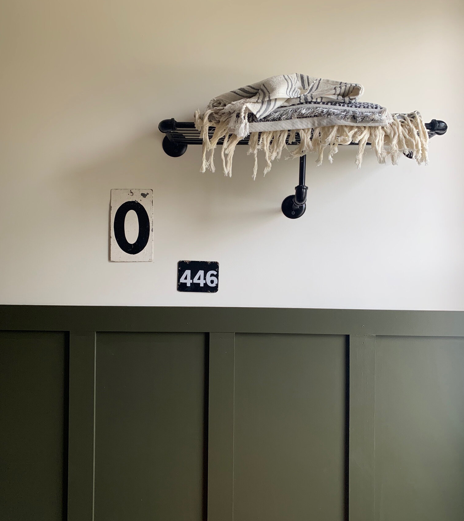
The black bath tap is from Soak. The metal shelf from RockettstGeorge (I bought these a number of years ago and unfortunately can no longer find them) which I spray painted black. The vintage oil painting is from eBay and the planter from Ferm Living.
Towels were sourced from H&M and the vintage letter and number from local shops.
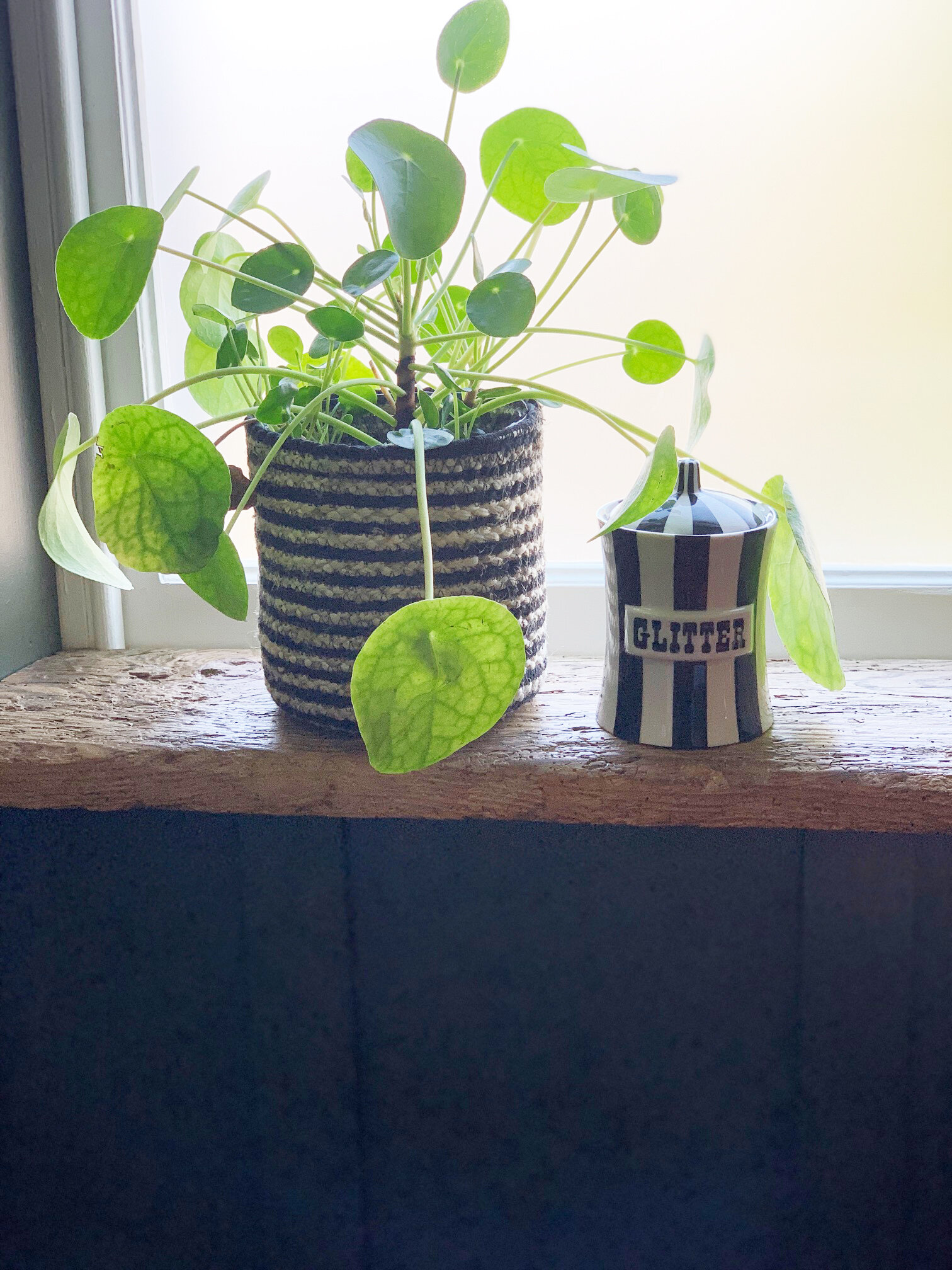
I really wanted to create a relaxing vibe in this room. I like the olive green against the copper, mixed with black and warm wood. The floor gives the room the pattern that I simply can’t live without; a contemporary twist to the otherwise traditional room. The window ledge, which you can see below, was made by my workmen from a piece of vintage wood, originally used as a bench.
I’m beyond thrilled with how this room has turned out and it has definitely been worth the wait. I’d love to know if you like it as much as I do.
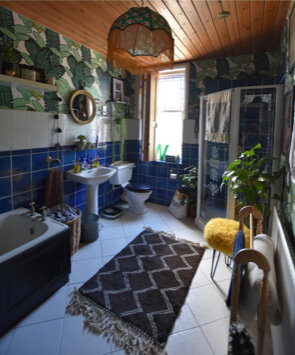
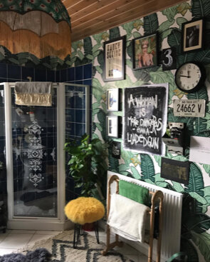
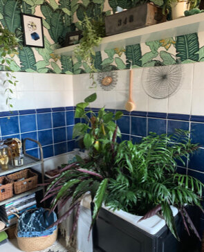
And, here is a reminder of what it looked like before. It is hard to believe it is the same bathroom.
Shower screen, shower, slate shower tray, toilet, bath tap and sink were gifted from Soak.
Tiles were gifted from CaPietra
Wash table was a gift from Oakwood Vintage
Lights were a gift from Dowsing and Reynolds
Bath was bought with a press discount from BC Design.
Window Revamp was a gift from Ventolla.
All other items I purchased or previously owned.
Work was paid for by me and carried out by Richardson Gas, C.R. Plastering.
The Girl with The Green Sofa

