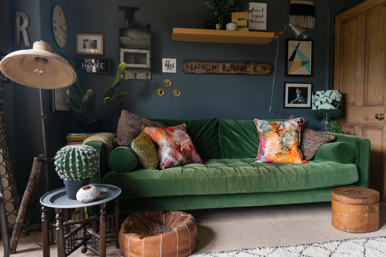
Hopps House, a beautiful renovation of a period property.
Tonight, on the blog we have the gorgeous renovation of Hopps House, by a husband and wife team, Martin and Aylsa, Martin being as heavily involved in the interior design as his wife, and partial to the use of a hammer. I'm going to let them tell the story in their own words......
HOPPSHOUSE HOPE TO CAPTURE YOUR IMAGINATION AND WIN YOUR HEART WITH A WARM SOCIAL EMBRACE. WE EXTEND OUR WELCOME TO ALL THOSE WHO CHOSE TO FOLLOW AND IN RETURN WE HOPE TO GIVE YOU LITTLE SQUARES OF INSPIRATION. EST.2015
Hopps House is run by husband and wife, Martin and Aylsa and we have two young girls aged 7 and 1. Not forgetting our handsome Labrador Hugo. We have been together ten years and married for five. We both work in the Emergency Services and share a passion for interiors. I think people are surprised when they find out I have as much involvement around the house as I do, especially on Instagram as it’s dominated by female interiors. Here, I write my take on how far we have come.
Back in 2015 we purchased what would become ‘HoppsHouse’ because we instantly fell in love with the charm on offer or maybe it was the selling techniques you are always told to ignore when viewing a property, I don’t know, but the bread baking in the oven, dimly lit candles and a log burner roasting away certainly helped.
It was that ‘one’ property that I added to the list of potential new homes despite being told by Aylsa that we couldn't afford it but I knew it was exactly the type of home we had been pining for. It had traditional character and it was the ideal location to raise our young family.
So that was that and within weeks we sold our first home, which was a three bed new build. Whilst practical as a first home, we just knew it wouldn't grow with us. I remember moving in to our new home in the second week of December and I also distinctly remembering it wouldn’t need that much doing to it. How wrong could we be? The wool was certainly pulled over our eyes during buying and despite making it comfortable for Christmas it was not long after that I came downstairs to find a slug crawling across our kitchen floor. It was then that I knew… the kitchen had to be ripped out.
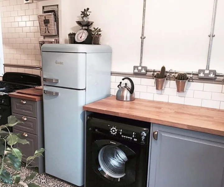
Aylsa says I don't do things by half and so like a man with no plan (but a hammer in his hand) I set about it. A trip to Ikea helped with our decision on what colour kitchen we would have and the rest came about naturally. I recall thinking that if we have a grey kitchen and white walls we would need to inject some vibrancy somewhere, so with only the floor left we choose the Marrakech inspired tiles. I've always wanted to visit the old market in Medina Quarter. The old kitchen that I removed had a large fridge and wall hanging cupboards and what I noticed after taking them out is how much lighter and airier it felt so with that we bought a 3/4 fridge and compromised by installing an integrated freezer. The conduit pipes were inspired by @sara_lou_c and her partner @chris.j.parkinson who we've known for a number of years.
We then took the sensible decision of style over cost (always a winner in our house much to the annoyance of our bank manager - and had the wall tiles installed on both sides of the kitchen with a border to finish.
Naturally, after having the kitchen finished we moved into the hallway and porch because I thought at least then, if we close all the doors in the house it would look complete from front door to back! As we have a Labrador it made sense to have tiles installed on the walls in the porch and we choose a floor which looked traditional but actually only cost £45 (Walls and Floors).
In the hallway, we wanted something that would be forgiving to a young family and withstand the wear and tear of everyday life so we opted for a reclaimed wooden floor from Obrien’s Architecture in Boldon. The floor was taken from an old School gym and you can still see the yellow markings which were once laid upon it. The light in the hallway was originally installed in our first home. It was an idea which came about after a visit to Hotel Du Vin in Poole, Dorset where they had a larger version of the light as a centrepiece above the turning stairs. I sourced the light from a small internet based company called Dutch By Design.
Undoubtedly, the boldest move I made in the hallway was to expose the brick wall especially after Aylsa left for work that day and advised against it. Remember that man with no plan and a hammer, he had come again and by 4pm I knew I was in too deep, knee deep in dust to be exact. With the clock spinning ever quicker and Aylsa due home soon I called in some help from a cleaning professional… my mam. Together, we broke one Dyson hoover, bought and collected a Henry Hoover and removed several rubble bags.
Aylsa returned, unimpressed with the dusty brickwork and the lack of a hoover. The builders, who we have employed throughout and can highly recommend (DGI Property Services) then came in and completed what I had started by repointing the brickwork and applying an acid wash to return each brick back to its former glory. It was then sealed with a 1/4 PVA Glue and 3/4 water wash, I thought PVA glue was just something used by Neil Buchanan in Art Attack!
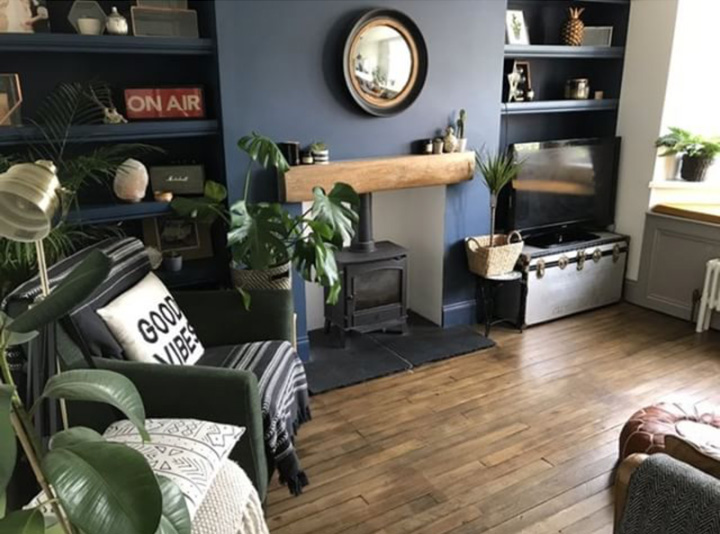
The living room was next and in here we were motivated to have a dark feature wall after seeing similar in Dee Campling’s and your own living rooms. The builders built the shelves in replace of those shelves that once graced the space between the chimney breast but to our astonishment were removed by the previous occupiers as they left for France (whoever knew there was a shortage of shelves in Southern France).
In the living room, we built a window seat to expand our storage solutions and to offer a seat for Hugo to watch the world go by. We have just sourced some shutters from California Shutters to complete the look and are now looking to paint the whole room dark. The flooring is a continuation of the flooring from the Hallway and the orange light was obtained from British Home Stores. The sofa was purchased from DFS and was brought from our old home. It was chosen because we felt it would be hardwearing and traditional, a winning combination.
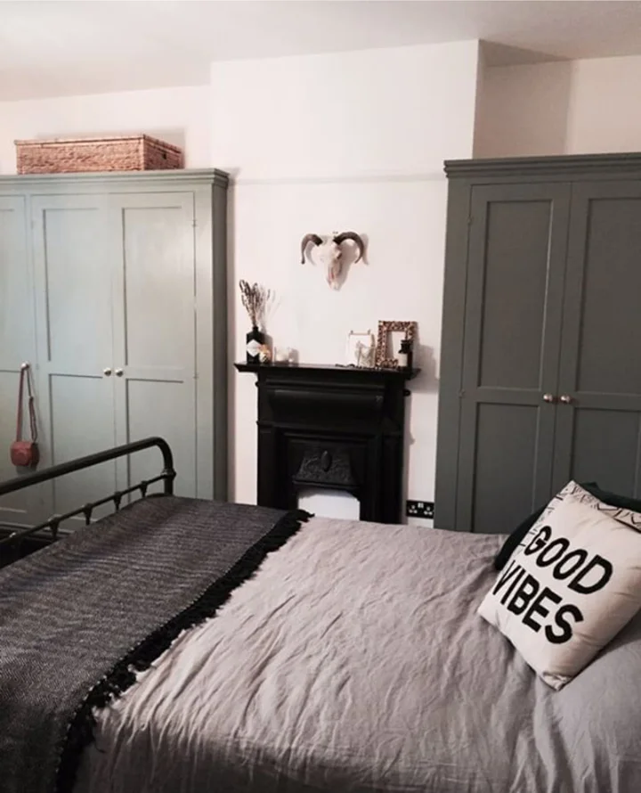
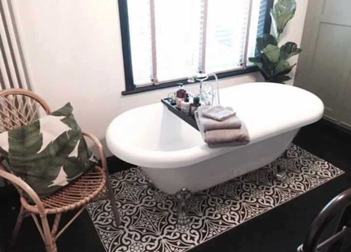
The runner carpet up the stairs is awaiting some brass stair rods and that carpet leads to the bathroom which is also awaiting some tender loving care, and it can wait as it isn't a priority. It has been done recently by the previous occupiers but isn't to our taste. A short-term fix was to install our dream bath… in our bedroom. Yet again, another bold move but somehow, I always get my way and on this occasion, I think she is pleased. Before the time of young children, we would often spend our weekends off staying out at boutique hotels but when two kids come along, you see your childcare vanish before your own eyes and so I wanted to create a space that would be as close to the real thing as possible and a bath at the end of the bed seemed to do just that. The carpet was removed to find floorboards in a good state of repair and with a lick of Farrow & Ball’s Off Black paint it provided the platform for which the Feather and Black bed frame could stand upon.
The fireplace was a little bargain sourced locally on eBay and added to the wall for character. The wardrobes were designed by us and created by the builders and finished with Card Room Green from Farrow & Ball. The light cluster finished the room off and was again purchased from British Home Stores.
The last acquisition to our piece was the nursery which again we stripped back to the floorboards and painted with Farrow & Ball’s Worsted. The bedroom like all the other rooms we have complete so far has been re-wired, re-boarded and plastered. In here I also exposed the brickwork on the same side of the hallway for continuity and to create a boho effect it was painted in off-white. The cot was purchased from Mothercare and was turquoise blue until we painted it copper. The yellow filing cabinet was bought from eBay and has proven to be quite the hit. As it is such a small room, any addition in height would cause it to be cramped so I created a bespoke copper pipe clothes rail for her little essentials.
We’ve come a long way but there’s still plenty to do and next we will refurbish our eldest daughter’s bedroom where we plan to paint the floorboards and add a large Persian rug with two single metal bed frames sat atop. We will also install two similar wardrobes like those in the master bedroom and a faux fireplace.
After that we will move to the largest room of the house - a second sitting room to the rear of the house. Our inspiration for that room is most definitely Lexden Home’s extension as we aim to have parquet flooring and a second log burner installed. A large floor to ceiling steel bi-fold door will stand pride of place at the end of the room as I aim to bring the outdoors in.
The Girl with the Green Sofa


