Amanda Cotton of HouseLust. A Colourful, Victorian Home Renovation
Tonight’s Home Tour is a stunningly colourful home, partly filled with dark and moody rooms but also with plenty of light colourful rooms too. There is wallpaper aplenty, and an eclectic mix of interiors items, right up my street actually! Meet Amanda Cotton of House Lust, a fellow maximalist, mum to one and a blogger; you can read Amanda’s blog here.
Read on to find out about how much Amanda has changed her home and how she has created this beautiful home on a budget.
1. Tell me about your home, where do you live and in what kind of house?
We live in a 1901 Victorian Mid-Terrace in Watford, Hertfordshire.
Originally it was a 2-bedroom house, but we undertook a loft extension last year (from August 2017- January 2018) to convert the loft space into two extra bedrooms and add an extra bathroom, so it could become a 4 bed. However, I use one of the extra bedrooms in the loft as my very own dressing room, with wall to wall wardrobes which I unfortunately have to share with my husband.
The house was formerly rented out before we bought it. The lounge was advertised as a bedroom, and the previous owners had done a terrible job painting over the 70’s wallpaper with a thick layer of magnolia to make it rentable. It was a complete do-er upper, with a 70’s bathroom with thick layers of mould, a shoddy cheap white kitchen and 70’s gas fire places in the two downstairs reception rooms. We discovered once we moved in that the 1st floor had the original fireplaces which had been tiled over, so that was an added bonus.
The cast iron fireplace in the lounge was added by us, as I just couldn’t imagine owning a Victorian property without a fireplace in the lounge.
2. Who lives there with you, how does your home work for you and your family?
It’s just the three of us. Myself, my husband Jess, and our baby boy Otis (8 months). To be completely honest, I feel like the house is having to work a lot harder since we had Otis. It feels like we’re bursting at the seams a bit, even though we have the bedroom space, ideally, we would now opt for open plan living downstairs which would be more baby friendly. The benefit of the loft extension has really helped us, and my dressing room is one of my favourite rooms in the house.
I’m a fashion designer when I’m not on Maternity leave, and I’ve built up quite the collection of clothes, shoes (mostly fancy trainers) and handbags, so it’s great to have them all accessible in this one room.
Otis has the biggest room in the house. This used to be our bedroom before we did the loft, so he has the benefit of beautiful panelled walls. Just what every baby wants! Ha!
Everyone thought we were mad to give him the biggest bedroom, but we’re so glad we did. He already has so many toys, I wouldn’t know what to do with them if he had a smaller room.
3. How do you describe your style?
Wallpaper lover, a little bit Eclectic, with a nod to maximalism, and a pinch of vintage/ industrial.
I used to be really into the industrial trend, but I’m glad I’ve grown out of the phase of trying to be a ‘trend’. I now just go with the flow and build on my collection of furniture and accessories like treasured air looms. I’ve realised that interiors are a lot like fashion, and sometimes it’s worth saving for the investment piece, rather than going for the cheaper knock off. But saying that, we all still need a little cheap knock off in our life now and then, and I’m a huge bargain hunter.
4. What influences you, where do you find your inspiration for decorating?
Before maternity leave I used to travel all over the world with work. I took inspiration for our loft bathroom from a fashion store in Seoul called ‘Style Nanda’. I was drawn to the plaster pink walls and navy woodwork. I was there in November 2017 as our loft was being built and I was watsapping my husband the photos saying ‘ I think I’ve found our bathroom colour scheme) ( I did a blog post on it if you’re interested… https://houselust.co.uk/blog/2018/3/23/interior-update-loft-bathroom)
I subscribe to Living Etc., and of course use Pinterest. But one of my main sources was always the trend forecast books at work- Nelly Rodi, luminary, Peclers etc. They always had the most captivating imagery in fashion and interiors, and put colour palettes together really well.
Let’s start as we go in…
Image Credit Banno Lighting
Hallway/ landings
This space took a real battering during the loft conversion, so we decided to really spruce it up. In June, we put the dado rail up with the help of my dad, and paid a decorator to hang the gorgeous deco Martini wallpaper by Divine Savages. I have wallpapered rooms in the house myself before, but I wouldn’t dare try and do it over the stairs, so we got someone in. Its back to Farrow and ball railings which really pulls out the navy in the print.
The pink tasselled light was a bargain from Homesense (£29.99) and is in the perfect shade of blush to compliment the wallpaper.
Upstairs I’ve recently hung my latest artwork purchases which were Christmas presents, by Margo in Margate which I’m really happy with. I love collecting art and finding new artists and love Margo’s ingenuous style.
The lounge
Painted in farrow and ball railings (you’ll see there’s a theme across the house), this was the first room to go to the dark side a couple of years ago.
We’ve recently got a new gorgeous green velvet sofa from West Elm, which complements our navy velvet sofa perfectly.
There’s lots of house of hackney prints in here, along with real and faux plants. All of the house of hackney bits have been made by me. I bought velvet fabrics at their sample sales in London and made all of the cushions and even the lampshade with tassels. I did say I was a bargain hunter! The two Palmeral cushions cost me £40 in total to make.
There’s lots of brass pops and some kitsch playful styling with my 30+ year old Orville money box in the glass dome, and an antique singer sewing machine, paying homage to my career in the rag trade.
I love our fireplace in here. It’s a bit gothic, and it works perfectly being black against the dark walls.
The marble top coffee table was a splurge from Camerich, the tv stand was a bargain from Sainsburys.
The Navy velvet sofa is from John Lewis.
Kitchen/ dining room
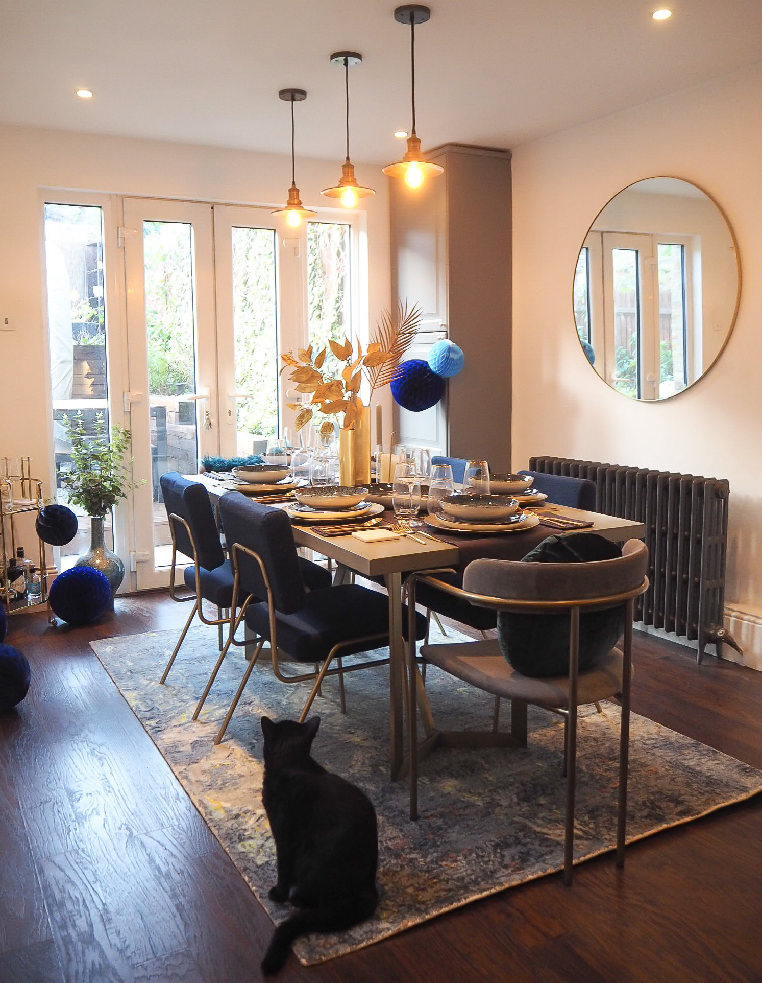
This was one of the first rooms which we renovated (2nd after our first-floor bathroom). We swapped the kitchen/ dining room over, moved windows, doors and added a lintel into the fireplace to create a feature for the oven.
We were broke at the time so we put in a grey shaker style ikea kitchen which has really stood the test of time. We splurged on granite worktops and it’s proved to be the best investment as they look the same as the day they went in.
The walls in here are white, back to the white metro tiles. I’m not the biggest fan of these spaces as I’d like more colour/ print and I think 2019 will be the year that it gets it.
Our concrete top dining table and mid-century dining chairs and rug are all from West Elm.
The large round mirror is from Select mirrors, and the drinks trolley is from Marks and Spencers.
I’m currently on the hunt for some wallpaper for this space.
Guest bedroom- Green/mustard Room
Every wall in the house has had fresh plaster since we moved in, it’s also had a new roof (twice), once at the beginning and then the second for the loft extension, new windows, new flooring… you name it.
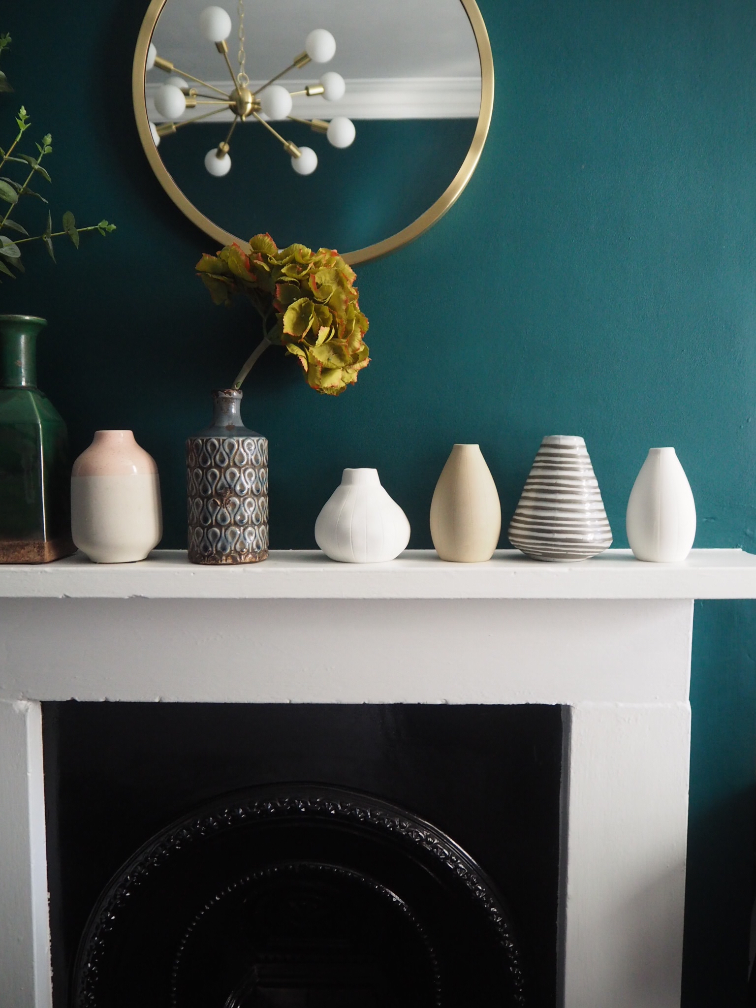
This room was a dumping ground, but last year at 39 weeks pregnant and in fog of nesting/ pre-oxytocin hormones I decided to paint the whole room in Valspar Breathe Deeply.
I love dark interiors and I love how this room is still dark, but also bright.
The white chest of drawers is from John Lewis, and the velvet bedding is all west elm. I love collecting pottery, and the little pots are all from Fiona walker England.
Otis’ Nursery
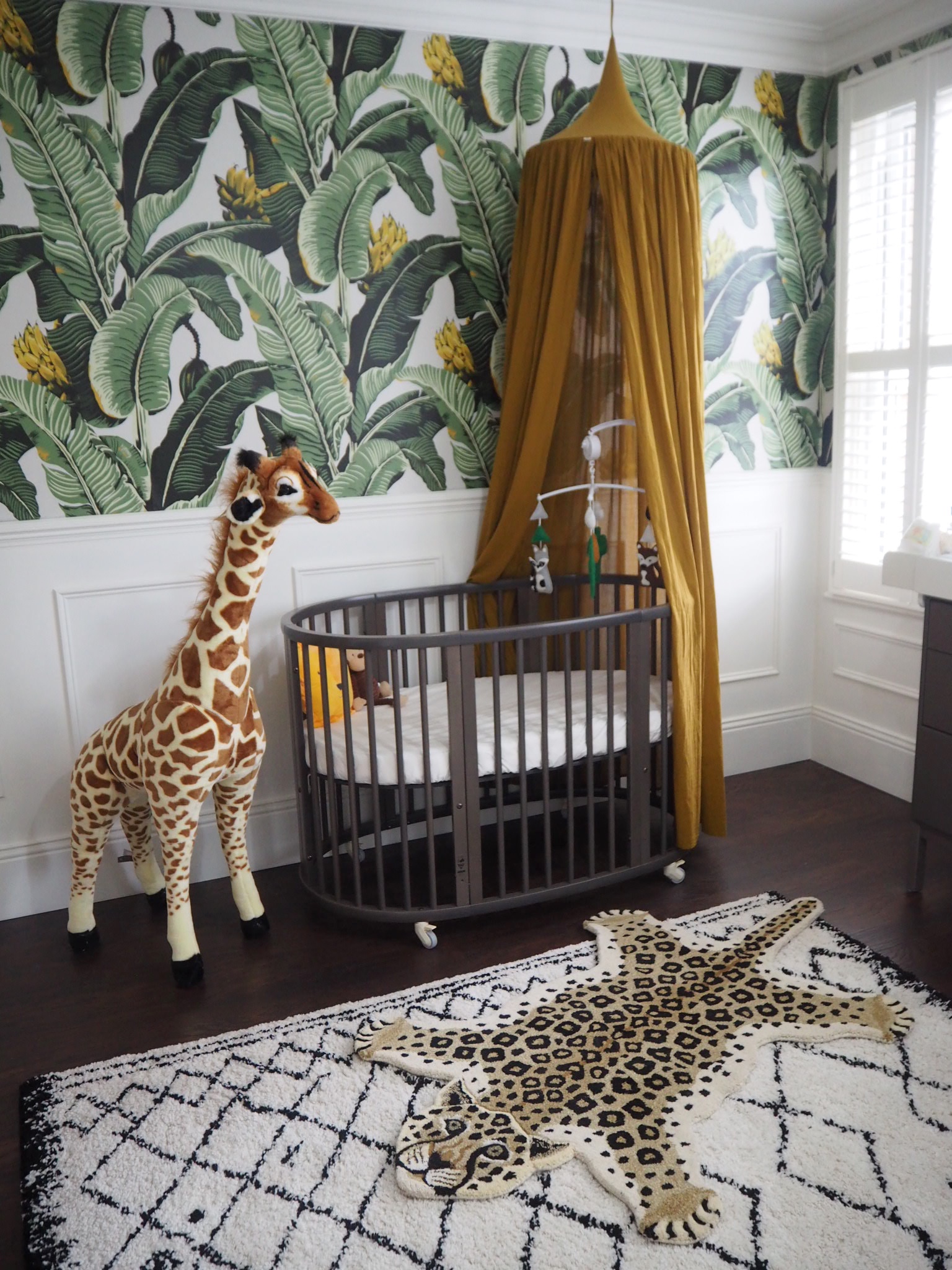
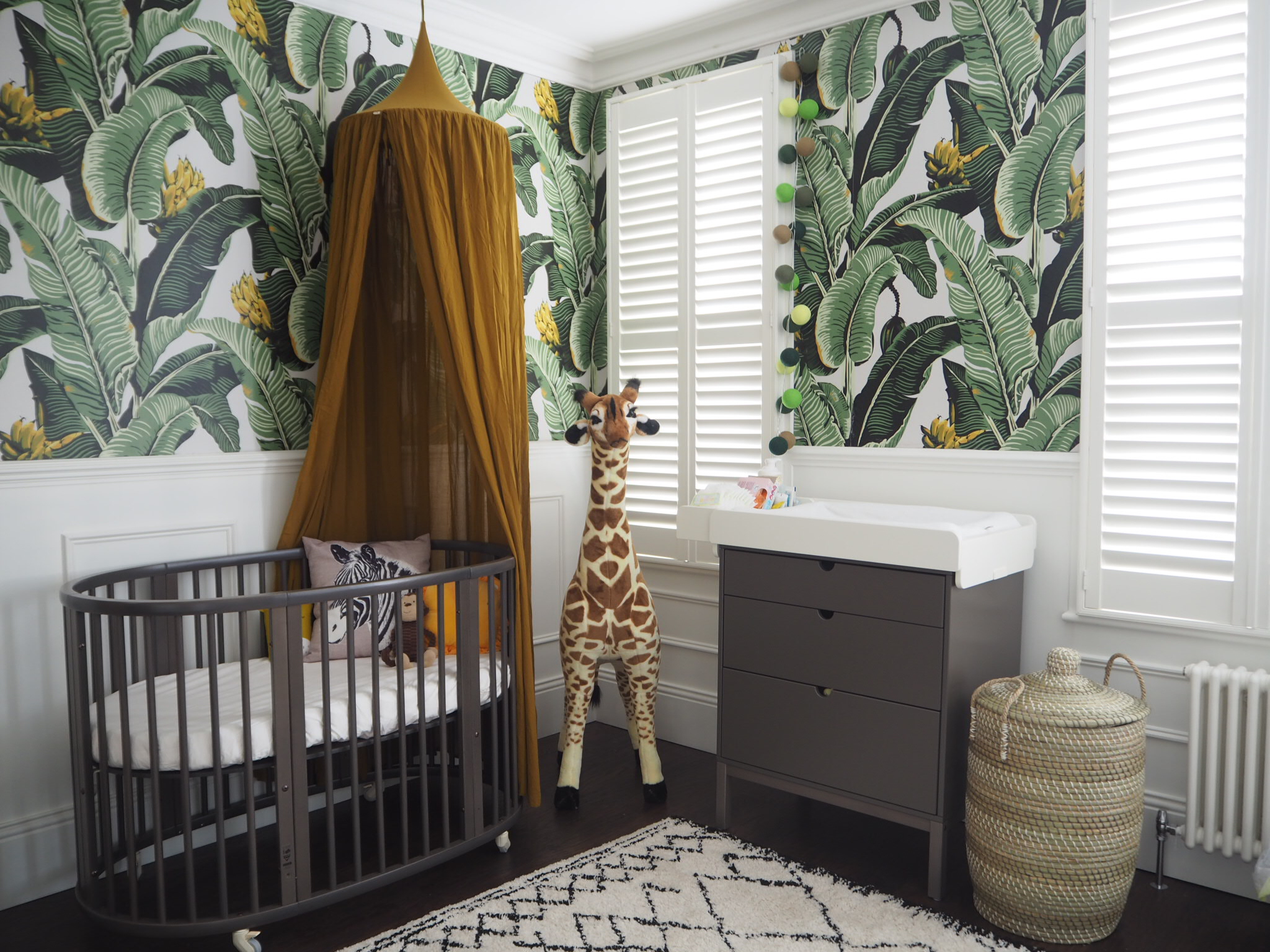
When we found out we we’re expecting, we thought it would be really fun to create a jungle themed nursery, since we both love animals. Plus, I love how its gender neutral, and isn’t plain grey. There wasn’t much out there for nursery inspiration that wasn’t just 50 shades of grey. I hope the jungle theme captivates his imagination, with the little elephant, zebra and lion heads looking out through the palms.
The room already had the beautiful wainscoting panelling which we had put in when it was our bedroom, so when I found the amazing jungle palm wallpaper by Milton and king, I knew it would be perfect, and that it wouldn’t look too much all around the room as the panelling breaks it up. I think it’s really playful and hopefully it will get his imagination going as he gets bigger.
The animal heads in here are a favourite- they’re by Fiona Walker, and the cot and changing table are from Stokke. I also love the mustard numero 74 canopy from Molly meg and the La redoute rug in super handy now he’s crawling.
Dressing room
My favourite room. The wallpaper is House of hackney Babylon, I picked it up at another sample sale of theirs for £40 a roll and the wardrobe doors are painted in Farrow and ball Hague Blue.
The handles are all brass and all the light switches/ plug sockets in the loft are either from Dowsing and Reynolds or Buster and Punch. We certainly up spec’d the place up there!
The insides of the wardrobes are all ikea with pull out drawers and shoe racks and gadgets, and the doors are custom made by a local carpenter.
We put in the grey cast iron radiator up here, and went for black shutters for privacy. We have these same black shutters also in the bathroom. I found it quite hard to find black ones, until I found a small local business in Watford called Harper collection who were able to source them for me.
Pink loft bathroom
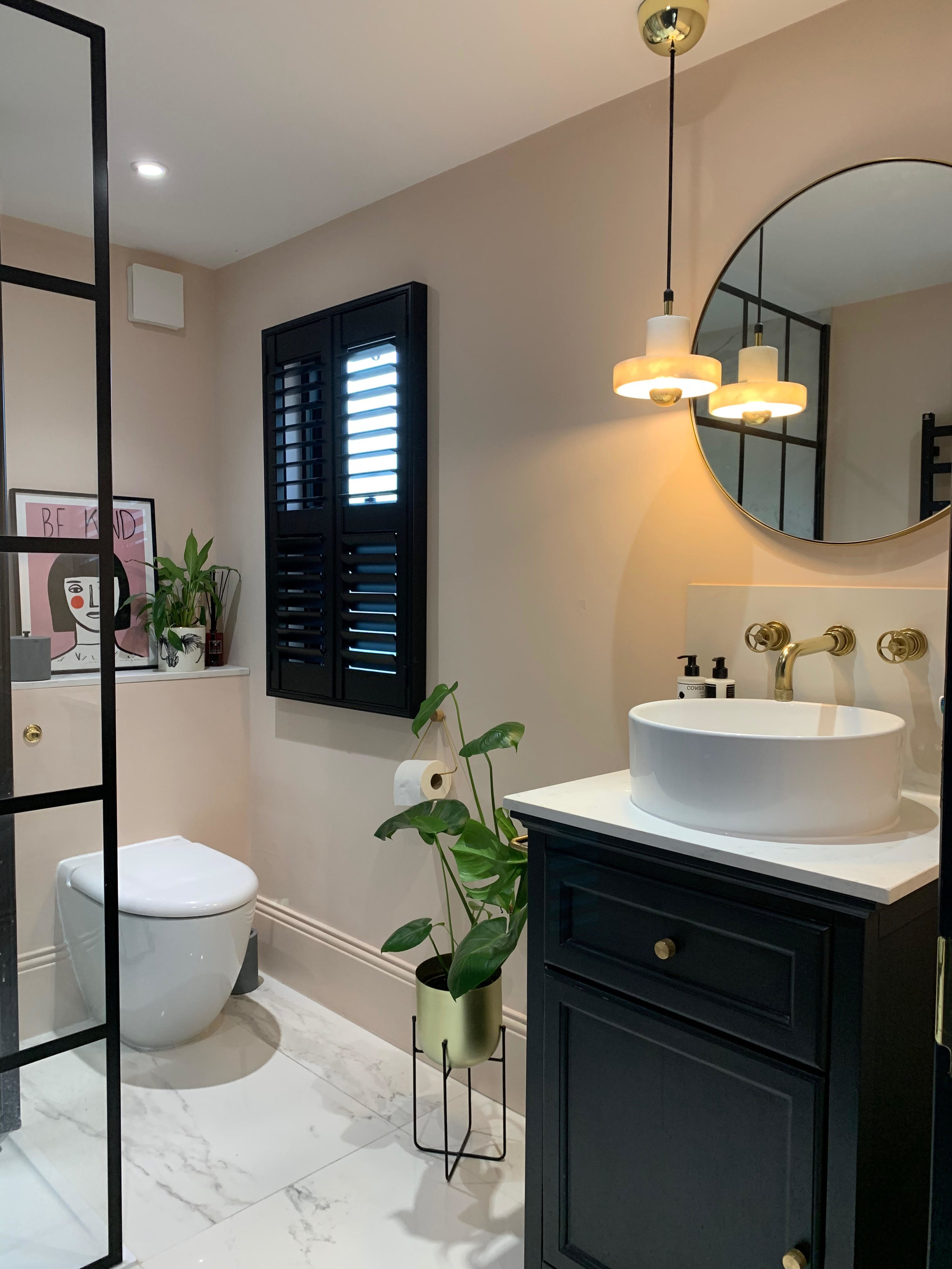
Painted in Farrow and ball pink ground, with the woodwork all in railings. I love the contrasting colours in here.
The black crittal style shower screen is from Drench, and the tiles are Carara marble which are a meter wide on the floor and in the shower.
We had a bit of a nightmare with our builder as I wanted a built-in tiled shelf in the shower, but my builders weren’t experienced enough to know how to finish the edge off, and used a cheap white plastic edging. It ended up being ripped out as it looked like it had been done with tipex around the marble. In the end, we thought it was best not to have one, and next time use a different plumber/ bathroom fitter. I wouldn’t have been able to shower and look at it. I would have had to sell the house.
This room also faced a few more snags during the build, when the electrician dropped the marble Tom Dixon light when he was hanging it, which took a huge chip out the side.
We also faced another similar situation when we asked the builder to raise the flex of the light over the stairs in our loft and he dropped it down the stairs. It’s a John Lewis sputnik brass chandelier. Oh, how we can laugh now, but I wasn’t laughing at the time.
The bathroom mirror is from Loaf and we pulled the vanity unit together ourselves, using a cupboard from Bathstore, the marble top was an off cut from a local stone yard in Watford and cost £40, and the sink is from Click Basin. Doing it this way was much cheaper than buying a ready-made vanity unit, and saved us hundreds.
The taps are solid brass from Aston Matthews… Another splurge! This something I sort of regret. They are a nightmare to clean, and unless you have a cleaner coming in weekly that doesn’t mind using Brasso, they can look quite shabby really quickly.
Our loft Master bedroom
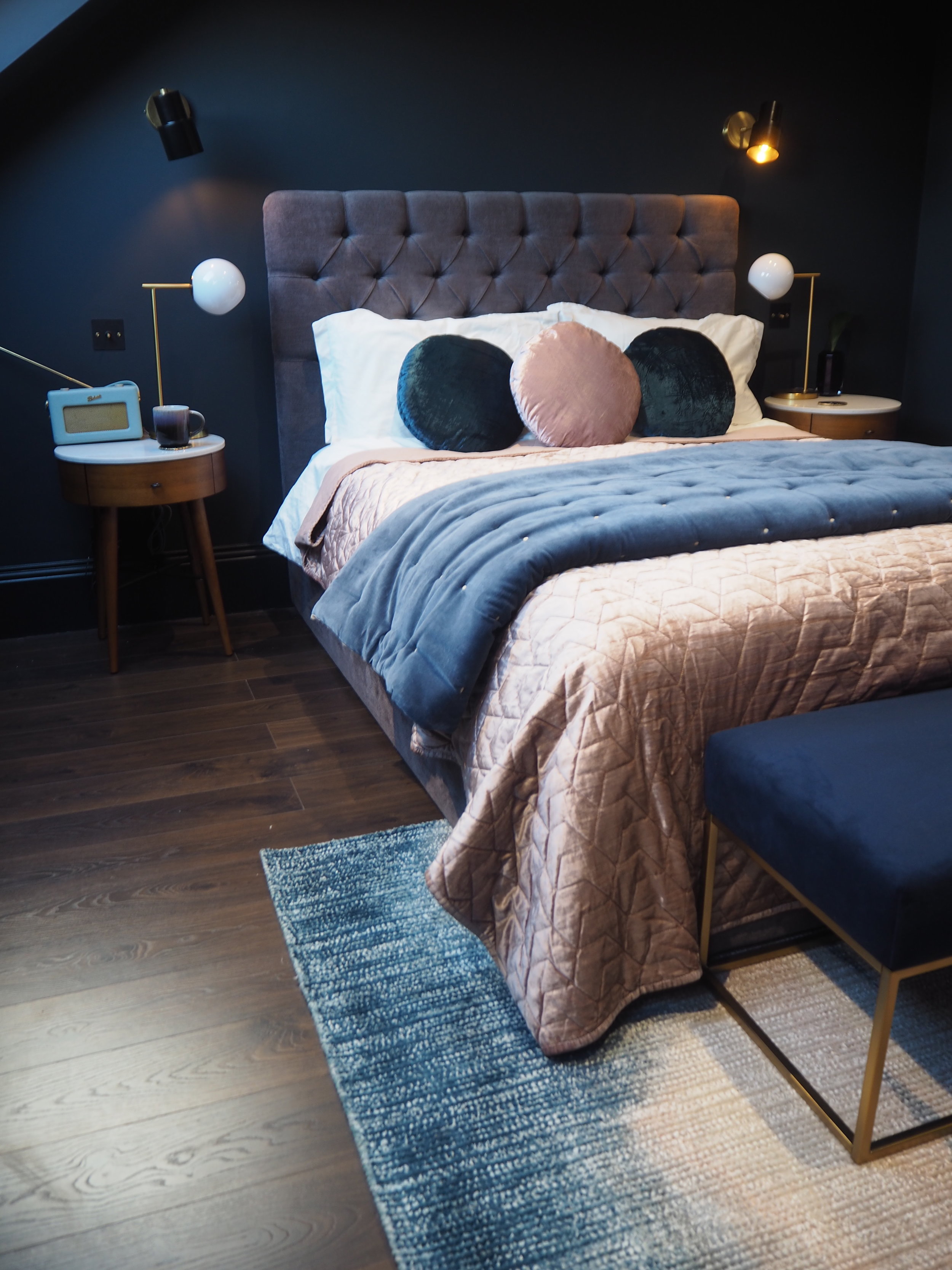
This room is also painted in my favourite Farrow and ball shade, Railings.
Our king-size bed is from Made.com and really the inspiration behind this room was just to achieve a bit of a Mid-century boutique hotel vibe.
Our bedside tables are the Penelope from West Elm, and we also have a small dresser in the same Penelope range.
The navy velvet and brass bench at the end of the bed is also from West Elm, and I think it gives the room a more refined clean look with its gold linear frame. The rug in here is also from West Elm, and was originally intended for our kitchen, but when it arrived I just couldn’t bare thinking about Otis flicking food on it, so its stayed up in our bedroom, and it actually works really well in here picking up the blush in the bedding and the blue navy walls.
I still need to put some more artworks up in here, but what I love about any room is that it’s never finished. A room can always be tweaked or changed around and that’s why I love interiors. There’s never a definitive ending.
(The wall lights are from Pooky lights, and the bedside lights and velvet bedding are all also from West Elm. The Long wall mirror is from select mirrors).
The Girl with The Green Sofa

