Lauren Sharkey @doer.upper
Today on the blog I'm featuring Lauren Sharkey otherwise known as @doer.upper. First time buyer, first time renovator, go and hear Lauren's story in her own words and drool over her lovely Victorian house.
Hello, I’m Lauren and I’ve lived in this Victorian terrace with my boyfriend, Harry, for just over a year. After renting in London for years whilst saving for a deposit, we finally plucked up the courage in late 2015 to start searching for a place to get our feet on the property ladder. After experiencing the usual house hunting horror stories, it was by chance we came across this little terrace in need of a lotof work.
In 2016 the keys were ours and the rest of the year was a blur of renovation chaos. Engulfed by dust, decisions and debt we made it through the other end in one piece and I swiftly got on with the fun bit, decorating!
This was our first opportunity to create a home that reflected our style. The only problem was, I had no idea what that meant! This house has proved to be a real test bed for my Pinterest addiction and love of different approaches to interior design. As a result, each room has a slightly different feel, so let me take you round…
Kitchen
I wanted to keep it quite simple but playful with a Scandinavian feel. DIYkitchens.com supplied the units in F&B Hague Blue. I tried to keep the copper touches quite subtle. The shelving keeps it feeling open despite the galley layout and also provides more wall space for some home-made art print! Probably one of my favourite things in the house has to be my Smeg fridge, I’ve wanted one since I was a child (strange child, I know!). The kitchen opens up at the end into a small but sunny dining area which hosts a small table, bench and my beloved olive tree.
Living Room
This is a north facing room so I wanted to keep the walls bright and add colour through furniture and accessories. I spotted the sofa months before we moved in and absolutely adored the deep teal velvet. I added texture with throws and the sheepskin and kept the cushions monochrome to let the sofa’s colour fill the space. The Ercol chairs and 1950s coffee table were bargains I picked up on eBay. It was important we tried to add a bit of the Victorian character back into the house so we bought two matching fireplaces from eBay (one for the dining room and one for the living room) and spent days stripping the paint off and polishing them up.
Dining Room
As this room was quite dark anyway I decided to embrace it rather than try (and fail) to make it a bright space. I’d fallen in love with lots of gorgeous dark interiors online so decided to embrace the dark and create a bold and glamorous dining room. The cocktail cabinet was my grandmother’s which I subtly upcycled by adding the geometric Cole and Sons wallpaper. The mid-century feel is also carried through in the chandelier and the Ercol dining chairs (another bargain from eBay!).
Main Bedroom
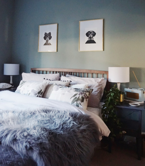
I wanted a bit of modern glamour in the main bedroom. The colour on the walls is Valspar’s Ballroom Slippers. I love the way it really sets off the white architectural features in the room such as the fireplace and window frames. I added hints of gold in the accessories and the marble top dresser with the faux fur stool to make it feel a bit more luxurious. The dressing table was an old Victorian washstand (from eBay, where else?!). The Newgate Bullitt clock along with the Roberts Radio carry my love of mid-century into this room.
Guest Bedroom
As this was the guest bedroom I felt I could have a bit of fun in here with colour. I was inspired by the Hockney Bigger Splash Print that I had owned for a while and absolutely love the palette. I wanted to give the room a ‘Club Tropicana’ feel and, being a millennial, Millennial Pink was the only option! However, I didn’t want it to overpower the room so only took it two thirds of the way up the wall. I accessorised with greys and blacks to contrast with the pink and make it feel more grown up. The prints help to add that vacation vibe I was after.
Bathroom
I wanted a clean scandi look in our tiny bathroom but also with a few touches to make it feel like it belonged in a Victorian house. The metro tiles are a classic Victorian look, but by using square instead of brick shape it brought it into the modern day. The industrial feel mirror, the vintage train sign and the gold lettering on the door all add to that vintage vibe. Whilst the cool grey, simple sink accessories and hanging plant bring in the scandi feel.
You can probably see why I can’t quite define what my interior style is yet! I’ve loved mixing scandi, mid-century, bright, dark, eclectic and paired down looks to create a home I love, thank you for taking tour and thank you to Nicola for having me!
The Girl with the Green Sofa


