Tina Archer's Stunning Period Home
This is a real stunner of a house, a fantastic period Victorian home, decorated beautifully; it's Tina Archer's home tour, a dark and moody home filled with gorgeous items; lighting, texture and art and a fantastic amount of space, yet retaining its period features, it really is a home to be envious of. I am!
Go and hear about Tina's inspiration.
I would describe my style as a blend of eclectic, boho vibes, mixing old vintage finds with a few high street classics. I definitely have a soft spot for the arrival of a new sofa, I am forever looking for that perfect dining table, I love cushions, art and greenery faux or real. I seem to be collecting poufs, not intentionally, but I have suddenly realised they are everywhere! I get excited about finding old vintage gems and giving them a revamp, whether that’s a fresh coat of paint, new handles or a simple rub down. Over the years I have tried to invest in classic lighting, especially a pendant light, whether it’s a Tom Dixon, a ‘Mila’ beaded chandelier, an old vintage railway light or a Clarence chandelier from Heals; I have three of these and love them dearly. I tend to buy objects that I truly love, that I know will stand the test of time and therefore can evolve with my style. I am constantly shifting pieces from room to room to create a fresh new space, these are then usually stored in the shed or the kids’rooms, ready to be dug out next month for their new place in the house. I know this is a bad habit!
I am always drawn to Victorian houses and fell in love with my house the moment I first drove up to it. “Derwent house” was built in 1892; it has high ceilings, beautiful window frames, battered floor boards, an original tiled hallway and fireplaces that I have learnt to love and has a garden with mature planting that keeps on going year after year. Each Victorian house we have owned has involved knocking a few walls down, as I strive for that open plan spacious living with lots of natural light and character. I do eventually want to live by the sea, in an original but modernised rustic industrial barn with lots of dogs!
Over the years my style has evolved with a darker inkier palette and this has led me to be braver in my choices and not too worry and doubt myself. I do like to try new things that add a bit of drama whilst creating a great cosy atmosphere for a room. With this has come more art; lots off it! It’s so important to me to be able to move pieces around to create a different look, not to mention lots of gallery walls. Having the dark walls has also provided the perfect backdrop for it all to stand out and look amazing. I own sheepskins, chunky knits and rugs a plenty (I’m not a fan of carpets except in the children rooms), way too many stag heads, rhinos and antlers to boot. Lots and lots of soft lighting, that is always the subject of a row when going to bed; ‘who is switching off tonight?’ And of course, the beautiful greenery that has added so much life to my rooms and who couldn’t forget the statutory cupboard full of old cushions!
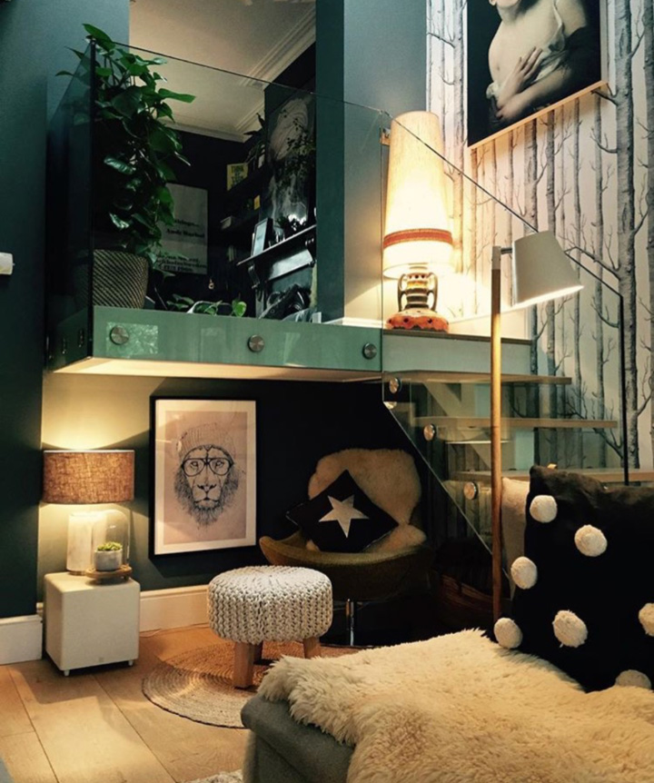
I am inspired by homes with interesting layouts, walls, lots of natural light and character. Visiting Abigail Ahearn’s house was amazing; her style, the layout, the glass wall, the different levels with the glass balcony. But, I am also inspired and recently drawn to the simpler, more modern rustic style homes which look so calm and inviting. Slowly, I am starting to introduce a more black and white palette and have begun contemplating a more paired back scheme (less is more as they say), at the end of this year in our extended extension, don’t ask! Even maybe a pink door in memory of our old holiday home in New Quay, who knows? Everything’s always changing and evolving, which makes it all the more fun!
Lounge
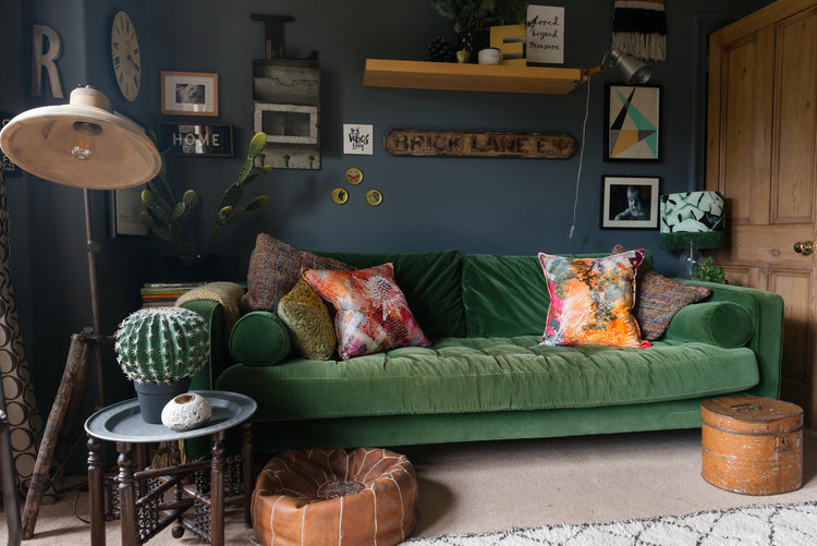
This has gradually got darker, and is soon to even further down that road. My son spends most of his time in here with his best friend the XBOX. The Yellow sofa is the main attraction here and the cushions are constantly rotating and taking their turn, it also helps warms up the room and is framed by the gallery wall behind. I decided to create this wall on a day Violet was ill off school; I was losing interest in the room and felt it was looking flat and predictable. A few fluffy poufs and rugs warm up the curtain less room, which at night looks like a fishbowl, the kids moan all the time, but I don’t care if people stare in. The rattan chair form Cox and Cox is my favourite at the moment along with my bargain eBay leather vintage chairs and my old faithful Clarence Heals lights.
Kitchen
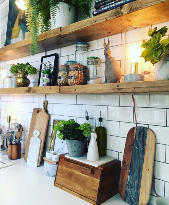
I hated the kitchen and never posted photos of it! I never wanted to be in it, as it felt cramped and small. The gloss cupboards were flat and cold and that area of the kitchen needed some interest and warmth. A new kitchen wasn’t in our plans, especially with a new extension on the cards. So, I decided to open it up by removing the cupboards to make it feel less ‘kitcheny’ and more like the rest of the house, especially as the downstairs space is all open plan. Getting rid of the pop yellow splashback and going for a more subdued palette meant I could add colour at any point in the future. The main ingredients were lots of subway tiles, I never tire of these, and two very long oak shelves which allowed me to open up the room with more space for accessories, plants, storage jars, art work and many different chopping boards made of wood and marble. Lesson learnt, go with your gut feeling, everyone thought it was wasteful and couldn’t believe I was going to put shelves there and “What about the all the dust?!” Now one of my favourite rooms of the house.
Bathroom/shower room
I wanted some consistency in the house, so both bathroom and shower room were decorated in the same design; subway tiles with dark walls, Farrow and Ball “off black” to be precise, and black ceiling and floors. In the shower room, I have gone for more rustic wood accessories and greenery to keep it fresh and simple, as the kids use this. The top bathroom feels more glam with contrasting copper accessories that amplify the black walls and the flamingo prints just add that touch of fun. The dual basins sit on an old wooden cupboard that has been painted so many times I struggle to remember, the current look is ‘Studio Green’ again by Farrow and Ball with gold knobs.
Hallway
This was going to be dark on all the walls, but I changed my mind last minute, I am so pleased I did. I used Railings from Farrow & Ball, the combination of white walls, black ceilings and woodwork, staircase and trims is so fresh and you can add colour or just keep it monochrome. I am particularly happy with the way the ceilings turned out, this helps with the height and space. I have added some interesting pendants, a few cosy rugs, some plants in corners and lots of colourful prints down the walls with a number stag heads to add depth.
The Girl with The Green Sofa

