Megan Ace Interiors Home Renovation
My family (corporate husband, 2 young children, Rupert the cockapoo and I) now live in the house that I grew up in. A rather peculiar idea to some, but whilst we were looking to upsize, and my mum needed to downsize, the idea of a house swap was born (legitimately, may I add). Initially, and unexpectedly, a rather emotional experience for us all; happy memories, painful memories, negotiating potential changes to my beautiful childhood home, and navigating the sensitive conversations about renovating the home my mum fought so hard to keep us in for so many years was something which took us all somewhat by surprise. But! Now, we couldn’t be happier. It really has been a win-win solution for us all.
My background is in theatre and arts. Pre-children, I was a theatre producer for national and international theatre companies. I travelled, saw some extraordinary theatre and not-withstanding, a shocking amount of average too. My experiences and the people who I worked with, without doubt, have shaped and enriched my life in many ways, not least, the kind of home in which I want to raise my family: open, un-precious, welcoming, full of things to make us smile, pepperings of memories, colourful and above all, a place to feel happy and secure.
After I had my first child, the theatre world and constant travel proved impossibly hard; the hours un-family friendly and I wanted to carve out something new, which would enable me to use my creative flair but would fit around the family. I believe that you can’t have it all; something had to give and I knew I didn’t want to be away as much as I’d be required. After many years of offering up tips, advice and suggestion to family and friends regarding interior decorating, I signed up to an online Interior Design course, took a deep brave breath in and set up Megan Ace Interiors, a year ago this month.
Anyway, onto the tour. We were conscious of keeping the heartbeat of this house alive; not ripping it’s guts out, tearing walls and original Victorian features down but being sensitive to its soul, whilst donning our hat to our own style and designing a home which functions for us all, and a space to suit how we want to live. If you are lucky enough to have one, I think your home should serve you all. A place for its inhabitants to enjoy. A moment, a room, a square of a home you feel most happy and serves you as you wish.
The Kitchen/ Live in Area
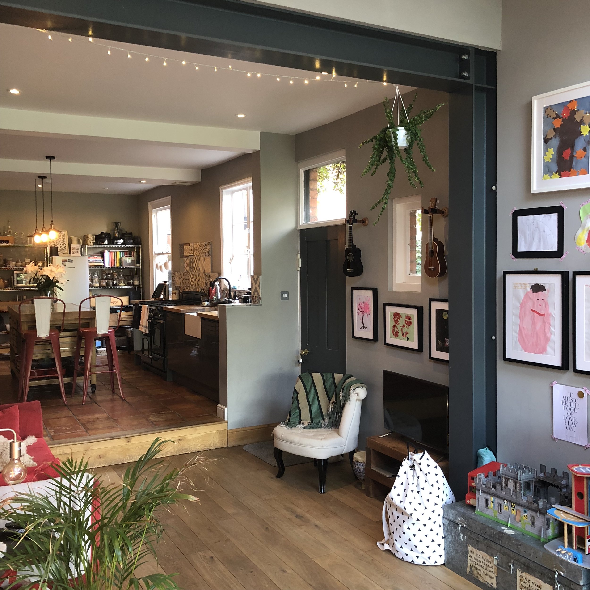
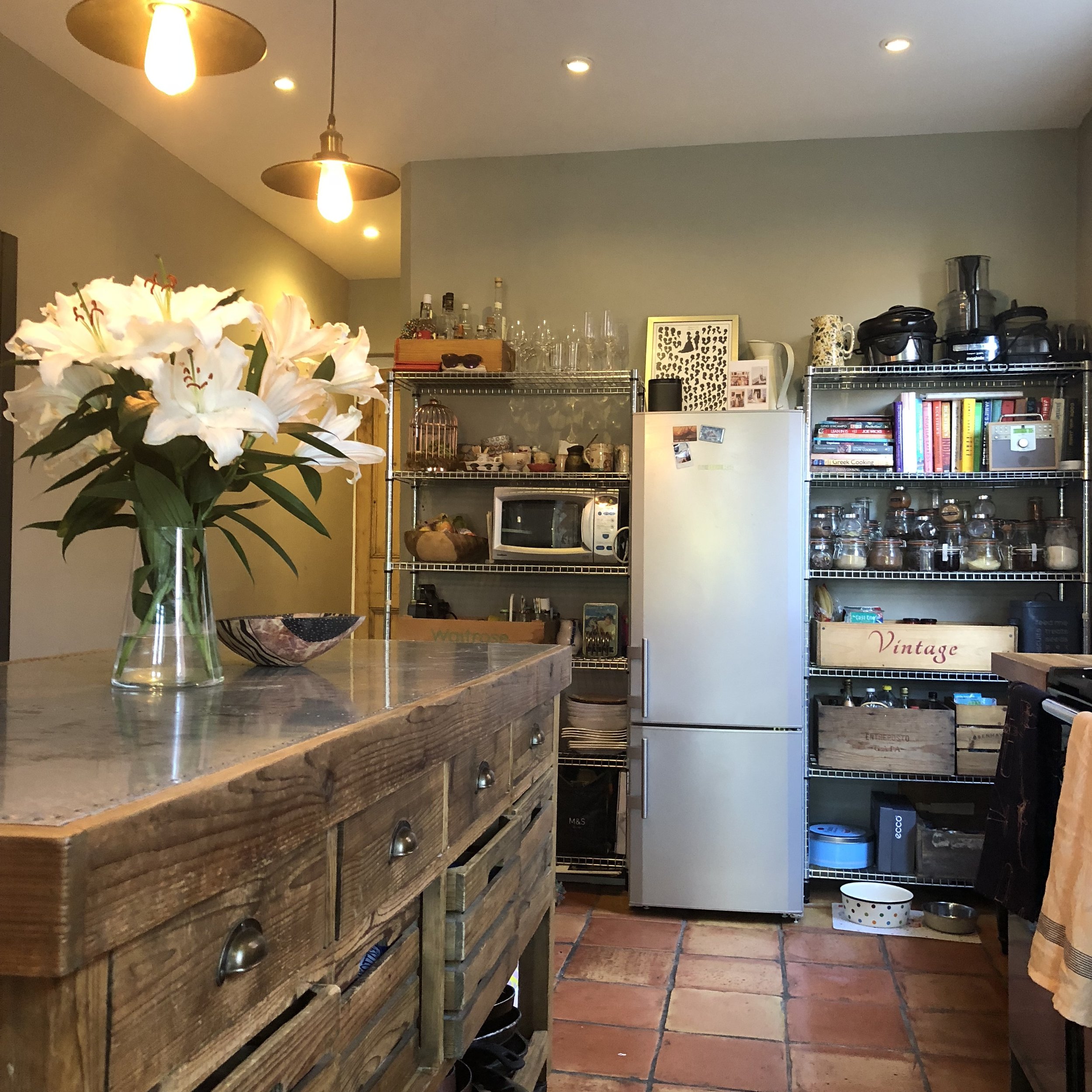
This room really is the heartbeat of our home and delivers exactly what we intended it to. And more. Fabulous for parties where everyone really is, found in the kitchen, propping up our island (on wheels so it can be moved about and we won’t ever have to leave it behind if we decide to move on) and perfect for the children and their toys too. We have a cork board and blackboard area (just painted the wall with blackboard paint) in the kitchen which has quite literally, kept us sane. Especially since our son started school, the admin!
We were keen to have an open living/ kitchen area so we knocked through and extended, all within permitted development (no planning permission required apart from notes to neighbours). We adore music, so have wired Sonos speakers throughout the house too. My husband says they ‘talk to each other’. I’m yet to be convinced, but they’re brilliant.
Whist this work was being done, we moved back into our old house and lived with my mum for a bit. It was the best decision we made. We had a 1 week old baby and a 2 year old. The idea of living on-sight amongst such chaos was something we were desperate to avoid. Our mental health had to come first and although many people are able to put up with it, we knew we wouldn’t be able to.
The ‘Adult Sitting Room’
The job in here was just cosmetics; from light to dark, with pops of colour to create a warm, and relaxing space which the children would be welcome in (occasionally and only when clean!) but would then double up as an adult space in the evening for bottles of wines and coffee table books. I always adore the incredibly smart and sophisticated look of two matching armchairs, a library wall and little else, but for now, the largest sofas the room could adopt, teamed with my great-grandpa’s arm chair was what we wished for.
We recently installed this glorious wood burner directly onto the external wall and it’s heavenly. We do have the original fireplace, but had to have the chimney breast removed from the loft when we had it converted (more on that room later) and inserting a burner into the existing fireplace (on an internal wall) was not an option, due to fire regs.
The Downstairs Loo
What to make an impact? If you have one, the downstairs loo is where you can take a risk. If it goes wrong, it’s easy to ignore; just pretend to guests you don’t have one. We went off-black in here on all the walls, which quite literally, blew the decorator’s mind, but we were confident it would work. Against intuition, where there’s little light, go dark - it really does make the room feel bigger, not smaller as one may think. This was done shy of 3 years ago now, and I’m itching to change it. Deep, dark wallpaper on all the walls perhaps? Will add that one to the list.
Moving up to the first floor:
By the time you read this, I’m hoping the stairs will have been painted and the black and white stair runner fitted. Let’s see about that one, shall we?!
Family Bathroom
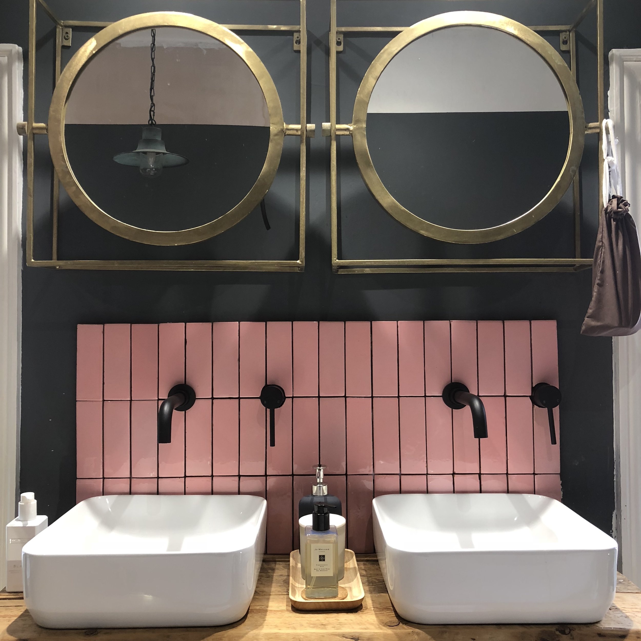
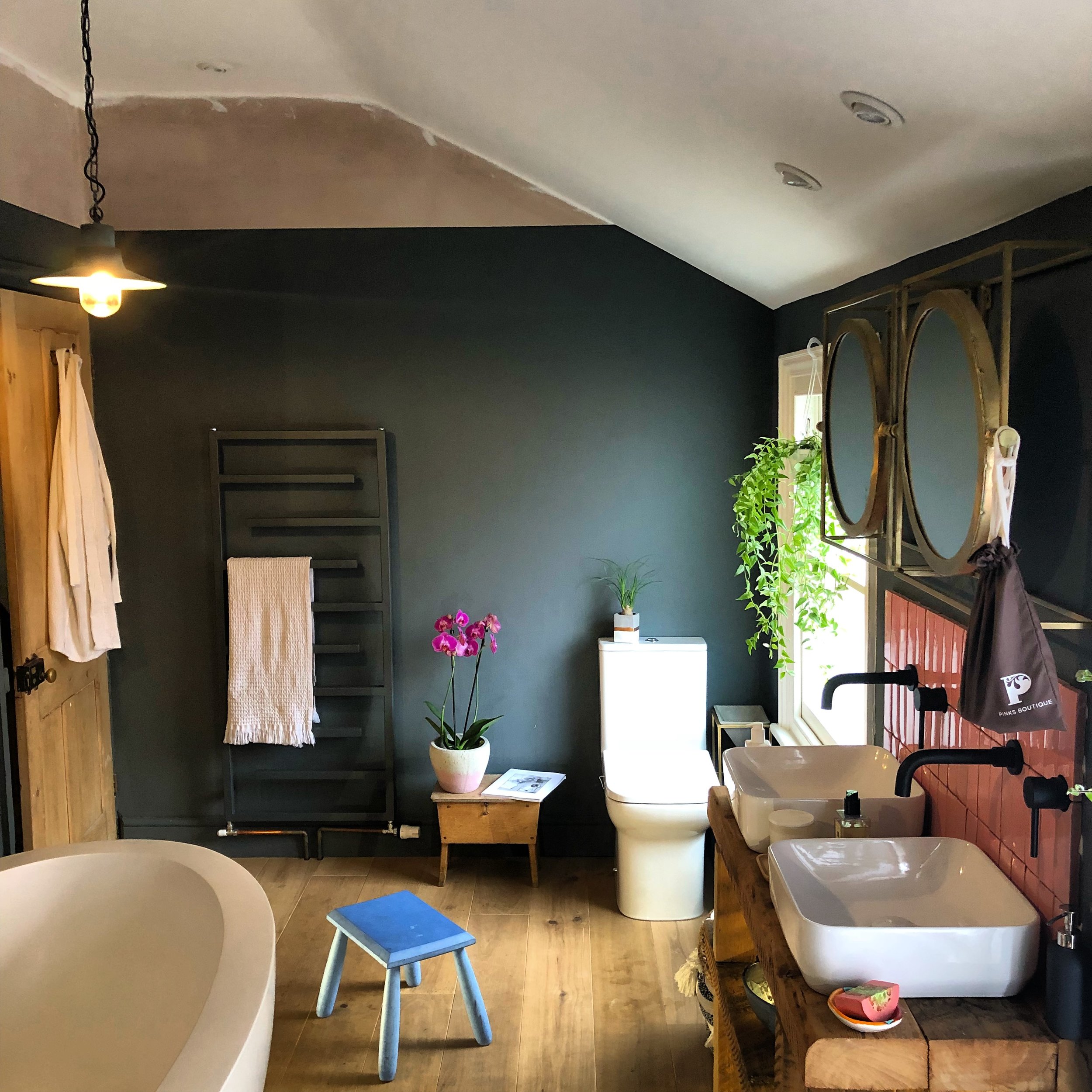
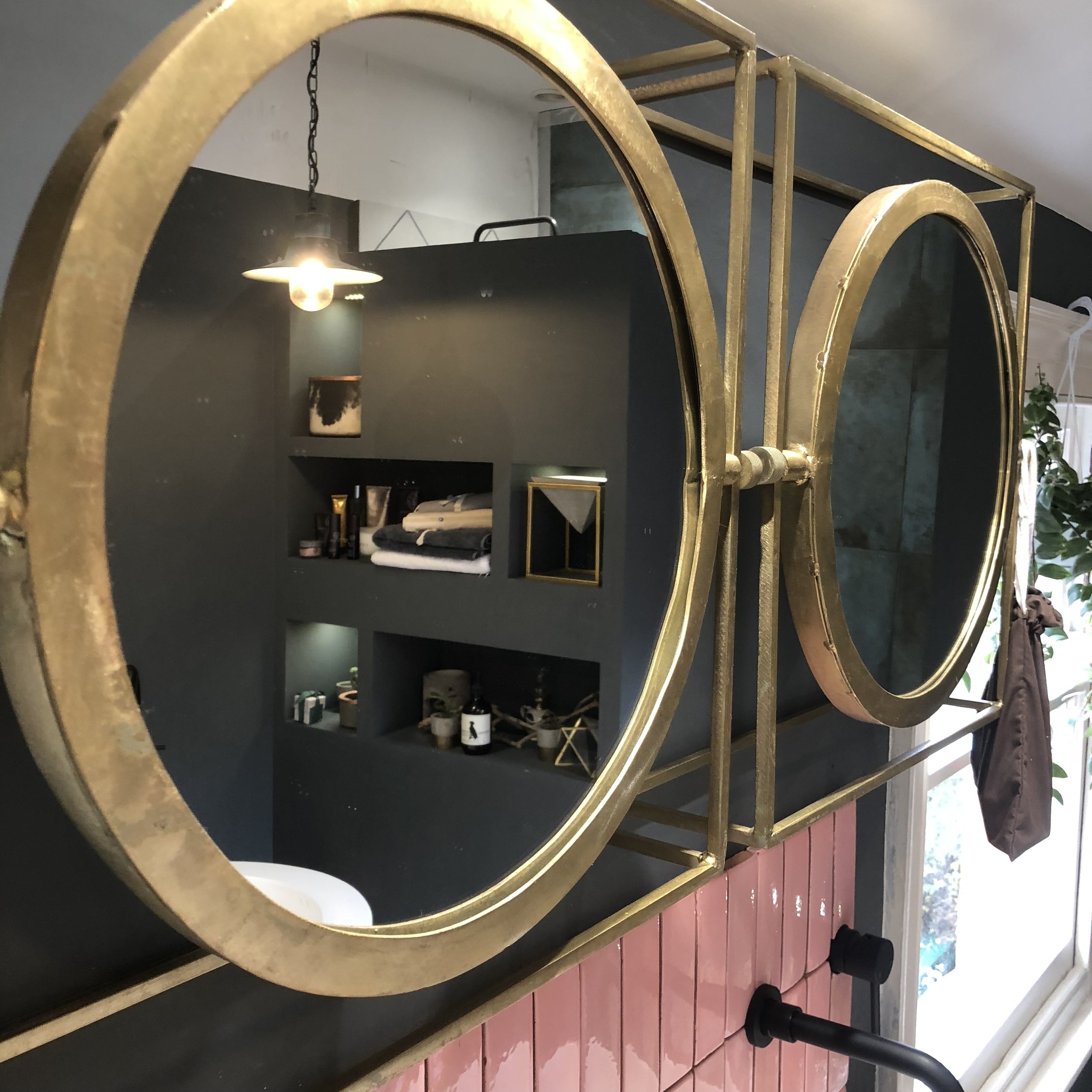
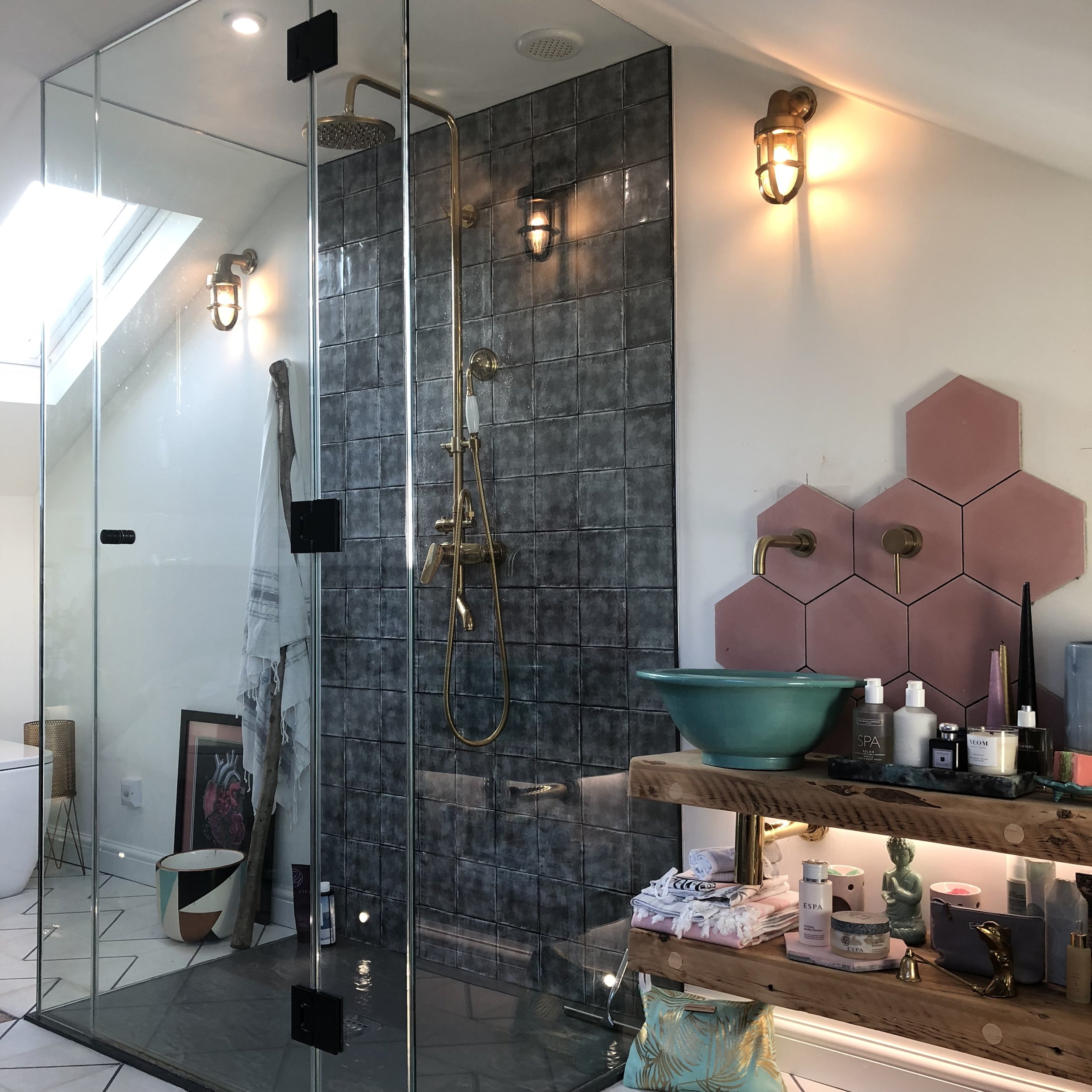
Our most recent project, along with our loft conversion was to knock the wall down between the existing family room and the small bedroom. Our vision was luxe, spa-like feels and again, a space to suit us all. The copper bath idea which I’d had on my lust-list for years was about to get erased and we opted for this massive, half-boiled-egg-like stone bath instead. Excellent for tiny ones to slide down, and even better for us to stretch out in with a glass of red. I kid you not, the whole family can fit in here, It’s bloody brilliant! We had a stud wall built with LED-lit recesses, to enclose a walk in shower which feels incredibly luxurious and it’s great for storage too. An important element of bathroom design.
My other top tip for bathroom design has to be the lighting. Layer it up; ceiling, floor, wall and stick certain lights on different circuits to make it function to requirements.
Note: please ignore the fiddly bits of painting and lack of grout on the splash back. Snagging lists are a reality.
Children’s Rooms
I wanted the children to have an input into the design of their rooms, or at least, make them feel as though it was like that. I’m not into ‘themes’ and I wanted the rooms to be future-proof (no babyish paint colours). I presented 3 different Wild Hearts Wonder papers to my son, a huge fan of wild cats and animals, so as soon as I saw the print, I knew he’d adore it, he just had to pick his favourite colour. Apologies the wall-mounted animal heads have not quite found their resting place yet, for now, they’re happy here.
And for my daughter, a similar process, although at only 2, I may have encouraged her to point to this one in particular.
Our stairway to heaven (to be carpeted and painted at the same time as the first set of stairs)... ahhh, those tiny, but oh so dangerous hands! We installed LED strip lighting along the stair string, under the balustrade which are on their own circuit - fab for mood lighting. The strip also comes on via a motion sensor (PIR) which is brilliant if tiny feet need to make their way up to us in the middle of the night.
We opted for a glass balustrade to bounce the light around in this rather narrow area. The stairs don’t continue on from the original ones, so I felt we could get away with a more contemporary look. Doing it this way meant that we’d not have to dog-leg the stairs into the loft room, saving on crucial bedroom space.
Loft room/Master Bedroom
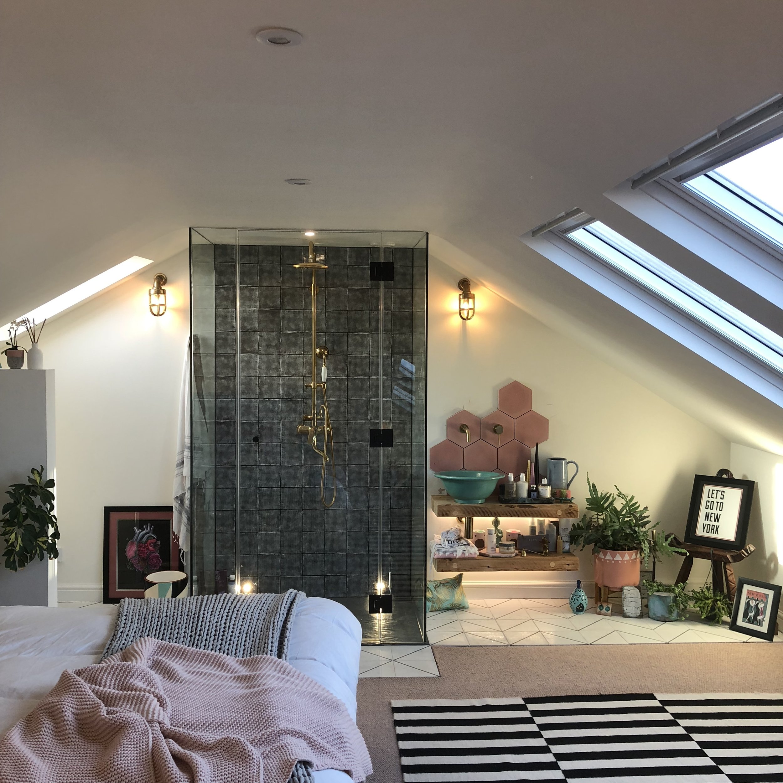
Finally ending at the top of the house, our recent loft conversion was quite frankly, something of a back-of-a-fag-packet design which our brilliant builder Matt Williamson from Pink Hippo Property Services, my husband and I produced as a team. It was always going to be an organic process; a rather typical design process for my own home as I have so little time to concentrate on it.
The space up here for us is magic. A room for us to reconnect and de-stress in. No television, just the very fabulous view of roof tops and Worcester Cathedral which at night, is lit so beautifully. The two huge windows gives an illusion of a glass roof. Go as big as you can afford to on roof windows.
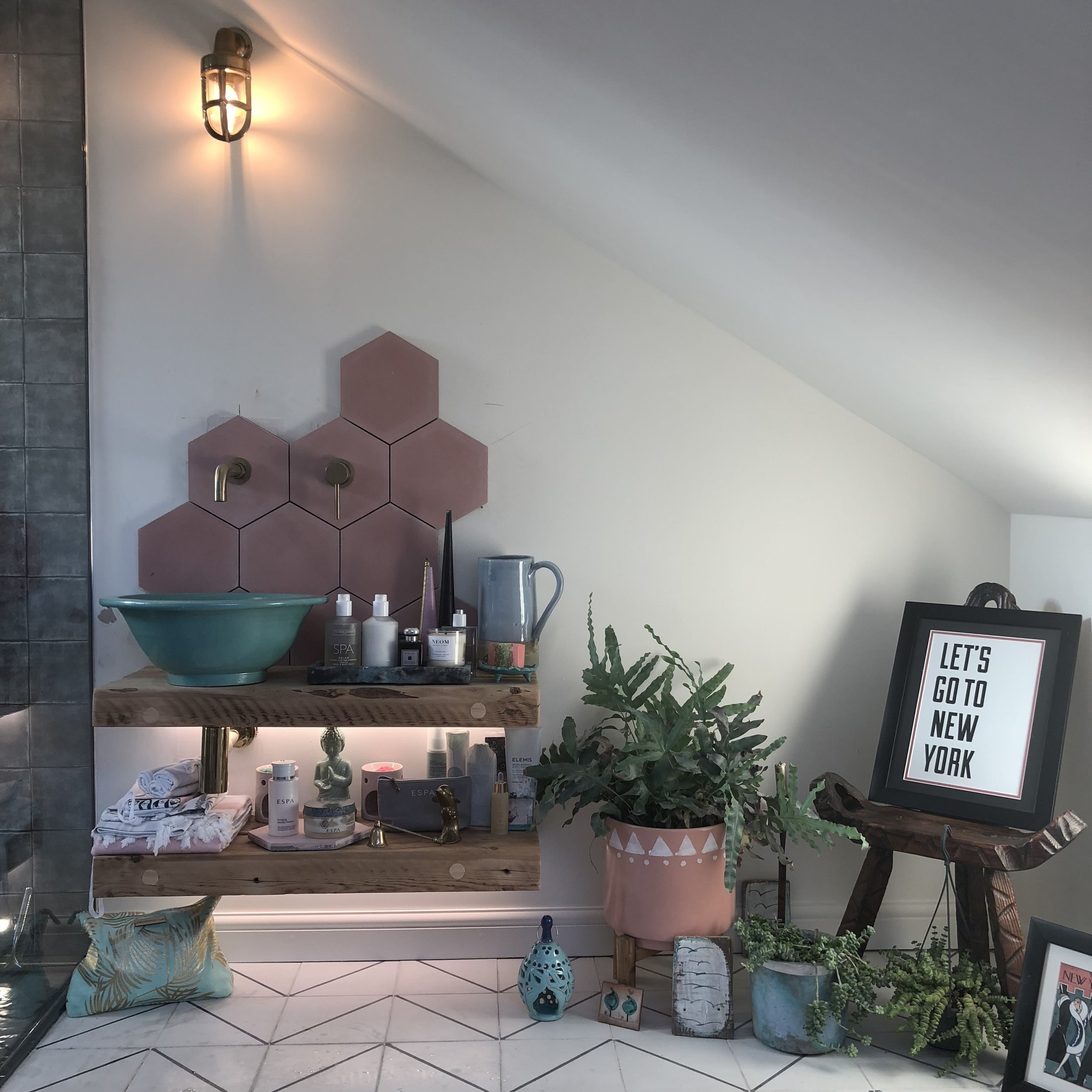
Over all, my style, quite simply is if it makes my heart flip, I’ll consider it for my home. As you’ll see, I like to have a mix of dark decor and also light, with pops of colour. Sound too much like I’m on the fence? Possibly so, but it allows me to move around the house depending on my mood (or my family’s, for that matter). I like art, objects and pieces of furniture to tell a story, not least as a point of conversation, but also to evoke memory and emotion. I also like to have at least one luxury/ statement item in each room; I’ll team it with bargain-buys from reclamation yards / brick-a-brac shops / local selling websites and for me, that’s a winning formula.
There’s not a day that goes by in which I don’t feel grateful for my little family and the house, we feel so happy living in. I’m so proud of what we’ve achieved in our home; already splitting at the seems with memories and a space for all our friends and family to enjoy with a plate of something in one hand and a glass/ bottle of something in the other.
To those of you who have found time to read this blog, even if it’s just one line, for the likes and the comments, I am truly thankful. Do remember that a lot of what we scroll over on social media is certainly far from reality. We are all guilty of diving into others’ home with envy and of course, the feeling of ‘how does their home look like that?!’ Truth is, it doesn’t.
Lastly, to Nicola, thank you so much for asking me to show you and your followers around my home. I am incredibly honoured and I shall look forward to sharing a bottle of something with you soon.
Here’s to happy homes, however they may look. Season’s greetings, all. Megan x
The Girl with The Green Sofa


