The 5th Surface, How Ceilings are the Key Area to Look at When Decorating-Upgrading my Guest Bedroom.
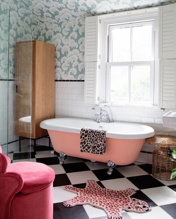
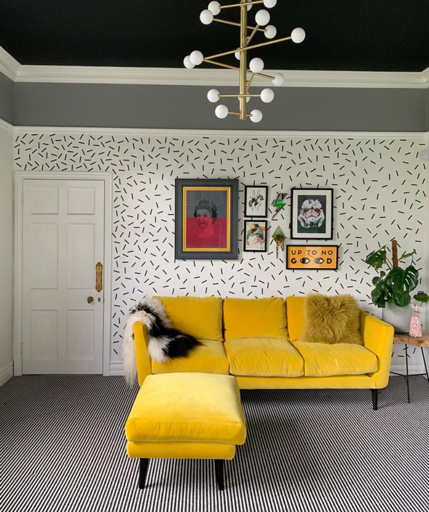
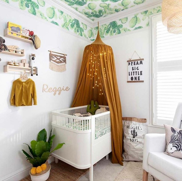
This year, the ceiling has become the 5th surface in interior decorating, not just the area to splash a bit of white or cream on, while paying attention to the rest of the room, but a feature in its own right. Be it adding dramatic wallpaper, or simply featuring it in a different but bold colour, normally reserved for the walls, everyone is paying attention to this area at the moment. It is especially useful, if you have high ceilings and want to bring down the height of the room; to add a darker colour. Bringing the wall colour, or indeed wallpaper from the walls across the ceiling, blurs the boundaries in smaller rooms and makes them feel larger.
And since I love to experiment with colour, and had been looking for an excuse to use Sulking Room Pink from Farrow and Ball, ever since I wrote about it here, I really wanted to have a play in my guest room revamp. I’m lucky, in that I can do all my own decorating, so apart from a little bit of back and neck ache from decorating a room, if I don’t like it, I can easily change it. And, that leaves me free to experiment, and experiment I did with this room.
I was also interested to try the neutral trend we are seeing in interiors at the moment. Now, as a colour loving girl, I am never going to be able to stick entirely to a neutral palette, but in choosing to use colour on my ceiling, I could afford and indeed, needed to have a more neutral wall colour. Moreover, this scheme allowed me to use the top of my lust list in wallpaper; Babylon from House of Hackney, embracing a third trend of bringing the outside in.
For me, I stepped out of my comfort zone with this revamp, moving from the dark, bold walls that have become my signature, to embracing a lighter look. This guest bedroom is south facing, so most of the year gets an abundance of light and if we are really lucky, a good deal of sunshine. Perhaps thought of as counter-intuitive, I decorate my north facing walls in dark bold colours instead of lighter ones, because while I can do nothing for the light in these rooms, I firmly believe the dark, moodiness adds depth and a cosy feeling especially in the blue light of winter. But this room does not suffer in that way, and I wanted to play with colour, keeping my walls as a blank canvas, my hypothesis was that I could then play with pattern and colour of my furnishings and with wallpaper and add colour to my ceiling.
The Decor
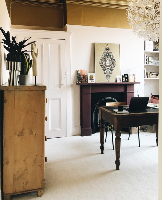
First up, I painted the ceiling in Sulking Room pink from Farrow and Ball and then I painted the walls in an off-white colour from Earthborn paints, in Woodsmoke. I chose to try Earthborn paints because I had heard that they perform really well and as a seasoned decorator, I can honestly say that this paint was smooth, quick and easy to apply with a coverage that was simply amazing. Considering I was going from a very dark navy to white, these walls took only two coats to get a very good finish.
Next, I tackled my wardrobe doors and skirting boards, this time in a satin black paint from B&Q. While this job took longer than the rest of the room to finish. I’m pleased that I added a darker element to the room, to ground the lighter and in some ways, slightly feminine colours, with a dark neutral.
The final paint job was an upcycle of my vintage chest of drawers, the first item of furniture I ever bought, a two tone with Brinjal and Bancha from Farrow and Ball, with an orange stripe in Charlotte’s locks.
Then it was time to add the texture and detail. I had been after the House of Hackney Babylon Wallpaper for as long as I had known this well-loved brand. Since I can’t resist a bit of green in a room, this wallpaper was ideal for me as it had the lighter background I was after but also allowed me to feature a nature inspired look.
The Detail
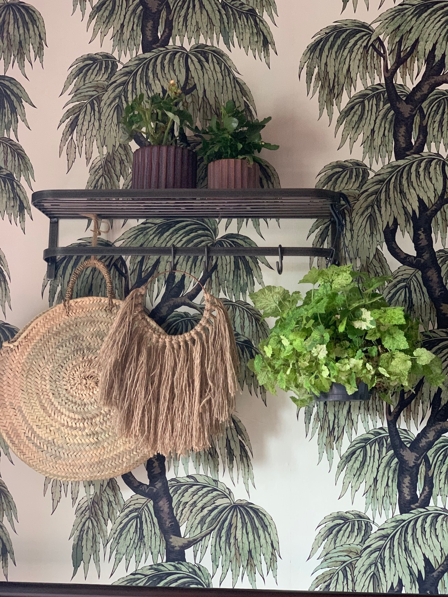
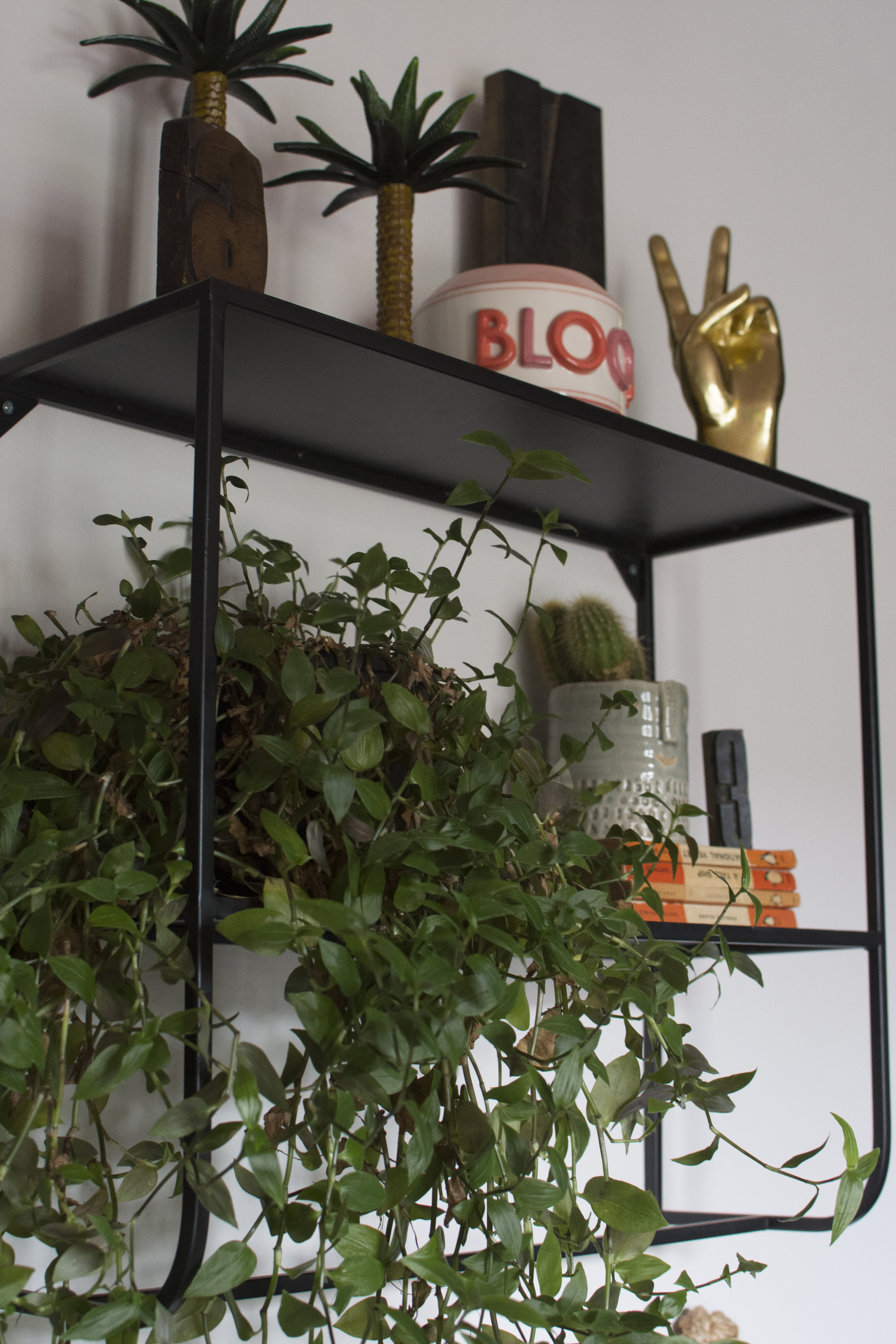
While I thoroughly enjoy the physical side of decorating, I am at my happiest in the detail of a room, the little bits of a room that make it yours. Above and below you can see two metal shelves from Design Vintage; The Steel Luggage Rack and The Prove Metal Shelf, both chosen for the ability for me to store and style my many trinkets and also because I wanted to add more plants into this room scheme, particularly hanging plants, and both offered the ability to simply hook a plant over the metal rails.
The plant pots in the above picture are in a colour that compliments the room scheme from BoConcept Redbrick, The bag from Grey September and the Hanging from @myoffthewallinterior.
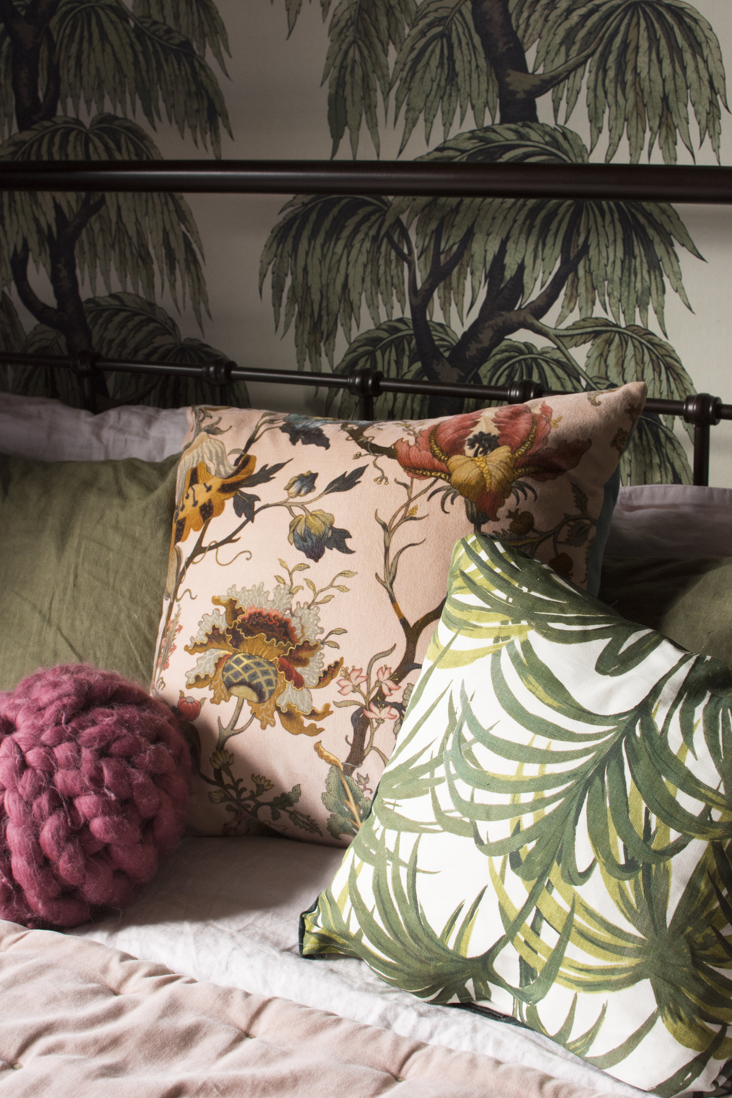
Giving myself plenty of time to complete my room, allowed me to unleash my sewing skills again. I wanted cushions to compliment the room scheme, so I simply ordered fabric, mostly from House of Hackney, and brought out my long-discarded sewing machine. While they may not be perfect, I feel a certain accomplishment in having made them, after so long without using those skills.
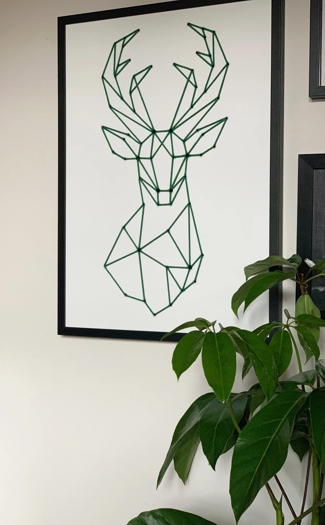
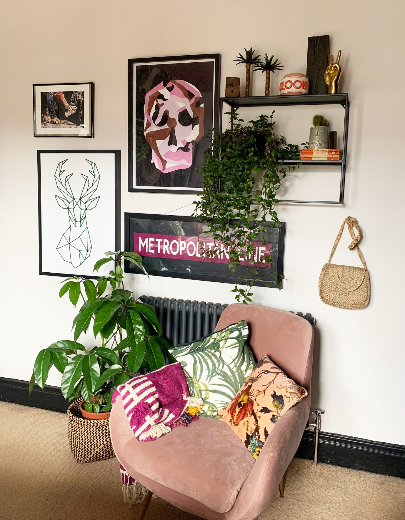
It wouldn’t be a finished room without some art on the walls and the stag print you can see from @Sifabricate, above and below sits alongside other art that I had moved from previous rooms; can’t beat a bit of “shopping your home” to save money and let’s face it, I am definitely not short of a picture or two. The Radiator was sourced from Soak.com.
The chair is from MADE.com and the throw from Anthropologie.
Finally, given my recent success in keeping houseplants alive, I was keen to add to my collection in this room, and while I moved one or two from other rooms, I received several hanging plants from Root House Plants, my go to place for finding plants and for getting advice on keeping plants alive.
This has been the longest room renovation, I have ever done, largely due to the day job being exceptionally busy, but in taking my time, I’ve managed to re-invigorate some old skills and source the items I wanted for this room, including from my own home. It has allowed my to play a little with where things sit, something I like to take my time over, moving things around until they “feel” right.
Am I finished? Undoubtedly not. I never finish my rooms on the first pass, choosing to decorate slowly and live with them a little while. But, I am happy with my little experiment, trying colours and on surfaces that I haven’t used before. I might not be in a hurry to paint another ceiling myself though!
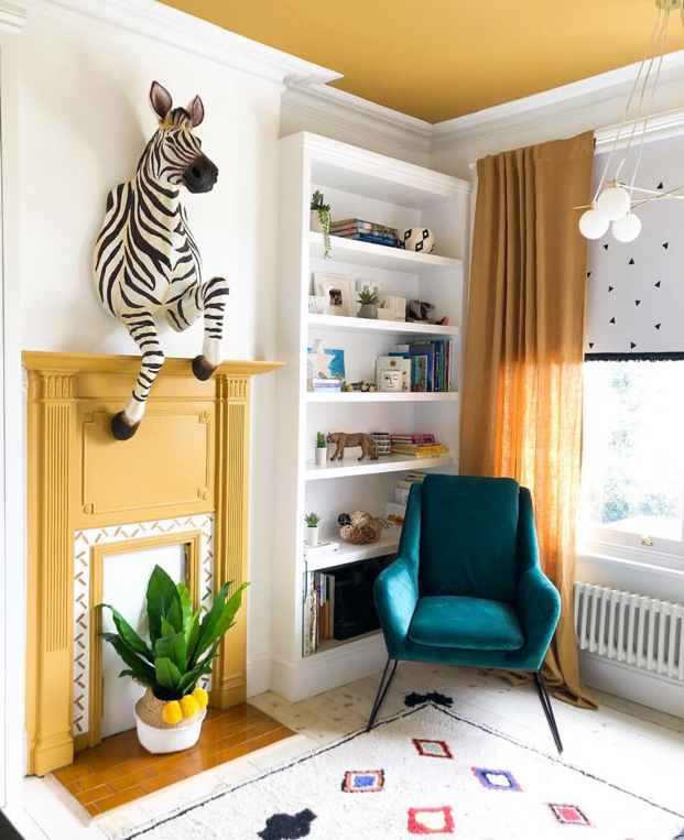
Have a look at some other great examples of utilising colour or wallpaper on the ceiling. Image Credits LHS to RHS @madaboutthehouse , @threeboysandapinkbath, @houselust, @comedowntothewoods, @threeboysandapinkbath
The following items were gifted to me especially for this room, all other items I bought myself
Earthborn Paint in Woodsmoke
Design Vintage; The Steel Luggage Rack and The Prove Metal Shelf
Hanging from @myoffthewallinterior.
Fringed Lampshade Beavamp
Stag art @Sifabricate
Hanging plants from Root House Plants
The Girl with The Green Sofa


