Kath Pinkham-Edwards Colourful Terraced Home
Today’s home tour is with fellow colour lover Kath Pinkham Edwards, who is passionate about eclectic interiors probably as much as I am. Winner of best kitchen in Real Homes, this really is a beautiful home, created on a budget. Read on to find out more about Kath and her home.
I've worked in the Oil and Gas industry for over 10 years as a Contracts Buyer for an LNG Terminal here in West Wales. I moved to Pembrokeshire when my daughter was 2 years old - she’s now 25, so this is home for me. I’m originally from Wales, worked abroad for a number of years but eventually settled back here. My daughter Natasha fled the nest a good few years ago and now lives in Cardiff. I’ve been married to Vivian (Viv) for 5 years and we’ve been together for 9. I’ve always loved interiors and making a house a home. I think this stems from many years in military accommodation where you can have any colour as long as it was Magnolia coupled with my family’s decorating tastes being ‘neutral’. We live here with our 2 rescue cats Nell and Sebastian.
Our home
Is a typical mid terrace house with a sitting room, dining room, kitchen and three bedrooms. Luckily this style of house also tends to have long gardens so not only do we get outside dining and relaxing space but we have 4 chickens in a walk-in run and get 4 eggs per day.
The house was built around 1900, I love this style of house as they are so full of character and solidly built. Both my grandparents and great grandmother lived in terraced houses so I suppose I associate this style with happy memories. Whilst I would love a double fronted Georgian manor house this is home for now. We bought the house 8 years ago, the house or garden hadn’t really been loved, there were hardly any original features left, so we’ve spent the past 8 years reinstating coving, iron railings, a wooden front door and are in the process of replacing the windows with sash. When we were viewing houses, I knew I wanted an open plan kitchen, dining, living space as Natasha would soon be leaving home, it would be just the two of us. This house fitted the bill so once we got the keys we started to rip up the carpets, sand the floors, knock the rooms through and build a side return extension. Unfortunately, while stripping the walls we discovered that all the upstairs walls, along with lots of other ‘issues’ needed fixing so the kitchen and bathroom refurb would have to wait. We painted every single wall in Farrow & Ball Great White, sanded the floors then moved in on ‘Black Friday’ where Viv went ‘out’ and I met the removers. Even though we hadn’t moved in I had the Christmas tree in a bucket in the garden ready.
Phase 2 (kitchen) and Phase 3 (bathroom) came when we had the funds. So, the kitchen was completed 4 years ago with the bathroom being completed 3 years ago. We lived with what we had for years rather than spend on something that wasn’t the ‘dream’.
Once through the blue front door you’re greeted with a ’storm-porch’ wallpapered in Cole & Son Flamingos in pink. Then into the hallway where we’ve laid a new oak parquet floor (turned out less expensive that reclaimed). As the hallway gets very little natural light, I’ve embraced the dark side and painted the walls, woodwork and ceilings in a dark green from Valspar. I’ve used this trick for a number of years in old houses as these blurs any imperfections. Three chandeliers from Dunelm give plenty of light when needed along with lanterns and fairly lights.
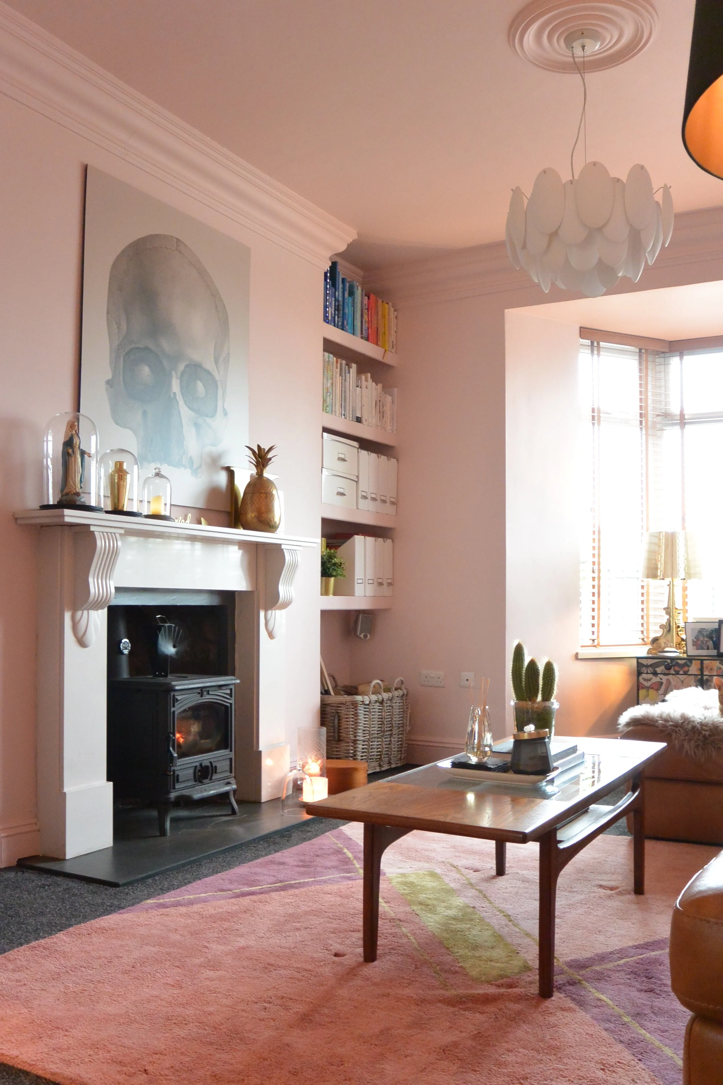
Turning right into the dining area you have the siting room on your right with its original log burner, Natuzzi sofa for great lounging, and my gorgeous mini sideboard from Boogaloo. I love the Damien Hurst skull print but it was way out of my budget so I found this skull print which was made to our specifications from Surface View. It's still one of my favourite things after 5 years. I love the juxtaposition of the skull against the pretty pink walls. I did treat myself to a Paul Smith cushion from the Rug Company though. The open plan downstairs gets loads of light so I went with Farrow & Ball Calamine, I wanted a ‘dirty’ pink that would work as the sitting room faces North and the kitchen and extension face South.
Calamine looks great in both areas.
The dining table, 4 of the dining chairs and sideboard are all E-Bay finds years ago. I love the fact that we’re only their second owners and they came from family homes that had purchased from new. The table is great as it extends twice to seat up to 10. We were lucky enough to have the two Eames chairs as wedding presents. I’ve softened the slate floor with a patterned rug which picks up the colours from the sitting room. My collection of convex mirrors was again inspired by Pinterest but borne out of budget. I couldn’t afford the typical convex mirrors that interior designers were collecting so I sourced these alternative ones from charity shops and E-Bay, not paying more than £15.00 for any one. The coloured glass on the alcove shelves again is all charity shop bargains. It looks great when all displayed together.
Going through into the extension, I have two garden chairs covered in sheepskins which are great for sitting and enjoying a class of wine while chatting to Viv when he’s cooking in the kitchen. The small table in between is from Homesense, which is great for budget friendly quirky pieces. This space is lovely in the summer with both doors thrown open. When we had the extension built we asked the builders to ensure the threshold was as small as possible so that when the doors are open its seamless.
Ahh now the kitchen, the love of my life after my daughter and husband….. I didn’t want the kitchen units to be all the same so we had a false wall built to house all the green units on the left-hand side, this gave a more symmetrical appearance and meant we also didn’t have to have any fillers. The units on the right-hand side are grey, we don’t have any wall units as such, with two windows I wanted to keep that sense of light and space. The units house a larder, freezer, wine fridge, Hotpoint fridge drawers (which I love), dishwasher and recycling. All the units are either drawers or have drawers in them. Everything needed to have its place so that the kitchen was as clutter free as possible. We chose a gorgeous Silestone worktop that resembles marble but is much more forgiving and hard wearing. When deciding whether to paint the open plan area pink I was inspired by a gorgeous Devol kitchen that was green and pink, as our kitchen has two colour units I knew the pink would go with both the grey and green. We had installed a slate floor when we built the extension and carried this through into the dining room. When we were choosing the flooring for the kitchen I wanted it to pick up the dark grey of the slate but have its own identity, I loved the British Ceramic Tile range of Illusion tiles and choose the Greek key pattern. The kitchen fitter said I’d get fed up with it. Four years on and I still love it. I wanted our splash back to reflect as much light as possible so went for a foxed mirror look and the bar area had to be a cocktail bar not breakfast bar so it had to be copper. I think these touches make a standard kitchen unique. Decorated with some vintage plates from charity shops and some faux (and real) horns I (jokingly) call this granny hunting lodge chic. All the lights were made by Viv. It’s so lovely in here especially with the underfloor heating!
Going upstairs into the bathroom I’ve gone for British Ceramic Tiles again, but this time in a marble. I figured marble is a neutral so will last my need to change the decor. I’ve wallpapered with Cole & Son Woods and Pears to contrast. If I want to change the look in here I just need to paint the bath, woodwork and can change the wallpaper to give me a completely different look. We’ve gone for underfloor heating in here again and saved on the tiles so we could afford a wet room shower. The bath is a small slipper bath from The Cast Iron Bath Company, Viv hates baths so this is just big enough for me to relax in, small table perfect for holding iPad and glass of wine. I lived abroad for many years where it was normal to have your washing machine in the bathroom. Two cupboards were built to hide the boiler and washing machine and laundry. This then allowed the plumbing for the shower to be hidden behind the stud wall. Viv’s favourite element of this room is the walk-in shower.
As Natasha has the largest bedroom we have the smallest double and have converted the smallest bedroom into a dressing room.
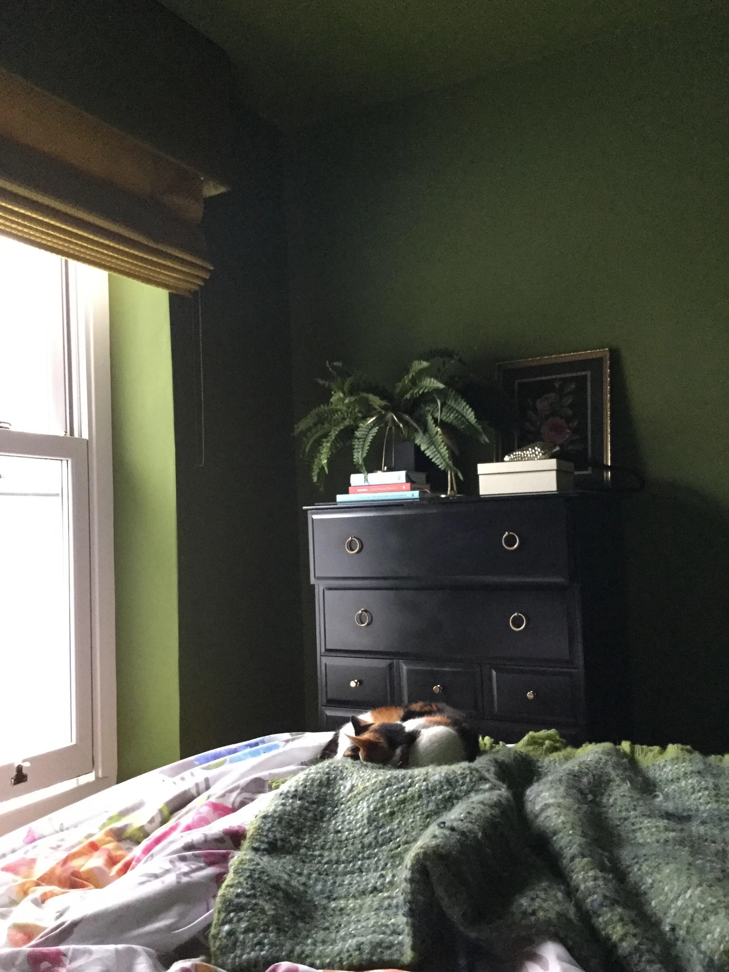
Our bedroom is painted in Valspar Pressed Olives - again walls, woodwork and ceilings painted in the same colour. We still have the original sanded floorboards here, softened with a rug from Wayfair, a vintage chest of drawers painted black is the only other piece of furniture. Linen bedding from La Redoute is my new favourite.
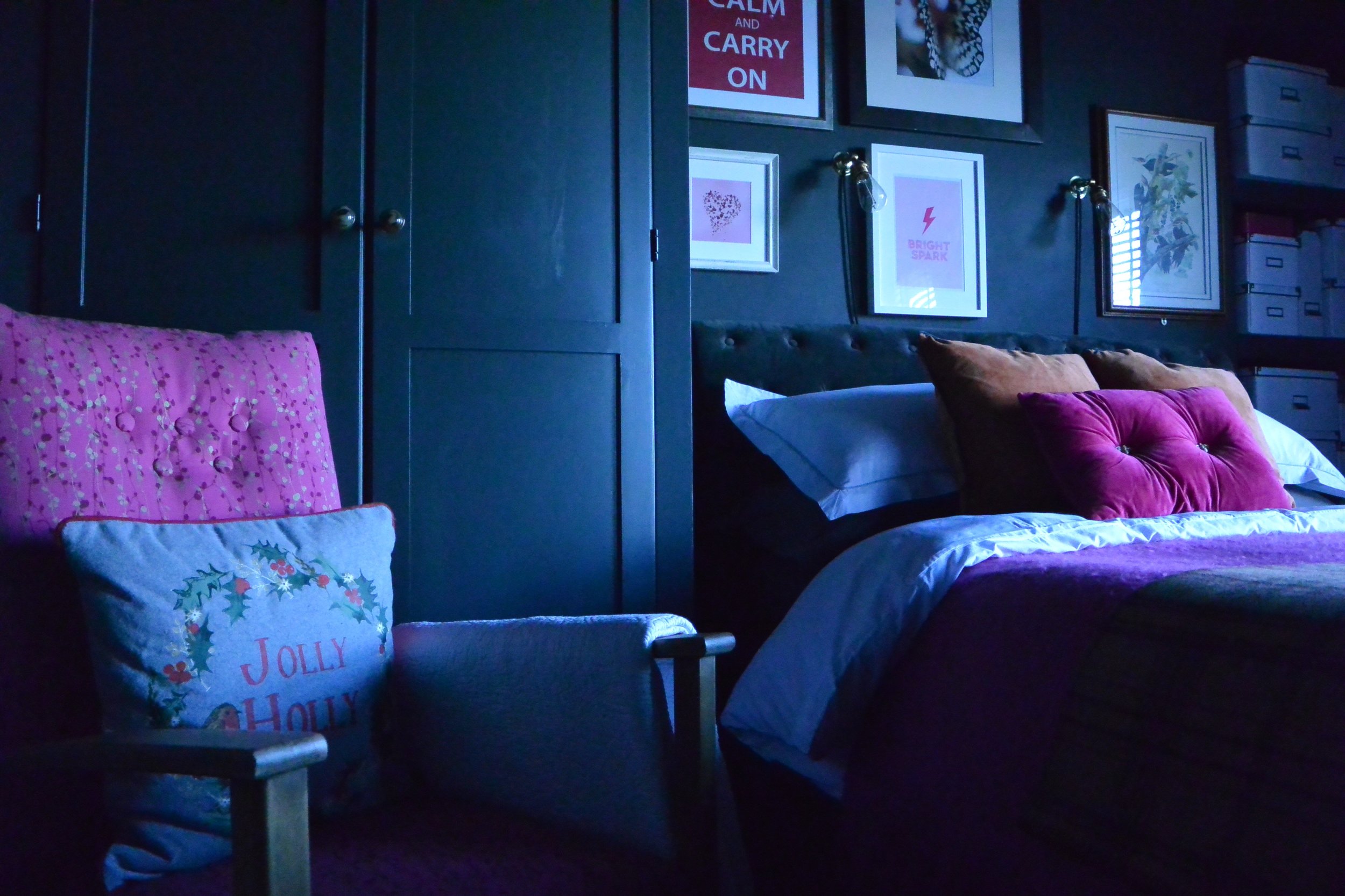
I’ve just completed (well nearly) Natasha’s bedroom going from a mid-grey to Farrow and Ball Railings with a new storage bed. I ended up painting the wardrobe which had seen better days but was still useful. We already had some prints, and added some new lights, again made by Viv and we’re nearly finished. Again, we still have the original stripped floor boards in here but this time a large jute rug for texture and two grey sheepskin rugs either side of the bed for cosy toes when getting out of bed.
The dressing room was completed with fitted wardrobes from Homebase and recently wallpapered in a gorgeous Linwood paper which ties in with the stripe stair carpet and dark green walls of the landing. Again, the stripped floors but softened with a bargain runner from TK Maxx. I bought a small Peacock chair that was pink so spray painted it black this now resided in the dressing room. I painted the ceiling and woodwork in leftover Downpipe.
At the top of the stairs we have a small office area.
The Girl with The Green Sofa


