The Wooden Hill, an Eclectic, Modern Rustic Home Renovation
My name is Marianna and I live in a cosy workers cottage in East London with my husband Ross, our 3 year old son Finn and our crazy red headed cocker spaniel Indy.
I divide my time into teaching Pilates two days a week, helping out part time with the design agency that we run in Hackney and generally moving things around to different spots in the house just to confuse people and keep them on their toes. The truth of the matter is they barely notice but it makes me happy anyway.
Describing our style is a tricky one as its quite eclectic, there is definitely a heavy nod towards the modern rustic there with all of the natural materials. Working in East London for the last 9 years has had its influence with the industrial inspired exposed copper pipe lighting and brickwork in the kitchen so let’s go with those two for now.
I get most of my inspiration from Country Living Modern Rustic magazine, I have every single issue. Pinterest has been an obsession of mine for many years now too and obviously Instagram coming onto my radar just over 18 months ago has been a bit of a game changer. I honestly had no idea interiors Instagram was a thing until my husband alerted me to Reena's @hyggeforhome account which he knew would be right up my street and suggested that we start our own account as a renovation diary.
We started the renovation 18 moths ago after over a year of planning, which in hindsight was a blessing as at that point our son was 12 months old. If we had started the work before he was born we would have made some very different design decisions. Being able to take his and our needs as a family into account was actually invaluable. I moved out for what was supposed to be 12 weeks to the sister-in-law’s garage with Finn and Indy in tow while Ross crashed on the sofa at work. It ended up taking 7 months for it to be at a liveable standard with running water and electricity and there was still a lot of work to be done to make it a home. If you’d have told us that at the beginning of the process we probably wouldn’t have gone ahead but as everyone will frequently tell you, it is always worth it in the end and they are right.
The Kitchen and Family Room
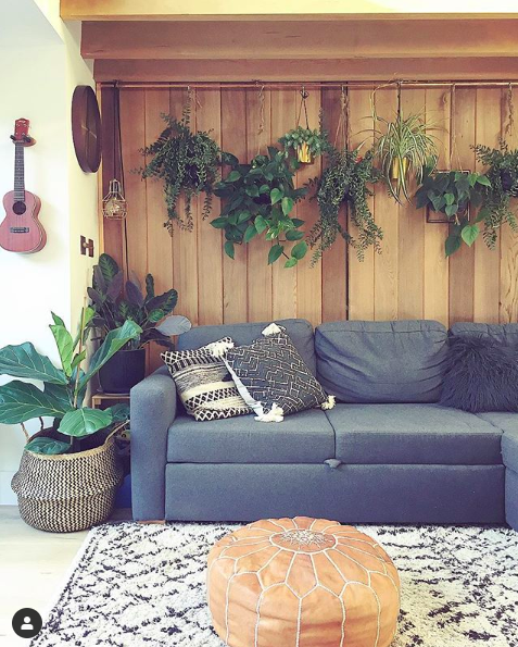
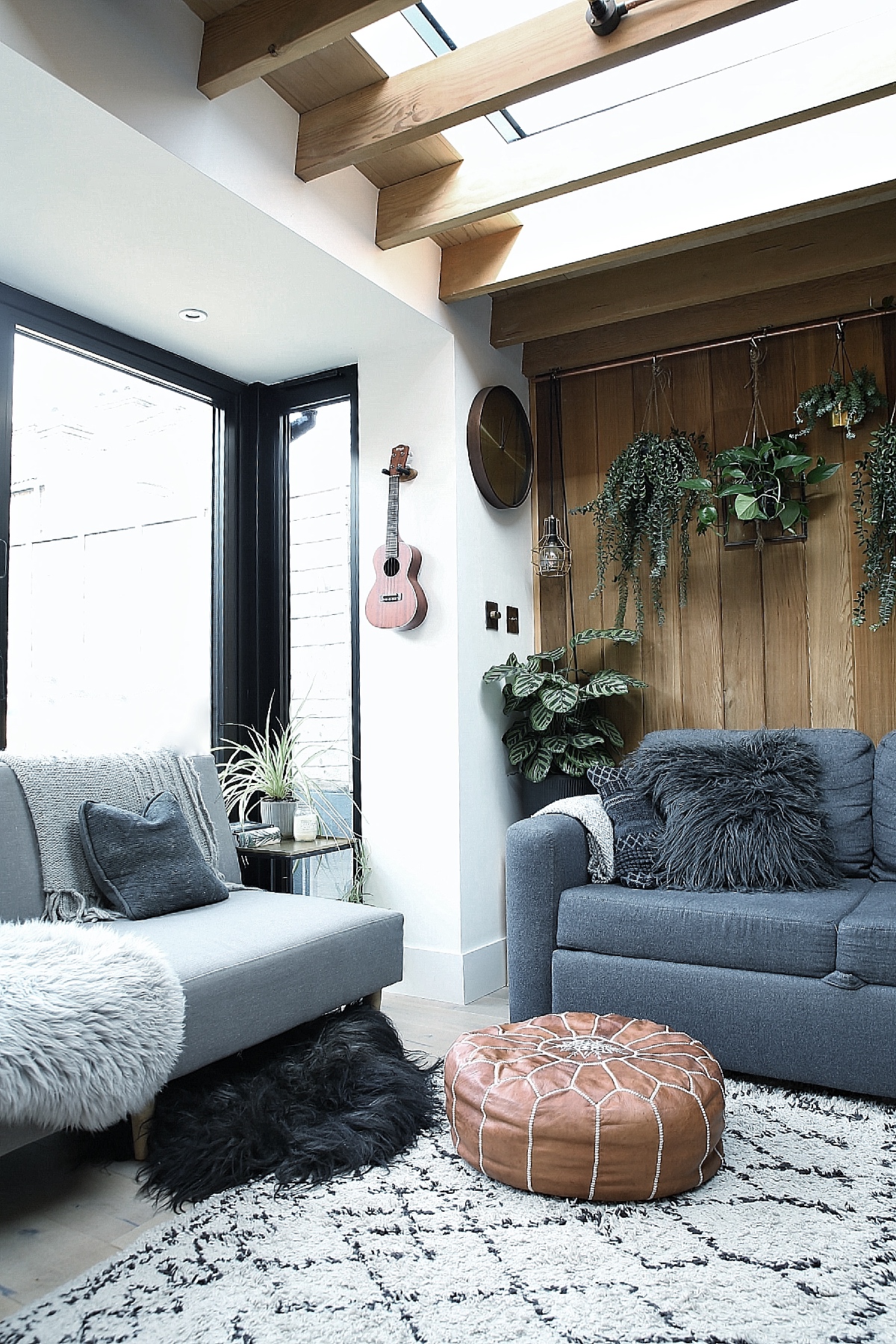
Our favourite space in the house is undoubtedly the kitchen and family room. It is the one room where we had a clear idea of what we wanted to do with it from the very beginning. We’ve always loved wooden cladding, wood is such a tactile material, it really transforms a space and it smells like an alpine forest in there when I spray all of the plants. Plants also feature heavily in this room as we would eventually like to clad around the entire garden to make it one unified space when the bifolds are open. We had originally planned on having white handl- less scandi inspired kitchen units but in a last-minute change of direction we decided on a dark blue shaker style to give it more of an industrial feel which we felt was more in keeping with the exposed copper.
Built in Storage
My husband designed all of the built-in storage in the house. We used a structural carpenter to do all of the carpentry work which saved us a fortune but you have to draw them a clear plan and make sure they are following it to the letter or they can occasionally go off piste.
He designed a TV unit with pull out toy drawers in the family room using plywood and left over red cedar fence posts for the sliding doors to tie in with the floor to ceiling banister posts on the stairs that we used. He also designed the storage under the stairs using plywood so that the two spaces now have a really nice consistency. It’s a fairly small two up two down terrace so the storage we have incorporated has been absolutely life changing.
The Dining Room
We love adding a personal touch to our home and as this project was very much done on a budget we have done a lot of the work ourself. It may be a little bit rough around the edges but I hope that as our home has that relaxed, rustic feel we kind of get away with it. The basket wall in the dining room has at least three baskets within it that were hand-painted by me. You can probably guess which ones.
Finn’s Room
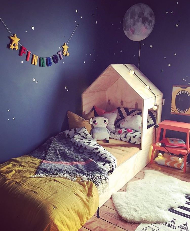
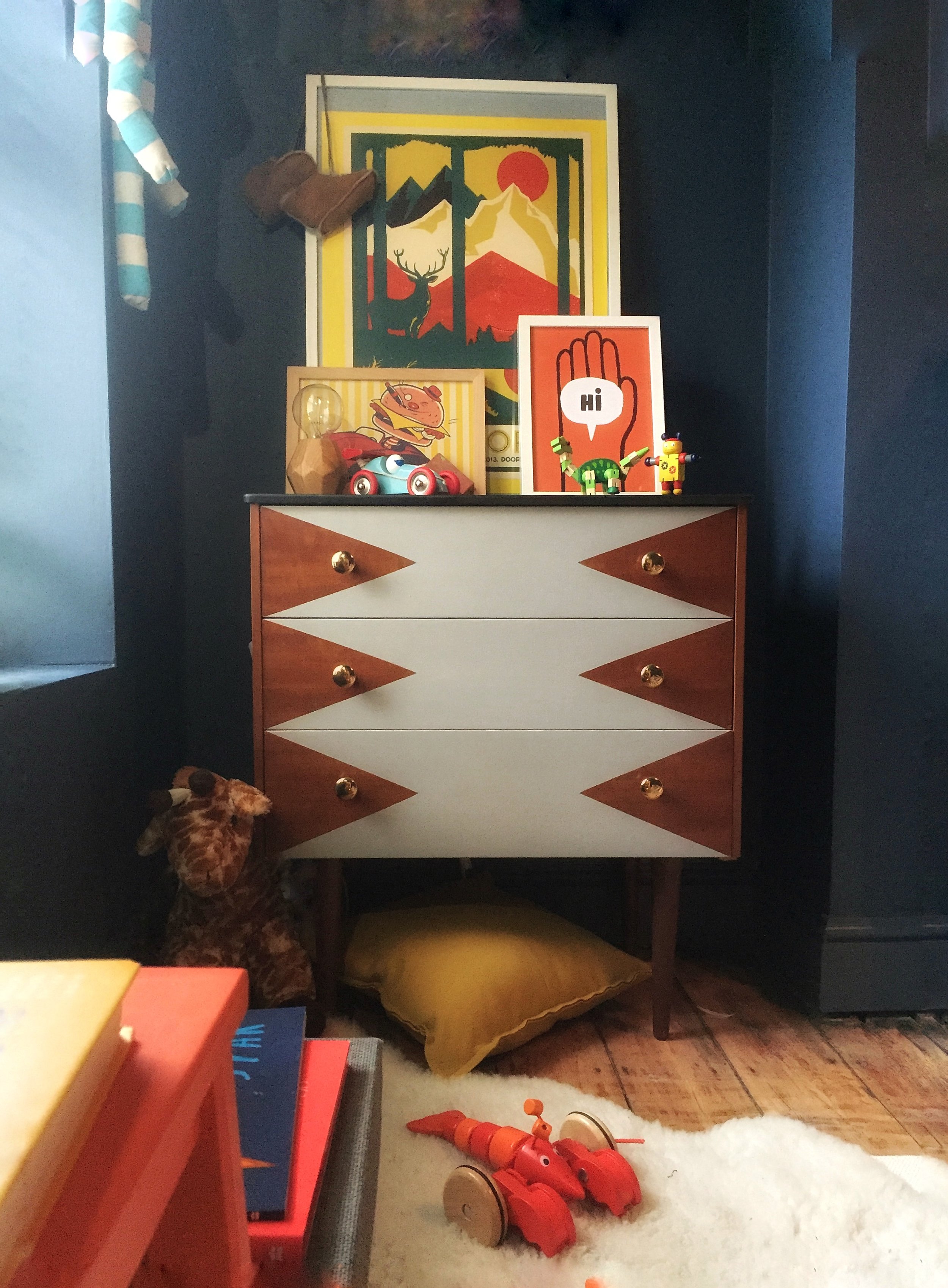
The plywood cabin bed and fitted wardrobe in our son’s room were also built by us. It was so lovely to have our son involved in the process and to see that with a bit of imagination you can create something magical without spending a fortune. The look on his little face when he saw it all finished for the first time was absolutely priceless.
The Staircase
Our staircase has a very Mediterranean feel, my mother is Greek Cypriot so I may have been influenced there in some way or another but the real long and short of it is that it is a very old and beaten MDF staircase. We didn’t have any money to replace it and it was not fit to be painted so we decided to tile it instead. This worked out much cheaper than a good quality carpet as we did the tiling ourselves. It’s more durable and with a young boy and a muddy dog in the house that is invaluable. The staircase is the first thing that you see when you walk into the house and the sight of it makes me happy every single day. In the absence of a grand, tiled hallway it is a fantastic compromise for a smaller home.
The Snug
The living room has a bit of a style of its own. It's not part of the open plan living area of the house so we thought that might be our free pass to be a little bit braver and bolder. Green was the obvious choice after many a late-night scroll on Pinterest and mustard because, well mustard velvet. I was inspired by the amazing Kate Learmonth of @the.kate.edit to create a feather wreath out of pheasant feathers after being completely blown away by her feature in the Rocket St George Extraordinary Interiors book. It creates such an impactful focal point in the room and is a real talking point whenever anyone comes to visit. We tend to use this room in the evening when Finn is in bed so it's a bit of a cosy retreat. We love the atmospheric feel of the dark walls and woodwork, combined with the mixed vintage pieces. It’s a dramatic contrast to all of the neutral earthy tones used in the rest of the downstairs of the house.
The Bathroom
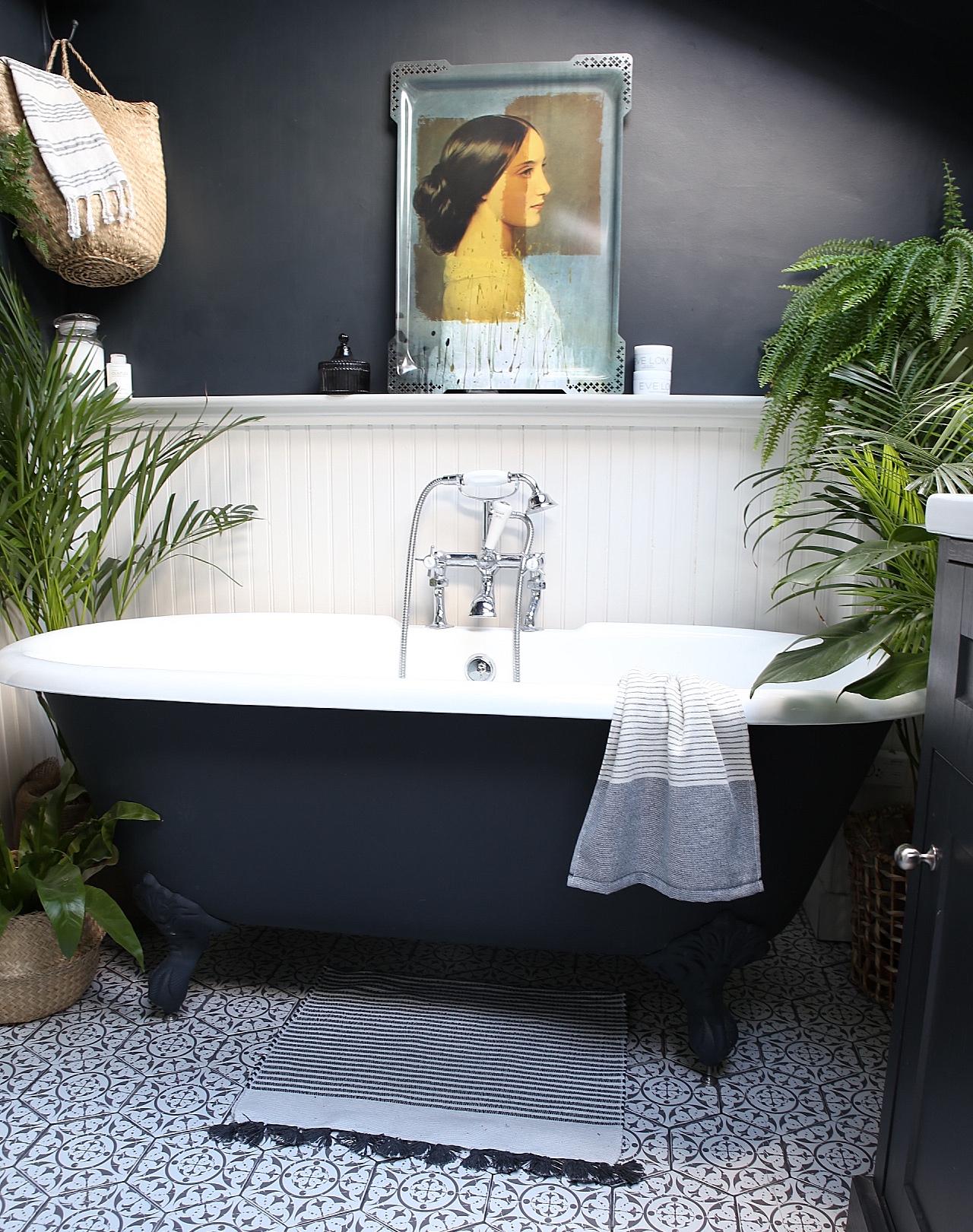
After a lot of deliberation, we decided to take the house from a three-bedroom house to a two bed. We moved the bathroom from the end of the kitchen to one of the bedrooms upstairs. To have a freestanding bath and a walk-in shower after years of living in tiny flats in London with no bath was exciting to say the least. We wanted the bathroom to have a traditional feel and loved the idea of taking the black and white theme from the staircase and flipping it on its head as you lead up the stairs into the bathroom. It was the first room to be finished during the renovation so it was the first one that we decorated. The nearly black walls and ceiling were a bit of a last minute decision and thankfully one that we still love. We feel completely spoiled every time we go in there.
The house is very much a work in progress with our bedroom still to do, and we also have plans to eventually go up into the loft but 2019 will hopefully be the turn of the garden to shine.
The Girl with The Green Sofa

