A Barn Conversion in Yorkshire-Meet Oakapple Decor.
Today’s Home Tour is with Marisa and Chris of Oakapple decor who have been renovating their barn conversion in Yorkshire, with a sympathetic nod to the age and character of the building in certain areas of the property, but also a nod to a more modern aesthetic in others. As my copper bath twins, I am particularly fond of their ensuite bathroom, but I also love their DIY hacks such as the striped door in the pink bedroom, or the rattan headboard in the main bedroom.
Read on tp find out more.
Tell me about your home, where do you live and in what kind of house?
I live in a barn conversion which was originally converted in the early 90s, in Yorkshire. We’ve been redecorating and renovating the house over the past few years. We do all the work ourselves so it can take a while to complete a project!
Who lives there with you, how does your home work for you and your family?
I live with my husband Chris. Some people might say our house is big for just the 2 of us but we use all the space! When looking for our ideal home, this house was the only one we came across with a near perfect layout. We just tweaked it a bit by relocating the kitchen to an undeveloped barn next to the garden- the existing kitchen was at the front of the house and was not ideal!
How do you describe your style?
That’s a tricky one! I feel that you should be sympathetic to the type of house you live in. In the more overtly beamed/exposed brick areas of the house I've stayed fairly neutral going for a modern rustic luxe look with some Scandi elements. In the rooms that are featureless, I’ve been a bit bolder and gone for some more modern and colourful on trend looks. I like to use pattern and texture in all my interiors
What influences you, where do you find your inspiration for decorating?
I use a combo of Pinterest, magazines and Instagram. I tend to see something I like then put my own spin on it. We like to be creative and make/upcycle our own versions of furniture that we have seen.
Hall
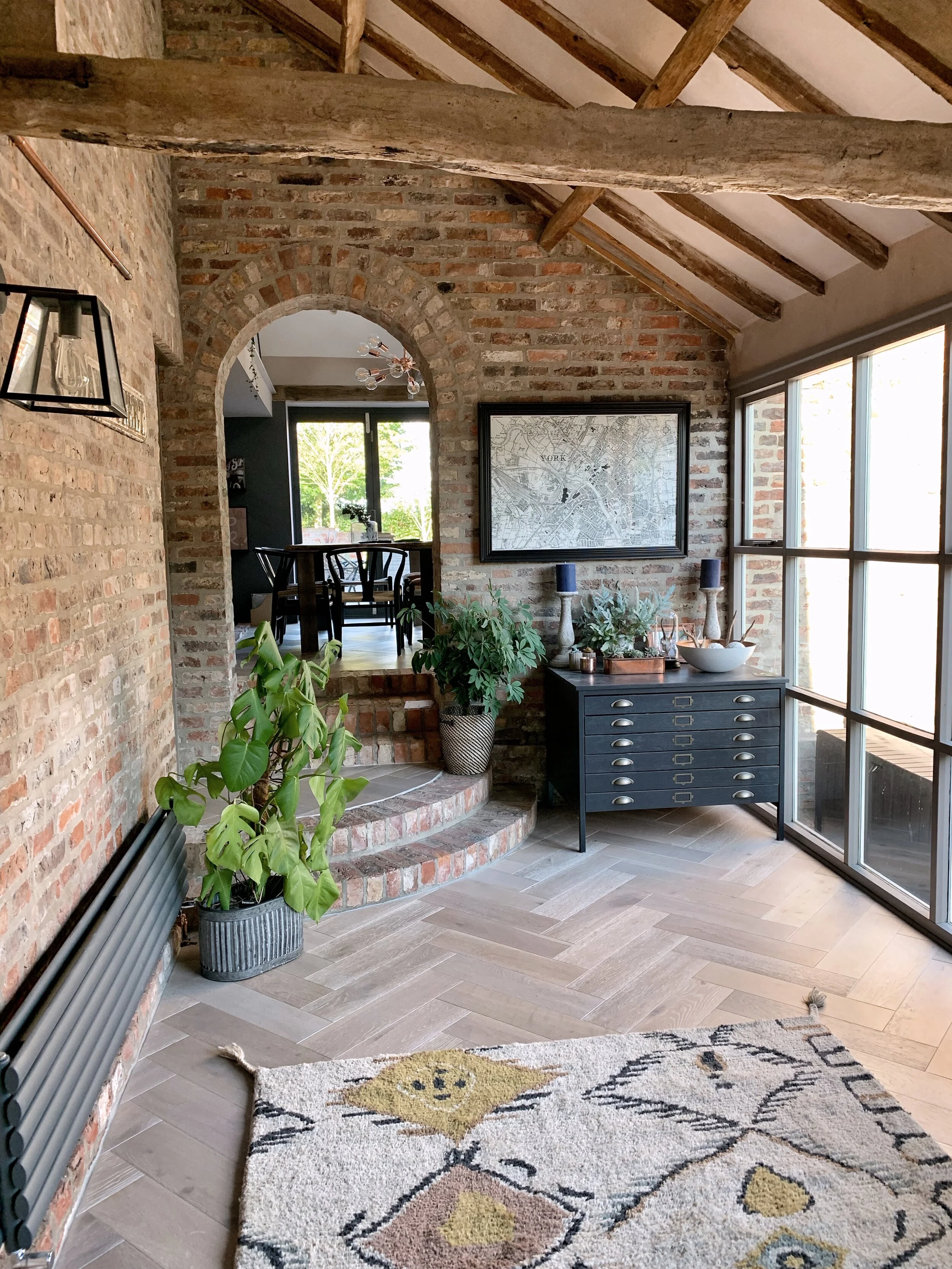
The first room we completed. It was actually in good condition so all we needed to do was paint the woodwork and lay parquet flooring. We went with a neutral colour to let the original features of the room do the talking.
Kitchen, Dining Area, Snug
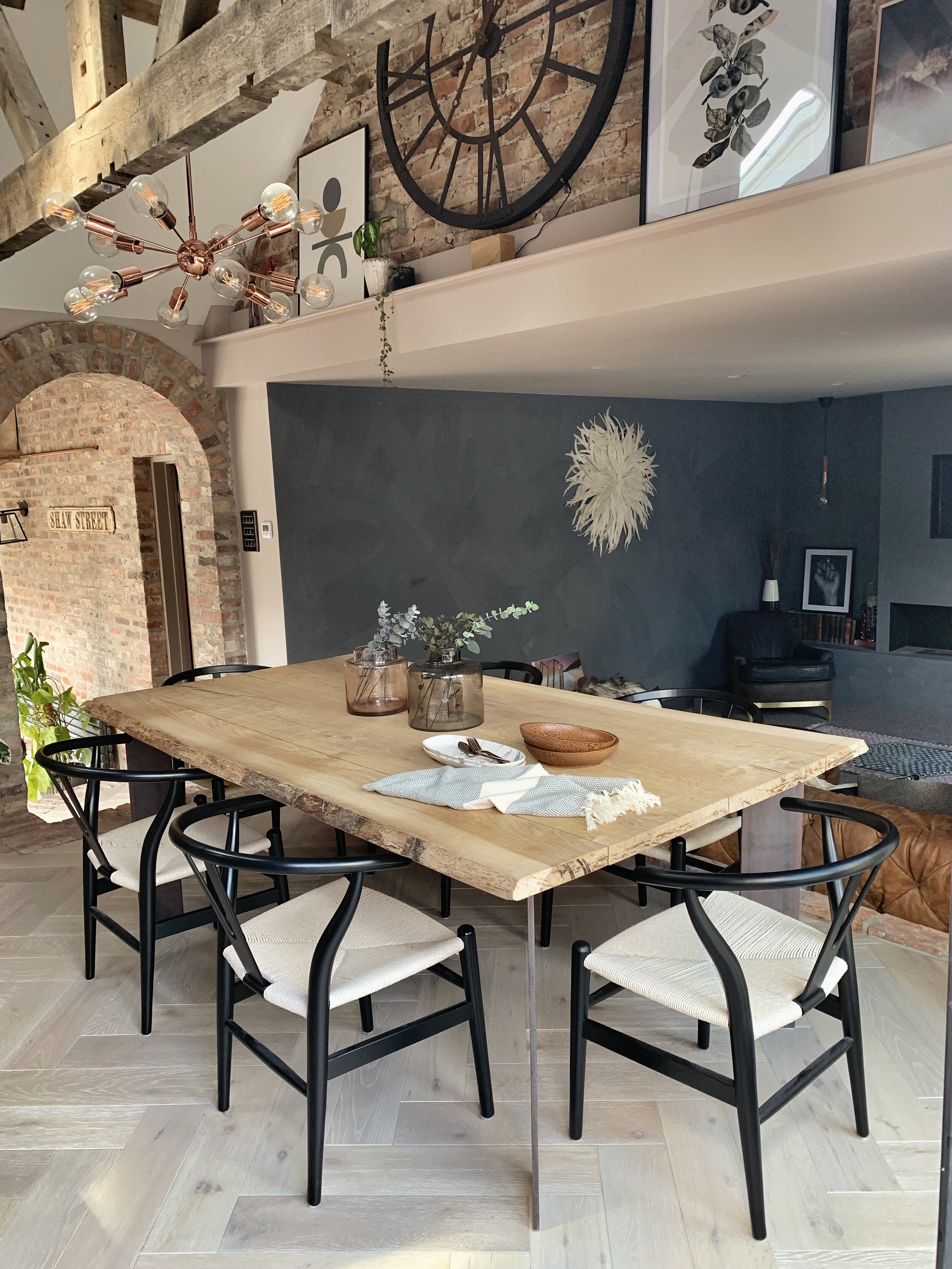
This was an unused barn which we joined to the rest of the house to make a kitchen/dining/living space. As we did this from scratch we were able to incorporate all the features we wanted in a kitchen. We had a bespoke kitchen made to make the most of the space we had. This can be repainted or we can add new hardware in the future if we want to change things. We went for a classic timeless style. Again, we stayed quite neutral in colour to let the features stand out. I managed to source a vintage apothecary cabinet on eBay so not all the storage is fitted and I love the character it brings.
Lounge
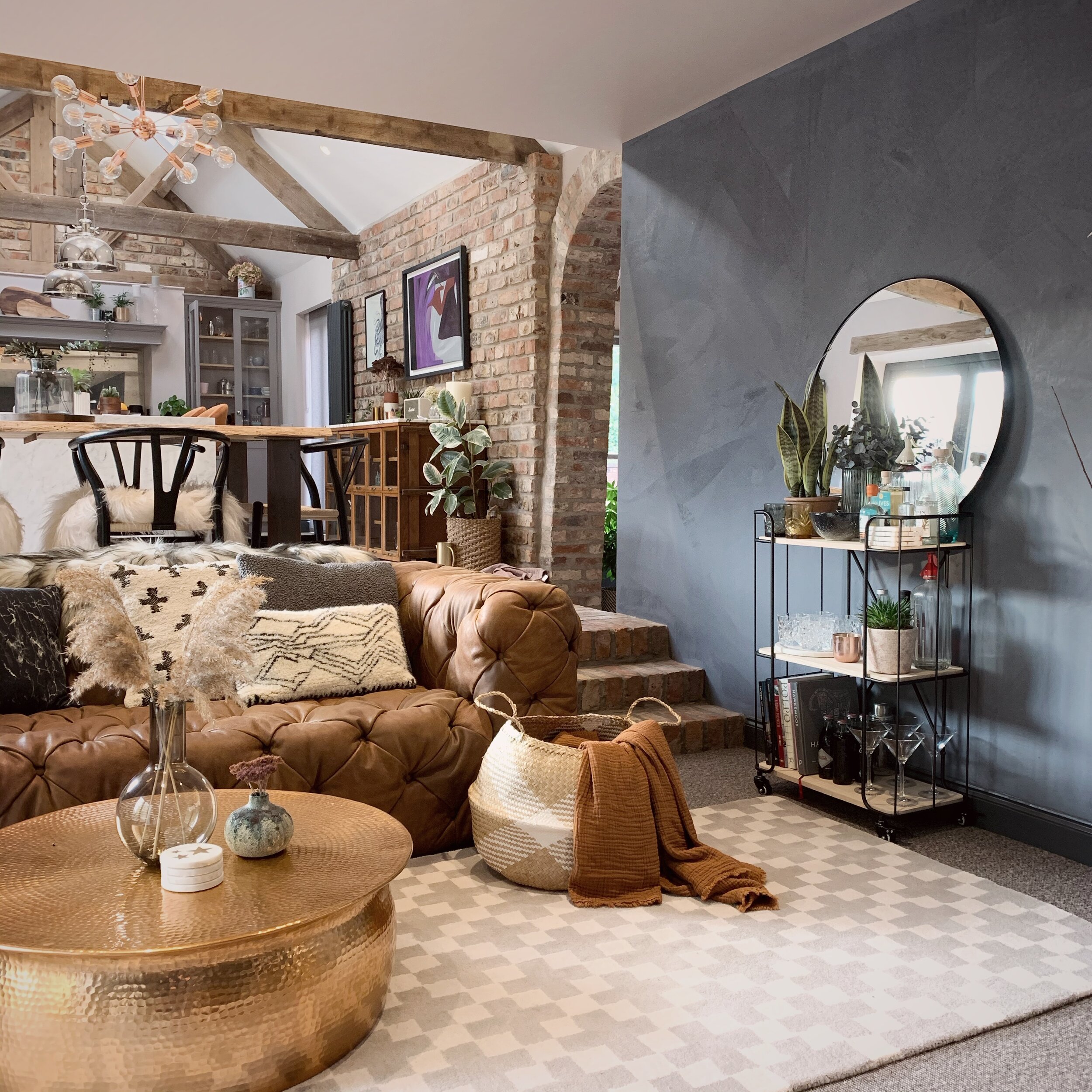
This is still a work in progress but we’ve used dark/pale grey colour blocking to break up the height of the room, warm accessories and lots of texture. I also added a statement wall mural of a Greek bust to fill a large blank wall above the doors (Image at top of this blog post).
Master Bedroom
I used one of my all-time favourite wallpapers-Nuvolette from Cole and Son, we took the wallpaper up onto the vaulted ceiling to make the most of it rather than hiding it behind the bed, where we’ve used panelling. We also made the cane headboard as it was so much cheaper than buying one and so easy to do!
En-suite Bathroom
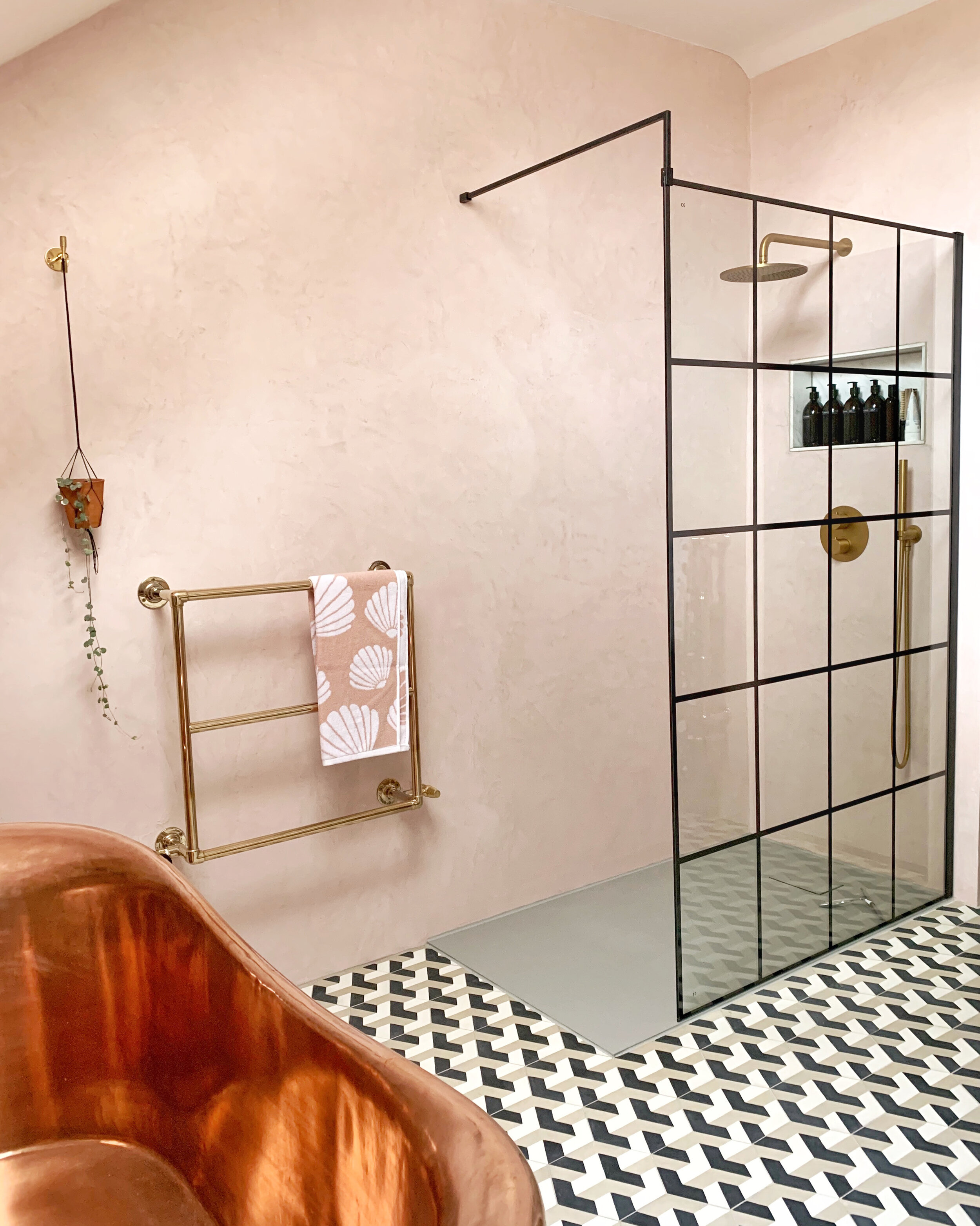
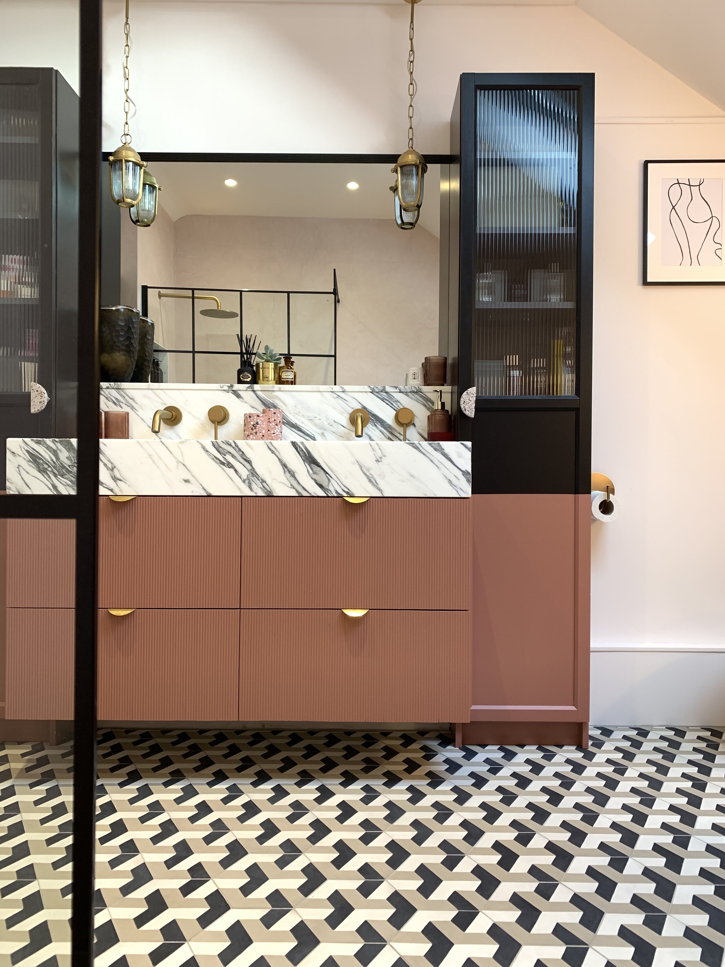
This room was a total indulgence for us. We exposed the original brick in the room and micro cemented the other walls for a natural look. I’ve always wanted a copper bath so I was so pleased we were able to fit one in. We went for a statement encaustic floor tile to add some pattern. We upcycled Ikea units to create the reeded vanity unit. The black of the crittall shower screen ties in with the black used elsewhere.
The Blue Bedroom
A dark and cosy room. We made the statement headboard by upholstering foam blocks. I’ve used metallics to contrast with the dark colours and added a bit of vintage with the SHH lettering.
Bathroom and Shower Room.
I went with a fairly classic look with the tiles-metro and hexagon black floor tiles and gave it a modern look with the crittall look shower screen and wide sink, softening the slightly industrial look with the Ellie Cashman dark floral wallpaper which I love!
The Study
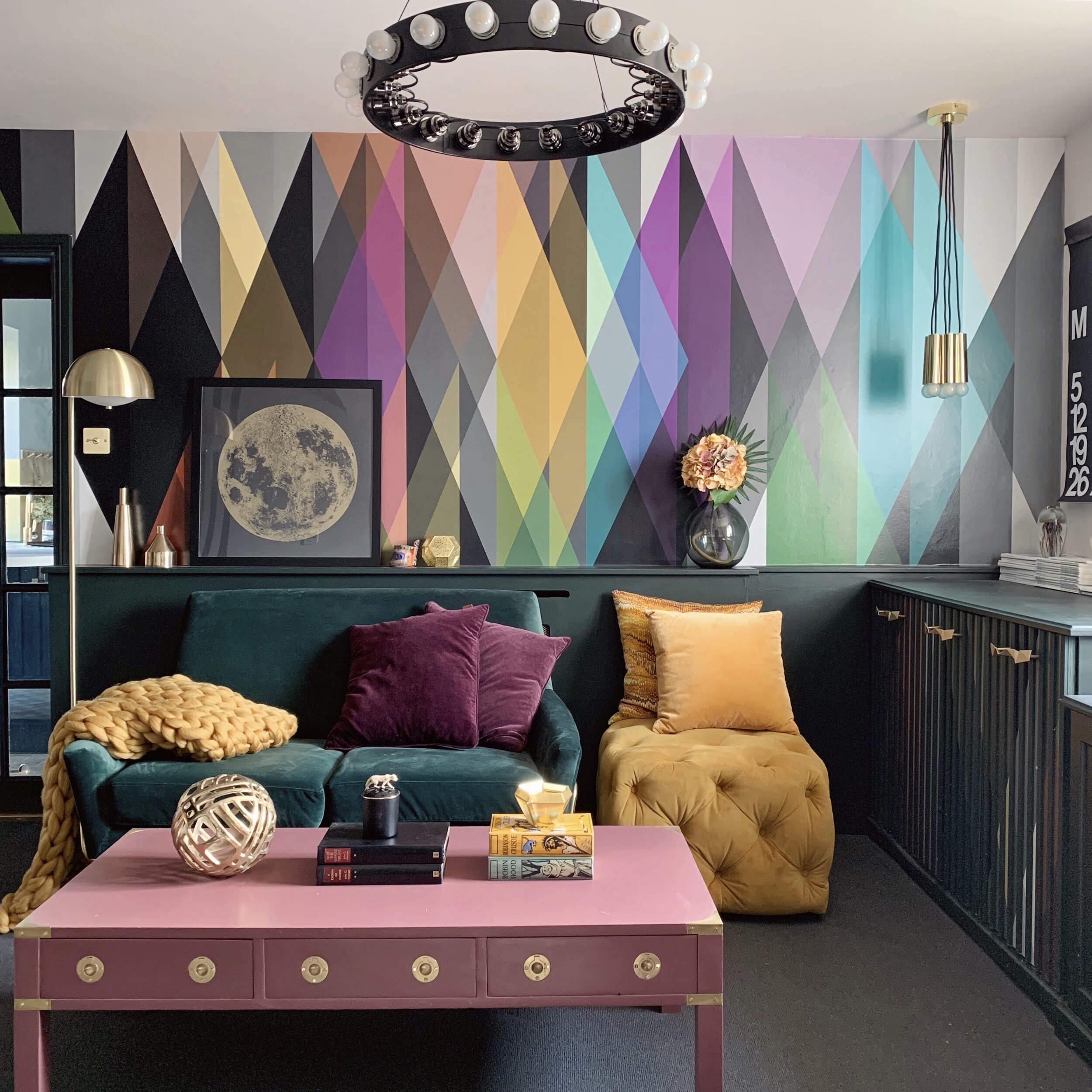
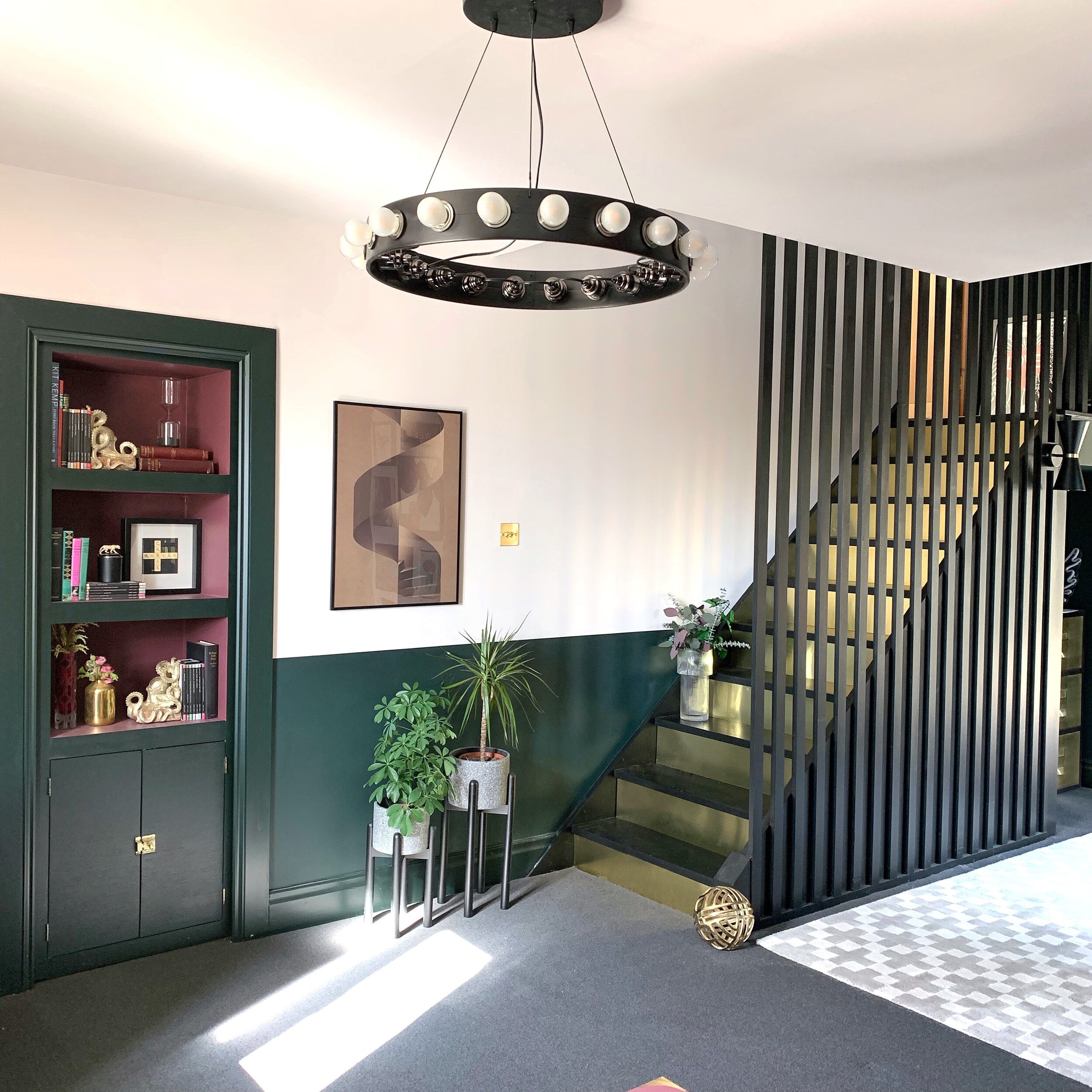
I wanted to use Cole and Sons’ Circus mural because I love it so much! I picked out a few jewel tones from the wallpaper to use for the furniture and used muted dark green and pale pink for the walls. I’ve used brass accents throughout which we also used on the stair risers, we created the modern balustrade as I didn’t feel a traditional look would work in this room.
The Pink Bedroom
I love pink and couldn’t resist using it in here. We took the pink over the ceiling to disguise all the awkward angles. We picked up some used wood flooring on eBay instead of carpeting and used lots of wood and rattan to balance out the pink.

